
Although for some, 2019 has been a frustrating year – and Seitz Kreuznach picked up on that with their Diamine Bloody Brexit exclusive – for us Ink Geeks, it’s been absolutely ‘bloody’ fantastic!
For those who are new to this website, this particular investigation began in 2015, and the last four years have been full of fabulous discovery, but, looking at art medium development within other art genres, one would have thought that there might also be a limit to how much fountain pen ink can be created and produced? And, that the ways in which fountain ink might be utilised would be finite too? Well… against all logical reasoning, 2019 would suggest that we are part of one art genre (yet to be recognised) where the products just keep on coming and the ways in which they can be used, really are limitless. So, I am declaring 2019 a vintage year and naming it ‘Year Purple’, as not only only is this information wonderful news for my investigation, but in 2019, more purple inks were produced than any other colour and that may have something to do with Bernardo, Scribble and Fountain Pens UK?
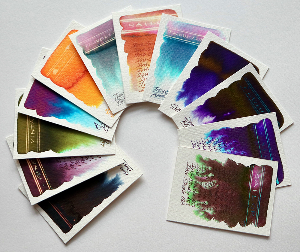
What fabulous colours!
Other news: Traffic to all of my sites is on the increase. The number of students doing my online course, Fountain Pen Ink Art – The Basics, is also growing. More and more people are discovering The Magic of Fountain Pen Ink and Fountain Pen Ink Art posts of amazing art across all social platforms are on the increase too. I am also planning to deliver more Fountain Pen Ink Art workshops in 2020 and further afield. Check here for dates.
A video all about four colour ink mixing and painting is planned for early 2020 as well as signed and sealed limited edition prints of favourite artworks which will be available to purchase from the shop page. Slowly but surely fountain pen inks are being rediscovered, reimagined and appreciated for their unique creative qualities. YES!

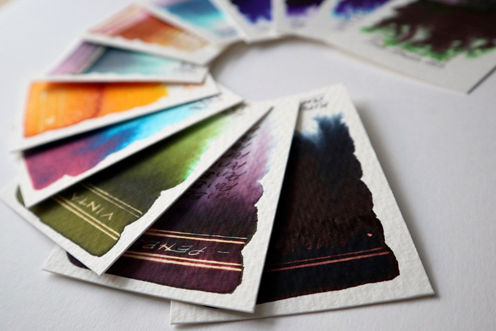
Just look at those sheens!
A brief overview: 2019 has been industrious so say the least. Diamine have been in overdrive with the production of many exclusive inks, particularly for Germany, including: The Les Paul Guitar Inks, Smoke on the Water and Purple Rain, Ortloff, Communication Breakdown, Bloody Absinth, Bloody Brexit, Manggis, Lion Rock, Calm and Passion, and A Night in Jodhpur as well as facilitating The FPUK Purple Project, releasing the mini monster sheens Christine and Philip AND launching the incredible Inkvent Calendar – featuring 25 new colours! And if that wasn’t enough, Sailor released their Ink Studio Range featuring 100 (YES 100!) amazing colours from their bespoke and until now unavailable back catalogue. I have also sampled the delights of Montblanc and been fortunate to swatch test a good range of inks from the Far East including China (PENBBS), Japan (Sailor and Takeda Jimuki) and the Philippines (Vinta and Troublemaker). Robert Oster is still mixing it up down under. J Herbin have just had a rebrand. And the new four seasons range from Van Dieman’s Inks is on its way for swatch testing to kick off 2020.
So, choosing my top 12 inks for 2019 has not been easy! But here we go:
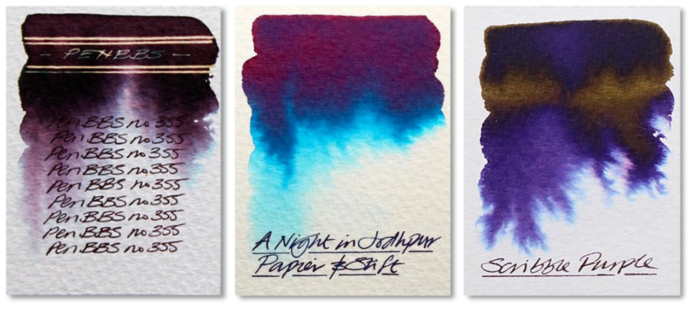
355 (PENBBS) – appears to be a deep damson colour with some very pretty chromatography bleeding out crimson greys with hints of turquoise. The reaction with bleach is a stunning bright neon gold. Click for article.
A Night in Jodhpur (Papier & Stift) – Take away the gold shimmer and you have an ink base similar to the great and wonderful Emeraude de Chivor. And what’s wrong with that? A stunning colour with a great tonal range and when used in a pen, hints of that sheen can easily be seen at the edges of the handwriting reflecting that deep metallic rose pink. Click for article.
Scribble Purple (FPUK & Diamine) – This is one of two inks to be developed by Diamine in collaboration with the Fountain Pens UK community on Facebook, who selected this as their top choice from ten prototypes in an exercise co-ordinated by Bernardo Gomes. A luscious deep purple, it also has a subtle golden sheen. Click for article.
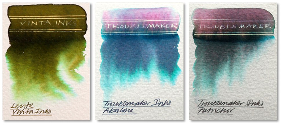
These inks are from Indonesia. I’m just so impressed with their delicate and sophisticated behaviours and they blend together so beautifully.
Sea Kelp (Leyte 1944 – Vinta Inks) – A deep khaki green bleeding out browns, greens, yellow and cyan when dropped onto a wetted watercolour paper surface. A gold reaction with bleach. No sheen. Click for article.
Abalone (Troublemaker Inks) – A deep blue grey that when dropped onto a wetted watercolour paper bleeds out pink, dark blue, greys and green turquoise. No sheen in evidence. A strong white gold effect when subjected to bleach. Click for article.
Petrichor (Troublemaker Inks) – A deep grey that when dropped onto a wetted watercolour paper bleeds out pink, dark greys and green turquoise. No sheen in evidence. A strong white gold effect when subjected to bleach. Click here for an article about painting with them.
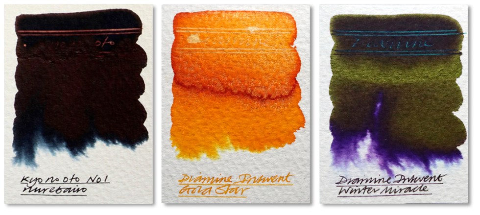
Nurebairo (Kyo No Oto) – A seriously heavy, and I mean heavy, black ink named after the black of a woman’s hair or the feather of a crow. A very heavy spread when dropped onto wetted paper with a hints of grey blue at the edges. A limited reaction with bleach. Click for article.
Gold Star (Diamine) – One of the Inkvent collection and a wonderful amber colour. Very similar to Apache Sunset with the addition of a silver shimmer. Great tonal range for a yellow with some heavy oranges in the more concentrated areas. Good reaction with bleach too. Click for article.
Winter Miracle (Diamine) – Another colour from the Inkvent collection and my favourite. A deep blue purple with a fabulous green sheen. The reaction with bleach is a neon turquoise! I used this recently for a portrait of Ringo Starr.

Just for the record, these Sailor inks are something else! The chromatography is just awesome! All 100 inks are fabulous!
573 (Sailor Ink Studio) – A gorgeous translucent brown with pinks and yellows in evidence in the watery areas. A neon gold effect when subjected to bleach. Beautiful! Click for article.
683 (Sailor Ink Studio) – A heavy and deep dark maroon with slightly more purple than the Sailor 737 that blends easily with water and bleeds out pinks and greens at the edges. A heavy green sheen in evidence indicating a heavily concentrated ink and hence the limited reaction with bleach. Click for article.
750 (Sailor Ink Studio) – A heavy and deep blue/purple that blends easily with water and bleeds out gradations of purples and turquoise at the edges. A heavy sheen in evidence. A very dark ink with a feint neon blue effect when subjected to bleach in the lesser ink concentrated areas. Writes a lighter purple than the 950 but otherwise very close in all other respects. Click for article.
So there you have it! Lots of sheen and chromatography but in all honesty there are just so many inks this year for consideration. Huge thanks to all of you who support what I do and believe in fountain pen inks as a creative medium. 2019 really has been an amazing year but 2020 could well be even better! And the art has only just begun! Have a great Christmas holiday!
Please don’t forget – all fountain pen inks are welcome to be sent to me for swatch testing and reviewing, so whether you are a manufacturer or a stockist, please feel free to send me samples.
AND HEY! If you’re interested to know more about how to use fountain pen inks in more creative ways – whether it’s simply to observe their chromatic behaviours, or, to recreate one of my swatch cards, or, to learn how to use them in watercolour painting, illustration and calligraphy, why not check out my online course or, even better, sign up for a workshop?
