
Outside of the fountain pen communities, Montblanc are arguably known as the status symbol of fountain pens. If I did a quick survey of pen ownership at Lloyd’s London, for example, I have a feeling that I could prove my point.
Stationery Shop Scotland very kindly sent me some samples of Montblanc ink to swatch test. Incidentally, if you’re just getting into swatch testing and you’re looking for the biggest range of 2ml ink samples in Europe, then I suggest you email Vijay for his extensive stock list. Here’s his email address: stationeryshop.scotland@gmail.com

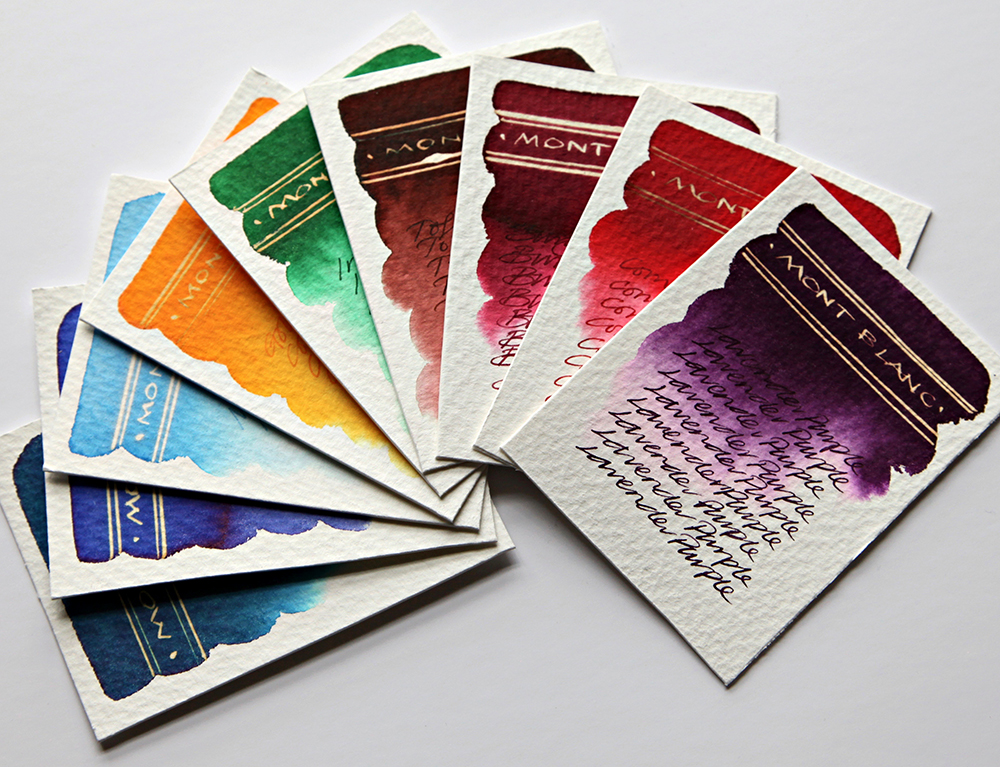
Lavender Purple – Deep rich purple with great tonal depth. Gold reaction with bleach. Lovely ink flow through nib. No chromatic behaviour.
Irish Green – Cool rich green with great tonal depth and very subtle evidence of chromatography with feint blues in evidence. Dull gold reaction with bleach. Lovely ink flow through nib.
Golden Yellow – Rich yellow with great tonal depth. Gold reaction with bleach. Lovely ink flow through nib. No chromatic behaviour.

Toffee Brown – Deep rich reddish brown with great tonal depth and very subtle evidence of chromatography with feint greys in evidence. Bright gold reaction with bleach. Lovely ink flow through nib.
Burgundy Red – Deep red with great tonal depth and very subtle evidence of chromatography with feint pinks in evidence. White gold reaction with bleach. Lovely ink flow through nib.
Corn Poppy Red – A bright red with great tonal depth and very subtle evidence of chromatography with feint pinks in evidence. Limited reaction with bleach. Slightly dry ink flow through nib.

Royal Blue – A classic blue with no evidence of chromatography. White gold reaction with bleach. Lovely ink flow through nib.
Leo Tolstoy – A dark sea blue with great tonal depth and evidence of chromatography with bright turquoise in evidence. Dull gold reaction with bleach. Lovely ink flow through nib.
Miles Davis – A very light and thin blue with no evidence of chromatography. Neon white reaction with bleach. Lovely ink flow through nib. Not sure whether ‘Miles Davis’ would better suit a darker blue?
As you’d expect, these are quality inks, although a little on the pricey side, you do get a unique and very chunky looking paperweight of a bottle to boot. From a chromatography and serendipity angle, not a lot going on here, but they do react well with bleach. The colours are rich and flow well through a nib and they do look good.
All tests on Bockingford Rough 200lb watercolour paper with handwriting using a Noodler’s Creeper pen.
Next workshop on Saturday 30th March 2019 – click for details.
