
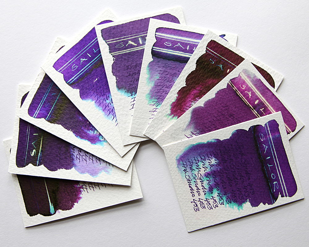
This is the second part of my Sailor Ink Studio swatch tests. The colours shown range from deep maroon to blue purples and red purples. Once again, what is instantly striking is the dramatic chromatography and heavy sheens.
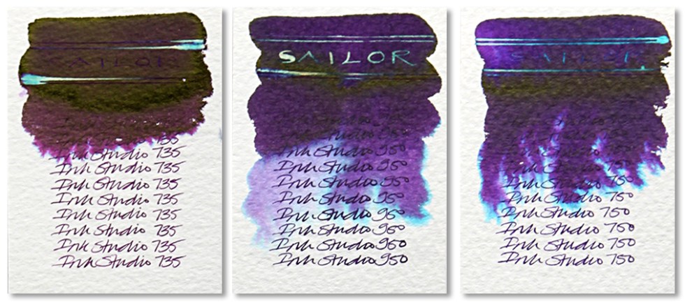
Sailor 735 – A very heavy Victoria plum purple that doesn’t blend that easily with water but bleeds out pink purples at the edges. A heavy sheen in evidence with a negligible effect when subjected to bleach due the concentration of the ink.
Sailor 950 – A heavy and deep blue/purple that blends easily with water and bleeds out gradations of purples and turquoise at the edges. A heavy sheen in evidence. A very dark ink with a feint neon blue and gold effect when subjected to bleach in the lesser ink concentrated areas. Writes well in a very dark purple.
Sailor 750 – A heavy and deep blue/purple that blends easily with water and bleeds out gradations of purples and turquoise at the edges. A heavy sheen in evidence. A very dark ink with a feint neon blue effect when subjected to bleach in the lesser ink concentrated areas. Writes a lighter purple than the 950 but otherwise very close in all other respects.

Sailor 453 – A heavy and deep blue/red/purple that blends easily with water and bleeds out light purples and green blues at the edges. A slight sheen in evidence with a white gold/neon blue effect when subjected to bleach.
Sailor 450 – A deep blue/purple that blends easily with water and bleeds out turquoise at the edges. A slight sheen in evidence with a neon blue effect when subjected to bleach in the lesser ink concentrated areas.
Sailor 350 – A matte purple that blends easily with water and bleeds out dark grey and turquoise blues at the edges. A flat even ink with a gold/neon effect when subjected to bleach in the lesser ink concentrated areas.
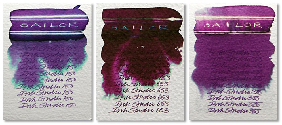
Sailor 150 – A mid tone purple that blends easily with water and bleeds out light pale green blues at the edges. A heavy sheen in evidence with a white gold/neon blue effect when subjected to bleach.
Sailor 653 – A very heavy and deep red that blends easily with water and bleeds out pinks and greens at the edges. A very dark ink with a negligible effect when subjected to bleach.
Sailor 335 – A flat matte reddy purple that blends easily with water and bleeds out greys and blues at the edges. Reveals a gold/neon effect when subjected to bleach in the lesser ink concentrated areas. A slight hint of a sheen.
All tests on Bockingford Rough 200lb watercolour paper with handwriting using a Noodler’s Creeper pen.
Many thanks to Catherine at Sakura Fountain Pen Gallery from whom I sourced the samples.
Swatch cards are now available to buy. Click for details. If you’d like to know how to create these yourself, why not check out my tutorials course? Click for details.
