
Taccia Ukiyo-e inks have been created in hommage to the Ukiyo-e art movement and the world famous Ukiyo-e artists including Hiroshige, Hokusai, Sharaku and Utamaro.
Ukiyo-e was a Japanese art movement established in the Edo period between 1603 and 1868. The iconic Japanese woodblock prints display the everyday lifestyles of the people of the time. The illustrations are characterised by clear designs, precise lines, bold compositions, and evenly laid colour. This art style laid the foundations for what we know today as anime.
The four chosen artists have four inks assigned to each. The gorgeous packaging designs contain image extracts of their instantly recognisable illustration work. In addition to the classic landscapes and marine scenes – geishas, sumo wrestlers and kabuki actors also feature.
Produced by Taccia in Japan, the inks have been created by Hiroshi Ishizu, an ink sommelier and Hanae Matsumoto, a colour consultant.
These first eight inks are dedicated to Hiroshige and Utamaro.
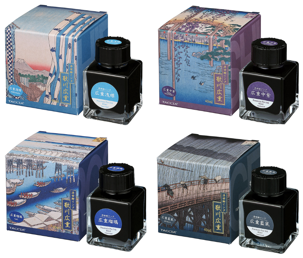
The Hiroshige packaging features four extracts of his famous sea and landscape illustrations.

Asahanada – A light translucent blue that bleeds out green when added to a wetted paper surface. A good reaction to bleach. For similar effects please click here for the Sailor Ink Studio tests.
Nakamurasaki – A deep purple that bleeds out cyan and faint pinks when added to a wetted paper surface. A good reaction to bleach. For similar effects please click here for the Sailor Ink Studio tests.
Ruri – A deep royal blue that bleeds out cyan and faint pinks when added to a wetted paper surface. A negligable reaction to bleach. For similar effects, Troublemaker Milky Ocean, please click here.
Ainezu – A cool blue grey that bleeds out blue greys when added to a wetted paper surface. A slight dull reaction to bleach. For similar effects please click here.

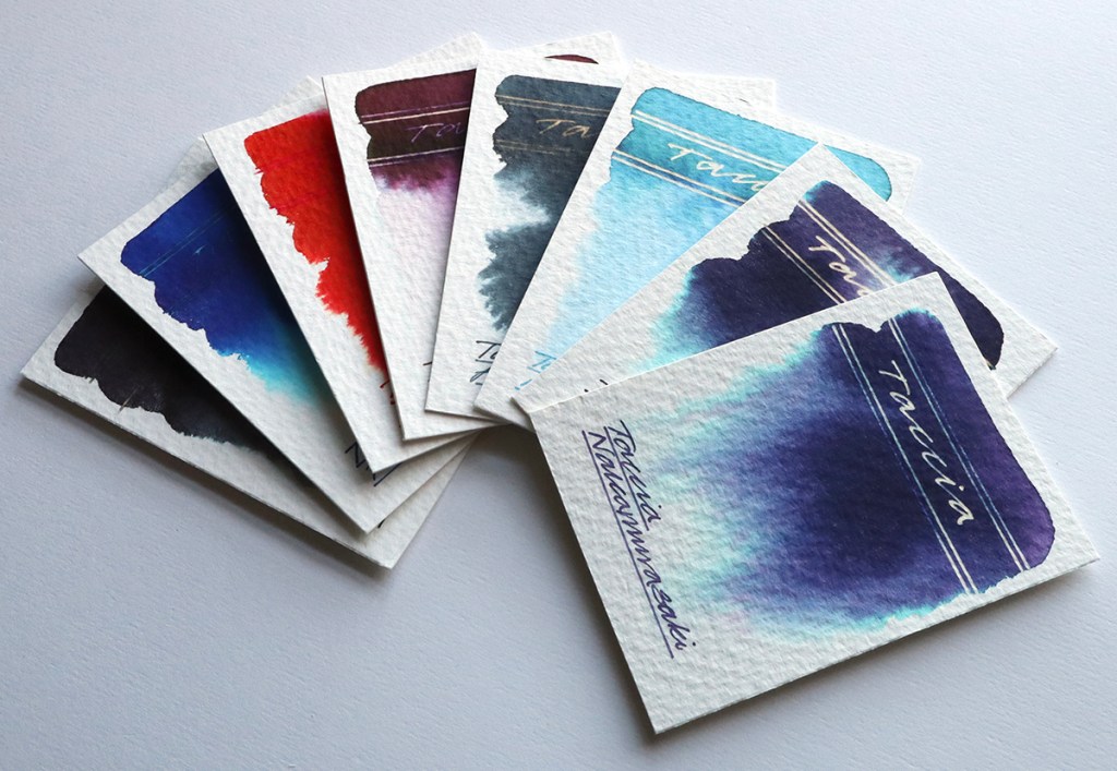
It wasn’t until I created the chromo scapes that the real beauty of these delicate inks appeared. Initially I added the tiniest hint of each diluted ink to a wetted Bockingford watercolour paper surface. The chromatography is just so delicate but so beautiful. When dry, I added an ink rule with a Creeper pen and then wet the area above the line. I then added tiny amounts of not so diluted ink to the rule and the wetted area above it allowing it to bleed. Once dry, I added a bleach rule below the ink rule and then added few random bleach dots to help give the visual illusion of lights on land by the waters edge. Just look at that chromatography now!
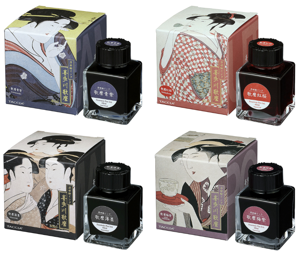
The Utamaro packaging features four extracts of his famous geisha illustrations.

Aomurasaki – A deep plum that bleeds out greys and cyan when added to a wetted paper surface. A good reaction to bleach. For similar effects please click here for the Sailor Ink Studio tests.
Benizakura – A rich thick bright vermilion with no reaction to bleach. For similar effects please click here for the Sailor Ink Studio tests.
Usuzumi – A cool black that bleeds out blue greys when added to a wetted paper surface. A slight dull reaction to bleach. For similar effects please click here.
Umemurasaki – A chestnut brown that bleeds out pink with the faintest hint of cyan when added to a wetted paper surface. A slight reaction to bleach. For similar effects please click here for the Sailor Ink Studio tests.

It wasn’t until I created the chromo scapes that the real beauty of these delicate inks appeared. Initially I added the tiniest hint of each diluted ink to a wetted Bockingford watercolour paper surface. The chromatography is just so delicate but so beautiful. When dry, I added an ink rule with a Creeper pen and then wet the area above the line. I then added tiny amounts of not so diluted ink to the rule and the wetted area above it allowing it to bleed. Once dry, I added a bleach rule below the ink rule and then added few random bleach dots to help give the visual illusion of lights on land by the waters edge. Just look at that chromatography now!
These beautiful ink samples were very kindly sent to me by Catherine Van Hove. She is the driving force behind the Sakura Fountain Pen Gallery and has considerable experience in the pen world and a well-deserved reputation for her professionalism. Sakura is the only European stockist of these inks and also stocks the complete Sailor Ink Studio range (100 in total).
AND HEY! If you’re interested to know more about how to use fountain pen inks in more creative ways – whether it’s simply to observe their chromatic behaviours, or, to recreate one of my swatch cards, or, to learn how to use them in watercolour painting, illustration and calligraphy, why not check out my online course ?
