

Welcome to my final post of Kobe fountain pen ink swatch tests, made by one of the world’s most revered fountain pen ink creators… Sailor. As it’s been a bit a frantic of late and I haven’t been able to blog as much as I’d like, here’s a double dose of swatch tests for all you ink geeks.
When Anja from Papier und Stift asked me if I’d like to swatch test the entire Kobe ink range, I just couldn’t believe my luck. And in spite of the courier delays due to Covid and Brexit, all eighty sample vials eventually arrived and the wait was definitely worth it. So here is my final post which I hope you’ll enjoy as much as I enjoyed swatch testing them.

Nankinmachi Fortune Red – A fabulous bright red that bleeds out red, orange, pink and yellow when dropped into a wetted paper surface. Neon gold reaction with bleach.
Rokko Shichidanka – A violet blue that bleeds out blues, purple and cyan dropped onto a wetted paper surface. A neon gold reaction with bleach.
Kobe Himeajisai – a dusty pink purple that bleeds out cyan dropped onto a wetted paper surface. Neon white reaction to bleach.
Hyogo Canal Blue – a mid blue that bleeds out cyan when dropped onto a wetted paper surface. A muted to bleach.
Hirano Cion Romance Gray – Gradates out grey when dropped onto a wetted paper surface. A muted dull gold reaction to bleach.
Kobe Ijinkan Mint – A translucent mint green that bleeds out subtle cyan when dropped onto wetted paper surface. A white neon reaction to bleach.
Yoki Goshu Sakura – A fresh pink with a white neon reaction to bleach.
Nunokiki Lavender – A rich purple that bleeds out purples and cyan when dropped onto a wetted paper surface. A neon blue reaction to bleach.
East Park Torch Orange – A rich orange that bleeds out yellow when dropped onto a wetted paper surface. A dull gold reaction to bleach.
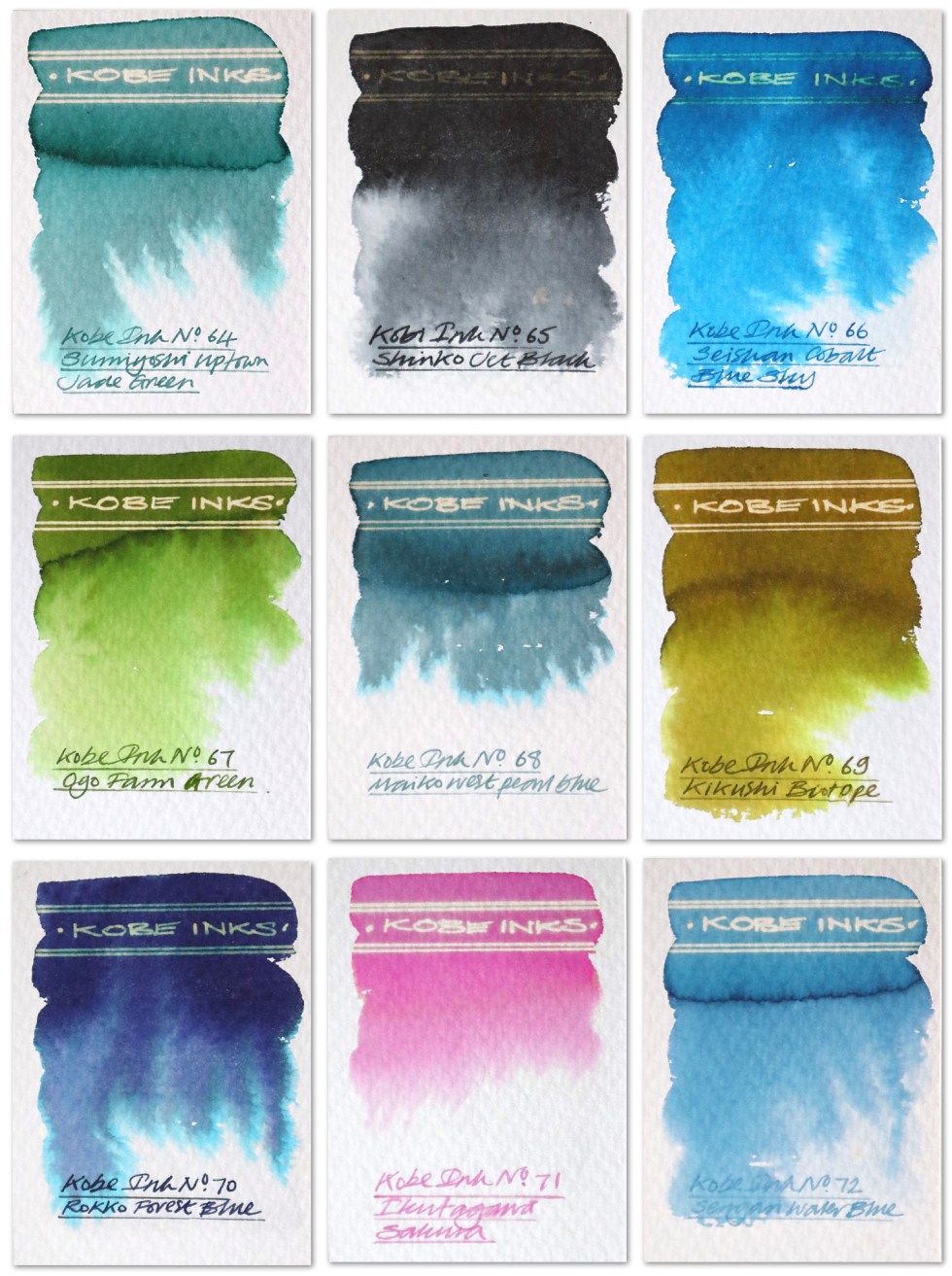
Sumiyoshi Uptown Jade Green – A dusty jade green that bleeds out subtle turquoise when dropped onto a wetted paper surface. A dull white reaction to bleach.
Shinko Jet Black – Grades out cool greys when dropped onto a wetted paper surface. A dull gold reaction to bleach.
Seishan Cobalt Blue Sky – A cobalt blue with a dull gold reaction to bleach.
Ogo Farm Green – A grass green with bright gold reaction to bleach.
Maliki West Pearl Blue – A dusty blue grey that bleeds out subtle cyan when dropped into a wetted paper surface. Neon white reaction with bleach.
Kikusui Biotype Green – A deep olive green that bleeds out greens and yellows when dropped onto a wetted paper surface. A gold reaction to bleach.
Rokko Forest Blue – A dark purple that bleeds out greys, purples and cyan when dropped onto a wetted paper surface. A dull gold reaction to bleach.
Ikutagawa Sakura – A cherry blossom pink with a neon gold reaction to bleach.
Sengari Water Blue – A translucent blue with a neon white gold reaction to bleach.
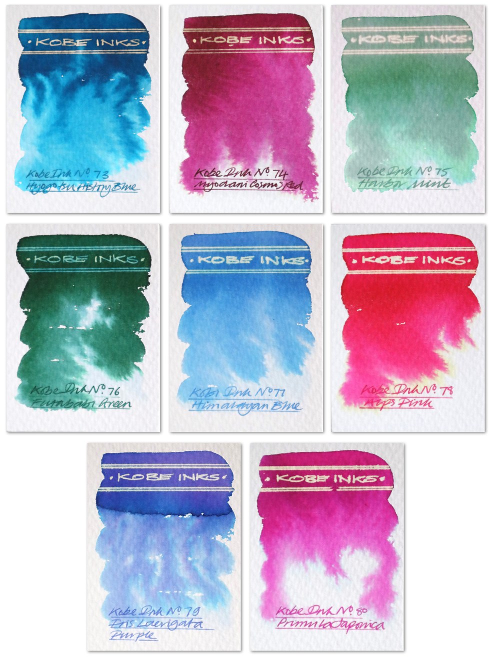
Hyogo Tsu History Blue – A dusty mid blue that bleeds out vivid cyan when dropped onto a wetted paper surface. A gold reaction to bleach.
Myodani Cosmos Red – a rich crimson that bleeds out pink when dropped onto a wetted paper surface. A gold reaction to bleach.
Harbour Mint – a dark mint green that bleeds out grey, yellow and cyan when dropped onto a wetted paper surface. A white neon gold reaction to bleach.
Futababi Green – A dark green that bleeds out greens and light blues when dropped onto a wetted paper surface. A neon blue reaction to bleach.
Himalayan Blue – A light translucent blue with a neon white reaction with bleach.
Alps Pink – A deep vivid pink that bleeds out pinks and yellow when dropped onto a wetted paper surface. A neon gold reaction to bleach.
Iris Laevigata Purple – A dusty light purple that bleeds out purple, pinks and cyan when dropped onto a wetted paper surface. A white neon reaction to bleach.
Primula Japonica – A dark pink with a neon gold reaction to bleach.
There’s just something about the fountain pen inks from the far east – a sophistication and a delicacy. Looking at the handwriting examples one wouldn’t have a clue about the chromatic wonders these inks have to offer. And as this project develops I am trying my best to seamlessly integrate writing and illustration together just using this one fountain pen ink medium. The more calligraphic based alphabets of the middle and far eastern cultures do tend to integrate with illustration a little more easily than our Roman based western alphabets, but with more fluid handwriting styles, abstracted calligraphic shapes and inks like these I think there’s plenty of visually impactive opportunities ahead.
Click here if you’d like to see my first review of Kobe inks
Click here if you’d like to see my second review of Kobe inks
Click here if you’d like to see my third review of Kobe inks
Click here if you’d like to see my fourth review of Kobe inks
Click here if you’d like to see my fifth review of Kobe inks
Many thanks to Anja at Papier und Stift for sending me the samples. All art created on Bockingford watercolour paper. Keep a look out for the next post. Fingers crossed the wait won’t be too long.
AND HEY! If you’re interested to know more about how to use fountain pen inks in more creative ways – whether it’s simply to observe their chromatic behaviours, or, to recreate one of my swatch cards, or, to learn how to use them in watercolour painting, illustration and calligraphy, why not check out my online course ?
