

Welcome to my second post of Kobe fountain pen ink swatch tests, made by one of the world’s most revered fountain pen ink creators… Sailor.
When Anja from Papier und Stift asked me if I’d like to swatch test the entire Kobe ink range, I just couldn’t believe my luck. And in spite of the courier delays due to Covid and Brexit, all eighty sample vials eventually arrived and the wait was definitely worth it. So here is the second of nine posts which I hope you’ll enjoy as much as I enjoyed reviewing them:
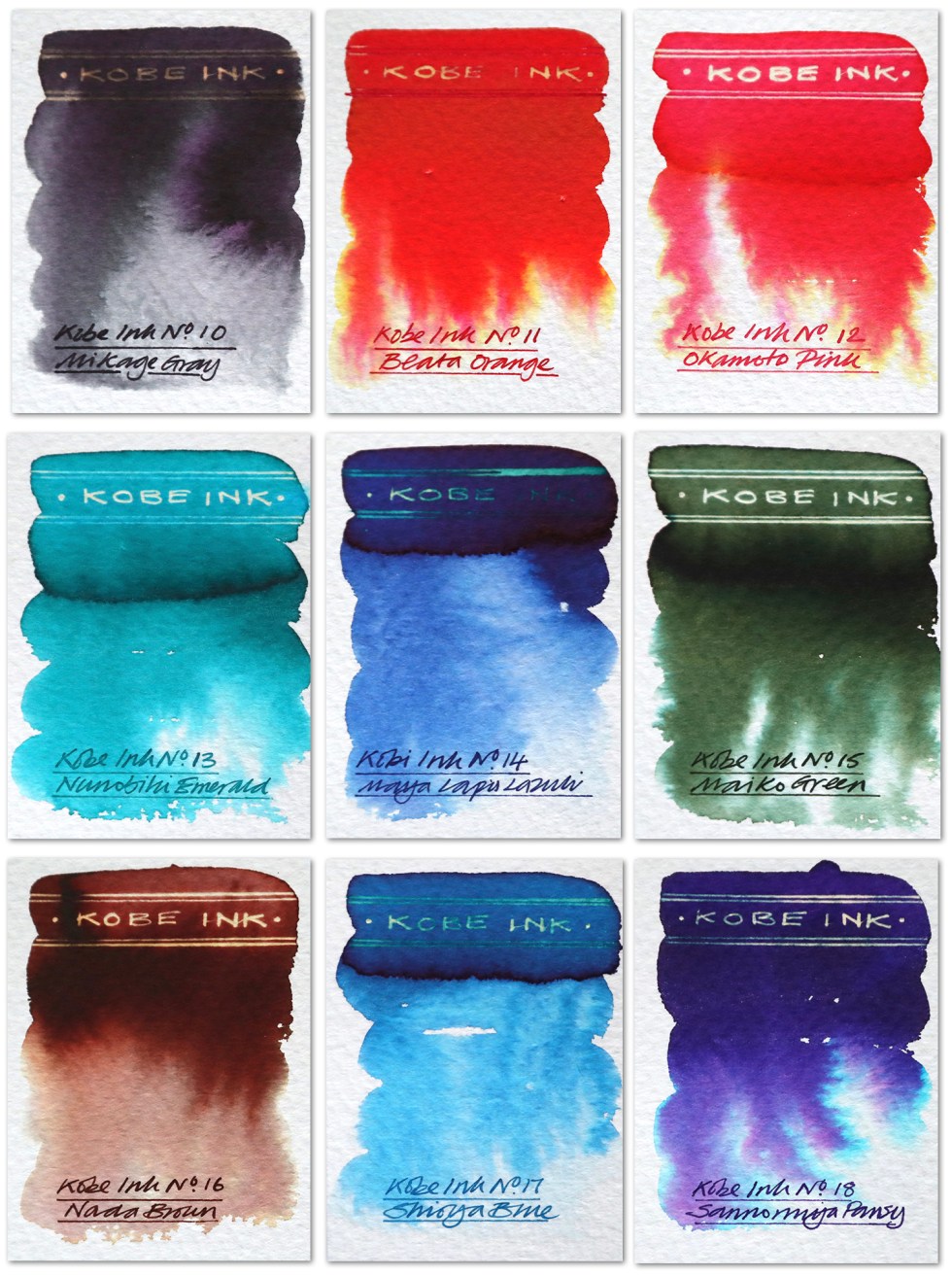 Swatch cards
Mikage Gray – A dark cool grey that bleeds out greys and purple when dropped onto a wetted paper surface. A clean gold reaction to bleach. I used this in the intro image. Great tonal range and chromatic effects.
Beata Orange – A rich deep orange that bleeds out pinks and yellows when dropped onto a wetted paper surface. A clean gold reaction to bleach but not in the more concentrated ares. I used this in the intro image for the sun.
Okamoto Pink – An orange pink that bleeds out pinks and yellow when dropped onto a wetted paper surface. A white gold reaction to bleach.
Nunobiki Emerald – A blue teal that bleeds out dirty greys and turquoise when dropped onto a wetted paper surface. A white gold reaction to bleach.
Maya Lapis Lazuli – A deep blue that bleeds out gradations of blue when dropped onto a wetted paper surface. A turquoise reaction to bleach.
Mako Green – A deep military green that bleeds out pale olives and blues when dropped onto a wetted paper surface. A neon white reaction to bleach.
Nada Brown – A horse chestnut brown that bleeds out salmon pink, greys and yellow when dropped onto a wetted paper surface. A gold reaction to bleach.
Shioya Blue – A warm mid blue that bleeds out cyan when dropped onto a wetted paper surface. A weak gold reaction to bleach.
Sannomiya Pansy – A deep dark purple that bleeds out purples and neon blue when dropped onto a wetted paper surface. A neon gold reaction to bleach when used in the less concentrated areas.

There’s just something about the fountain pen inks from the far east – a sophistication and a delicacy. Looking at the handwriting examples one wouldn’t have a clue about the chromatic wonders these inks have to offer. And as this project develops I am trying my best to seamlessly integrate writing and illustration together just using this one fountain pen ink medium. The more calligraphic based alphabets of the middle and far eastern cultures do tend to integrate with illustration a little more easily than our Roman based western alphabets, but with more fluid handwriting styles, abstracted calligraphic shapes and inks like these I think there’s plenty of visually impactive opportunities ahead.
Click here if you’d like to see the first nine swatch tests.
Many thanks to Anja at Papier und Stift for sending me the samples. All art created on Bockingford watercolour paper. Keep a look out for the next post – Kobe inks 19-27. The featured image of fishing with cormorants was created using Kobe inks 10 and 11.
AND HEY! If you’re interested to know more about how to use fountain pen inks in more creative ways – whether it’s simply to observe their chromatic behaviours, or, to recreate one of my swatch cards, or, to learn how to use them in watercolour painting, illustration and calligraphy, why not check out my online course ?
