
Welcome to my fifth post of Kobe fountain pen ink swatch tests, made by one of the world’s most revered fountain pen ink creators… Sailor. As it’s been a bit a frantic of late and I haven’t been able to blog as much as I’d like, here’s a double dose of swatch tests for all you ink geeks.
When Anja from Papier und Stift asked me if I’d like to swatch test the entire Kobe ink range, I just couldn’t believe my luck. And in spite of the courier delays due to Covid and Brexit, all eighty sample vials eventually arrived and the wait was definitely worth it. So here is my fifth post which I hope you’ll enjoy as much as I enjoyed swatch testing them.
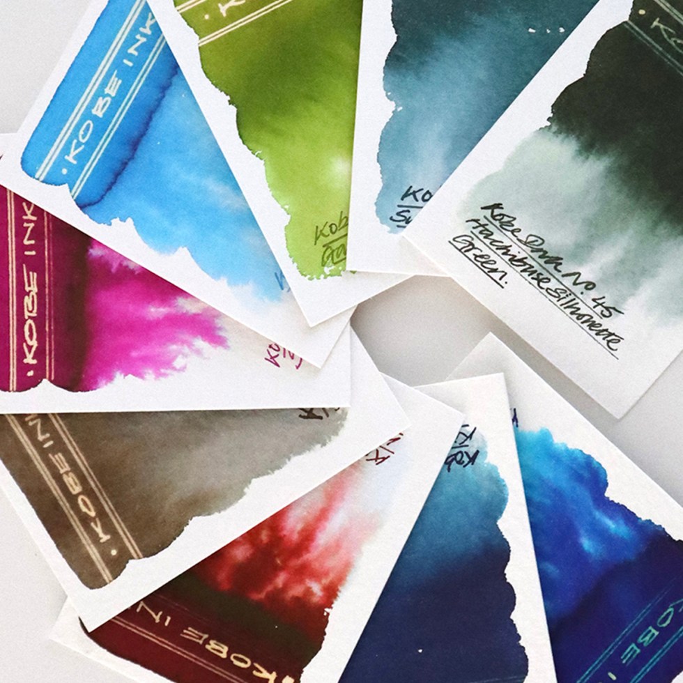
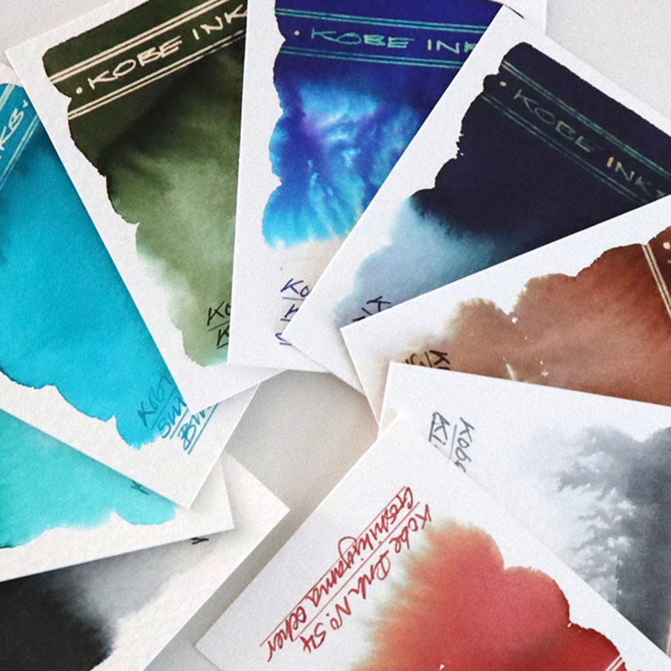
 Swatch cards
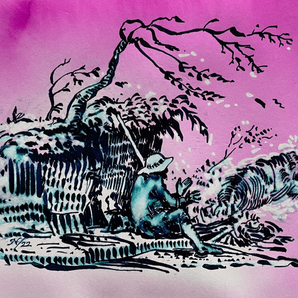
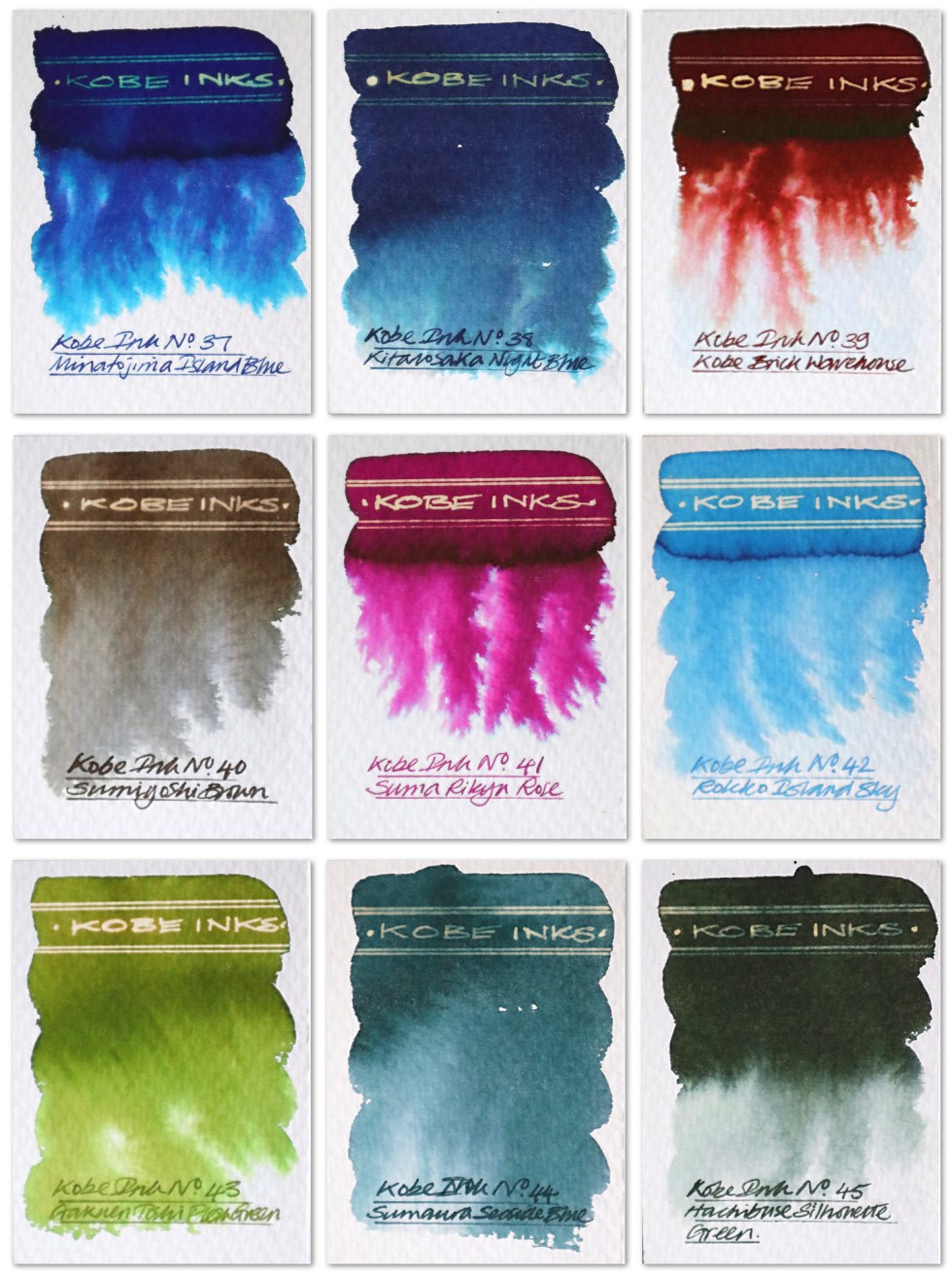
Minatojima Island Blue – A concentrated royal blue that bleeds out very subtle pinky purples and plenty of cyan when dropped into a wetted paper surface. The reaction with bleach is a little dull as the ink is concentrated. I used this for the line work in the hero illustration.
Kitano Night Blue – A dark dusty blue that bleeds out grey blues and cyan when dropped onto a wetted paper surface. A dull gold reaction to bleach in the concentrated ink areas.
Kobe Brick Warehouse – a wonderful chestnut brown that bleeds out anti foul red, pink, yellow and a feint cyan when dropped onto a wetted paper surface. A definite neon gold reaction to bleach.
Sumiyoshi Brown – a dark grey brown that bleeds out a walnut brown and grey when dropped onto a wetted paper surface. A dull gold reaction to bleach.
Suma Rikyu Rose – A fuchsia pink that bleeds out pink with a cyan edging when dropped onto a wetted paper surface. A bright gold reaction to bleach. I used this as the background colour for the hero image.
Rokko Island Sky – A translucent light blue that grades out blue when dropped onto a wetted paper surface. A white neon reaction to bleach.
Gakuen Toshi Fresh Green – A fresh olive green that bleeds out greens and sandy yellow when dropped onto a wetted paper surface. A neon gold reaction to bleach.
Sumaura Seaside Blue – A dark dusty teal that grades out when dropped onto a wetted paper surface. A dull gold reaction to bleach.
Hachibuse Silhouette Green – A deep dark green that bleeds out grey greens when dropped onto a wetted paper surface. A dull gold reaction to bleach.
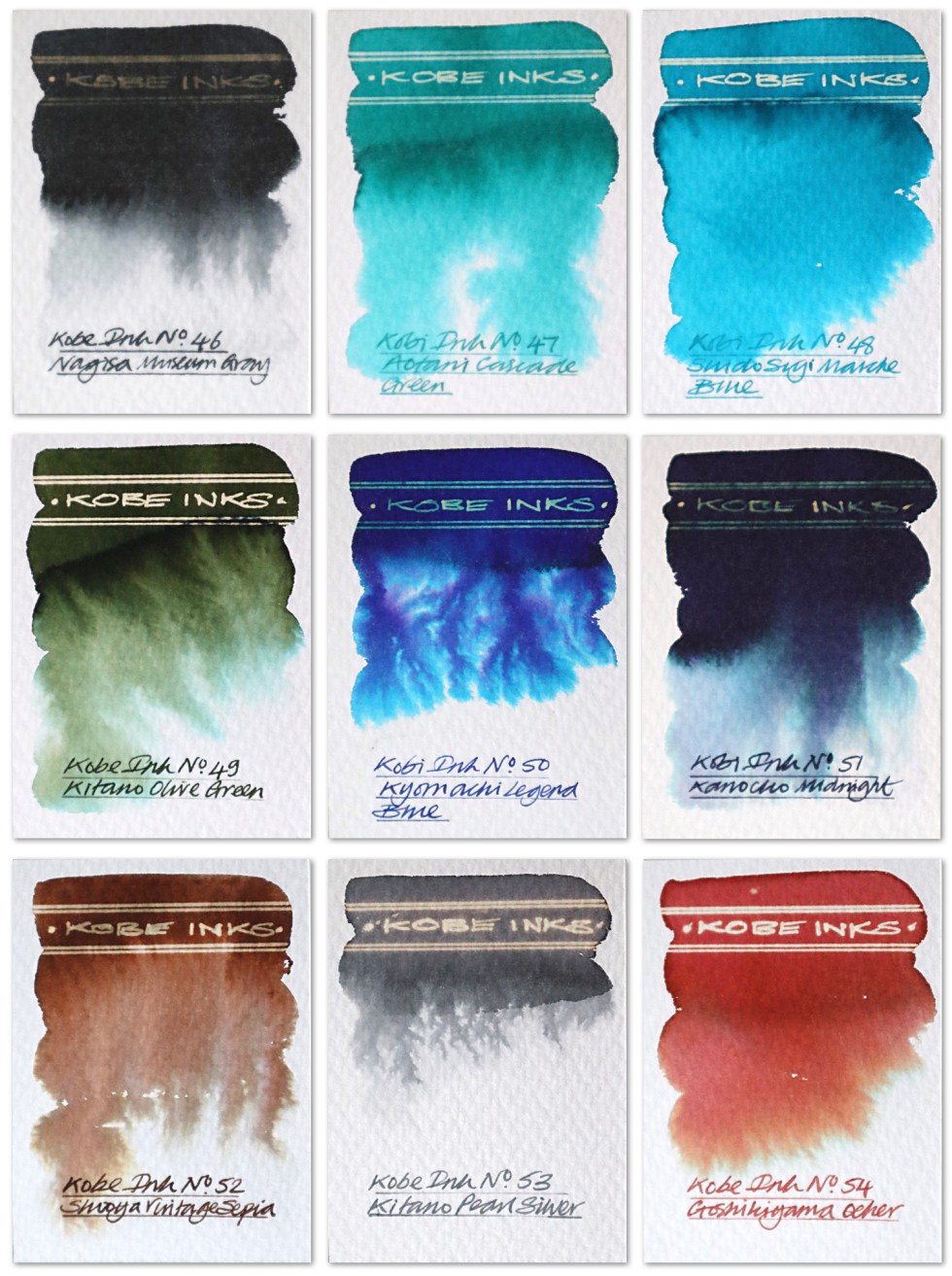
Nagisa Museum Gray – A black grey that bleeds out greys and a subtle pink when dropped onto a wetted paper surface. A feint gold reaction to bleach in the concentrated ink areas.
Aotani Cascade Green – a bright pastel green that grades out when dropped onto a wetted paper surface. A white neon gold reaction to bleach.
Suidosuji Marchais Blue – a bright turquoise that grades out when dropped onto a wetted paper surface. A white neon gold reaction to bleach.
Kitano Olive Green – A dark olive green that bleeds out greens, browns and cyan when dropped onto a wetted paper surface. A bright gold reaction to bleach.
Kyomachi Legend Blue – A purple blue that bleeds out pinky purples and plenty of cyan when dropped into a wetted paper surface. The reaction with bleach is a little dull as the ink is concentrated.
Kanocko Midnight – A deep dark dusty blue that bleeds out purples, greys and cyan when dropped onto a wetted paper surface. A very dull gold reaction to bleach.
Shioya Vintage Sepia – A dark sepia brown that bleeds out browns, greys and sandy yellow when dropped onto a wetted paper surface. A gold reaction to bleach.
Kitano Pearl Silver – A light translucent grey that grades out when dropped onto a wetted paper surface. A neon gold reaction to bleach.
Goshikiyama Ocher – A lovely dusty red brown that bleeds out chestnut brown, yellow and cyan when dropped onto a wetted paper surface. A neon white gold reaction to bleach.
There’s just something about the fountain pen inks from the far east – a sophistication and a delicacy. Looking at the handwriting examples one wouldn’t have a clue about the chromatic wonders these inks have to offer. And as this project develops I am trying my best to seamlessly integrate writing and illustration together just using this one fountain pen ink medium. The more calligraphic based alphabets of the middle and far eastern cultures do tend to integrate with illustration a little more easily than our Roman based western alphabets, but with more fluid handwriting styles, abstracted calligraphic shapes and inks like these I think there’s plenty of visually impactive opportunities ahead.
Click here if you’d like to see my first review of Kobe inks
Click here if you’d like to see my second review of Kobe inks
Click here if you’d like to see my third review of Kobe inks
Click here if you’d like to see my fourth review of Kobe inks
Many thanks to Anja at Papier und Stift for sending me the samples. All art created on Bockingford watercolour paper. Keep a look out for the next post. Fingers crossed the wait won’t be too long.
AND HEY! If you’re interested to know more about how to use fountain pen inks in more creative ways – whether it’s simply to observe their chromatic behaviours, or, to recreate one of my swatch cards, or, to learn how to use them in watercolour painting, illustration and calligraphy, why not check out my online course ?
