
Welcome to my fourth post of Kobe fountain pen ink swatch tests, made by one of the world’s most revered fountain pen ink creators… Sailor.
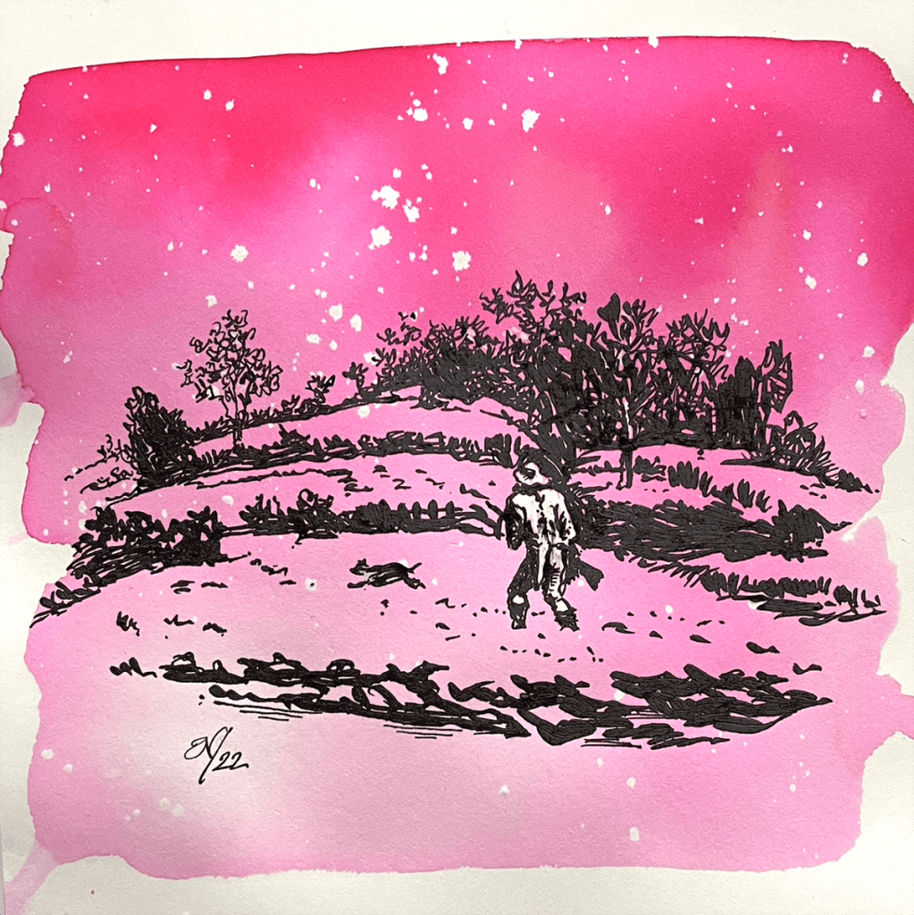
When Anja from Papier und Stift asked me if I’d like to swatch test the entire Kobe ink range, I just couldn’t believe my luck. And in spite of the courier delays due to Covid and Brexit, all eighty sample vials eventually arrived and the wait was definitely worth it. So here is the fourth of nine posts which I hope you’ll enjoy as much as I enjoyed swatch testing them. By the way, the intro image I’ve called ‘In the Land of Grey Pink’ (a homage to the Canterbury prog rock band Caravan) and for the background I used that stunning Oji Cherry (No.30):
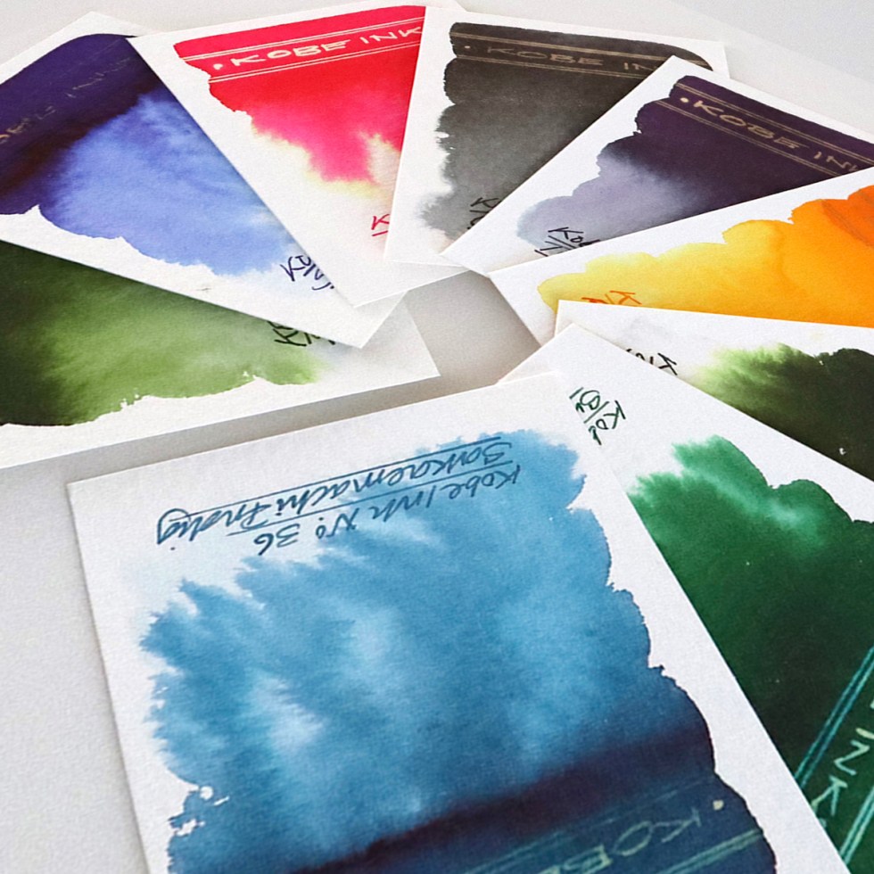
 Swatch cards
Suzuran Green – A dark green that grades out nicely when added to a wetted paper surface with subtle hints of yellow and grey. A clean gold reaction to bleach.
Suma Beach Blue – A deep purple blue that bleeds out blue and subtle pinks when dropped onto a wetted paper surface. A feint gold reaction to bleach in the concentrated ink areas.
Oji Cherry – a deep vermilion pink hue that bleeds out canary yellow and acid greens when dropped onto a wetted paper surface. A white neon gold reaction to bleach.
Coast Stone Grey – a mid warm grey that grades out grey when dropped onto a wetted paper surface. A dull gold reaction to bleach.
Tamon Purple Grey – A deep purple grey that bleeds out purples and greys when dropped onto a wetted paper surface. A dull gold reaction to bleach.
Rikyu Moon Yellow – A dirty orange yellow that grades to a cleaner brighter yellow when dropped onto a wetted paper surface. A grubby dull reaction to bleach.
Sorakuen Tea Green – A heavier version of Suzuran Green.
Sumayama Leaf Green – A green with a blue undertone that grades out olive green and cyan when dropped onto a wetted paper surface. A white gold reaction to bleach.
Sakae Machi Indigo – A lovely airforce blue that grades out different tones of blue when dropped onto a wetted paper surface. A dull reaction to bleach.
There’s just something about the fountain pen inks from the far east – a sophistication and a delicacy. Looking at the handwriting examples one wouldn’t have a clue about the chromatic wonders these inks have to offer. And as this project develops I am trying my best to seamlessly integrate writing and illustration together just using this one fountain pen ink medium. The more calligraphic based alphabets of the middle and far eastern cultures do tend to integrate with illustration a little more easily than our Roman based western alphabets, but with more fluid handwriting styles, abstracted calligraphic shapes and inks like these I think there’s plenty of visually impactive opportunities ahead.
Click here if you’d like to see my first review of Kobe inks
Click here if you’d like to see my second review of Kobe inks
Click here if you’d like to see my third review of Kobe inks
Many thanks to Anja at Papier und Stift for sending me the samples. All art created on Bockingford watercolour paper. Keep a look out for the next post – Kobe inks 28-35.
AND HEY! If you’re interested to know more about how to use fountain pen inks in more creative ways – whether it’s simply to observe their chromatic behaviours, or, to recreate one of my swatch cards, or, to learn how to use them in watercolour painting, illustration and calligraphy, why not check out my online course ?
