
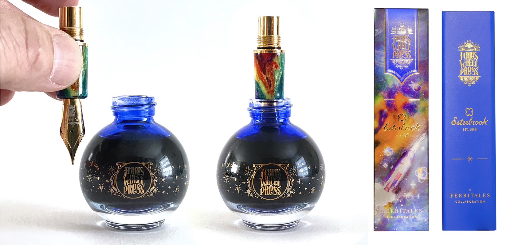
I have managed to get hold of one – the limited edition Nebulous Plume. This is a fountain pen and ink gift set imagined by Ferris Wheel Press in collaboration with Esterbrook and is part of their FERRITALES collection.
For those not familiar with these two brands, Ferris Wheel Press (FWP) are a design and stationery company based in Ontario, Canada, and have been making fine stationery for over ten years. They are easily recognised in the stationery sector for their beautifully packaged fountain pen inks. Esterbrook are one of the great names in American pen history and are known for the iconic Estie of which I have a couple and my black Estie with gold trim is my EDC (every day carry).
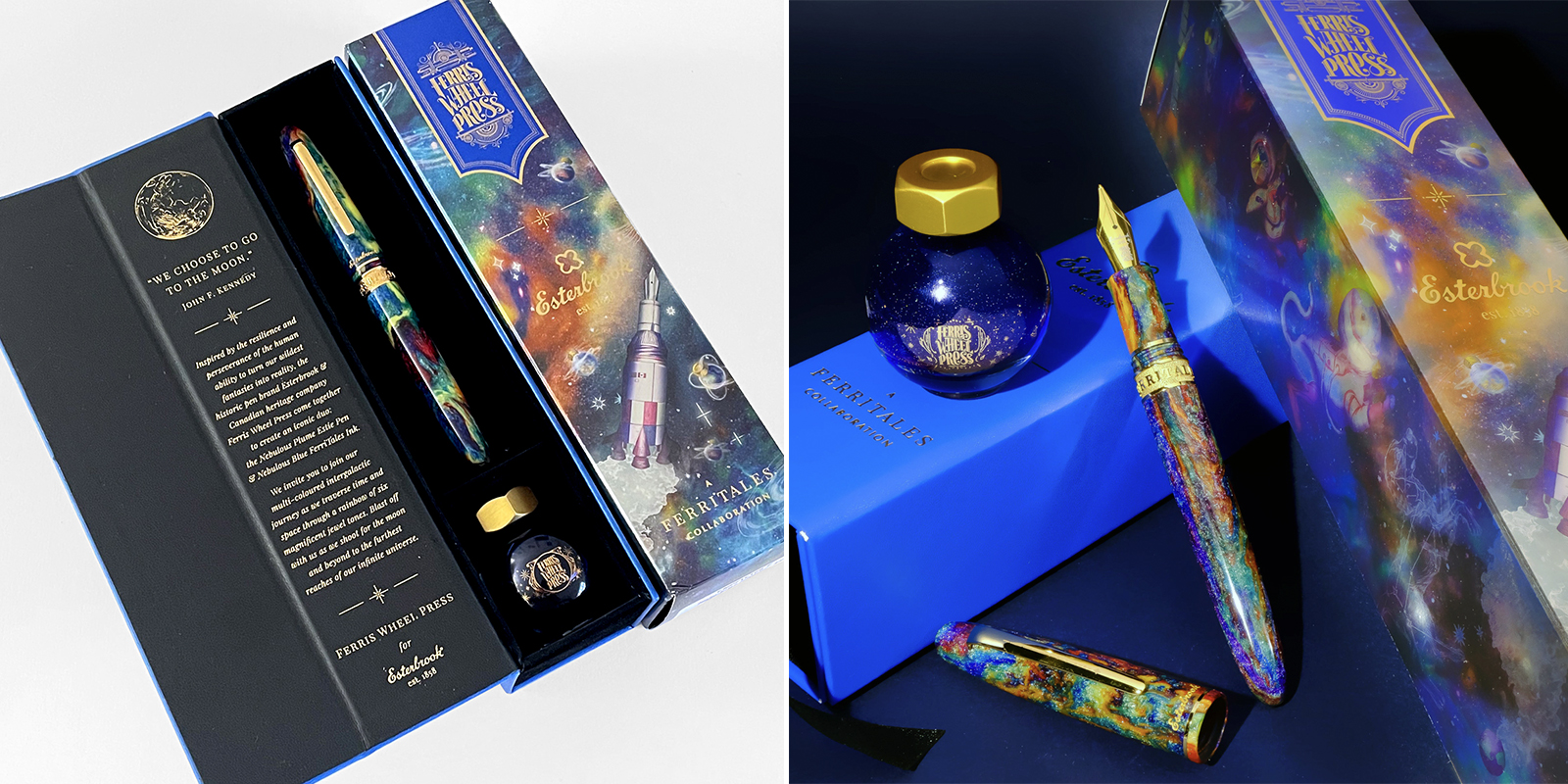
At first sight, the Nebulous Plume package looks impressive. The packaging, as one would expect, is to a very high standard with the outer card box beautifully illustrated, designed and printed with a gloss laminate and gold foil graphics and type. The inner gift box is a blue leatherette outer with gold foil graphics and type and the inner is black card with gold foil graphics and type with the gift compartment lined with black velvet.
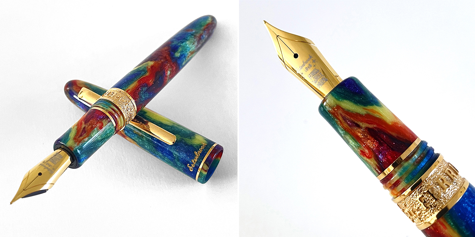
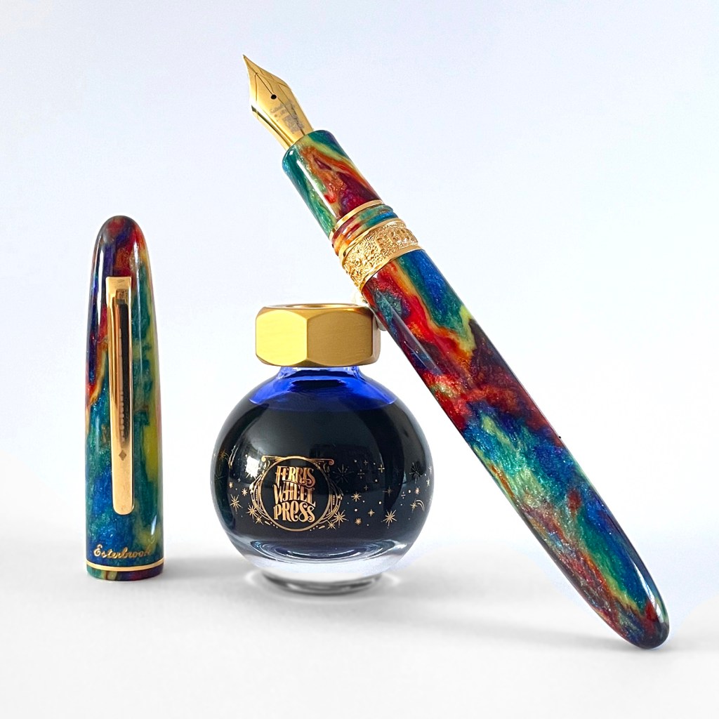
The individually hand turned Esterbrook Nebulous Plume pen is made from six custom acrylic colours incorporated with fragments of diamonds in the resin mix to give each pen an intense and luxurious sparkle. And each pen is unique. I have photographed my pen but also used the FWP group shot on the dark background to highlight this pen individuality.
The gorgeous rainbow coloured pen features a cushion cap design giving an airtight seal to prevent the nib drying out, as well as a pleasing experience when capping and uncapping the pen. The gold nib is tastefully etched with both brand logos and available in various nib widths. The pen is very comfortable in the hand and the nib is a joy to write with. I have a fine nib in this pen.
A unique embellished gold ring with FERRITALES etched into it has been added to the finishing touches and the overall gold trim finishes amplify the sparkles within the acrylic. This pen is undeniably beautifully finished and fits perfectly with the Nebulous Plume concept. The pen comes with a standard converter.
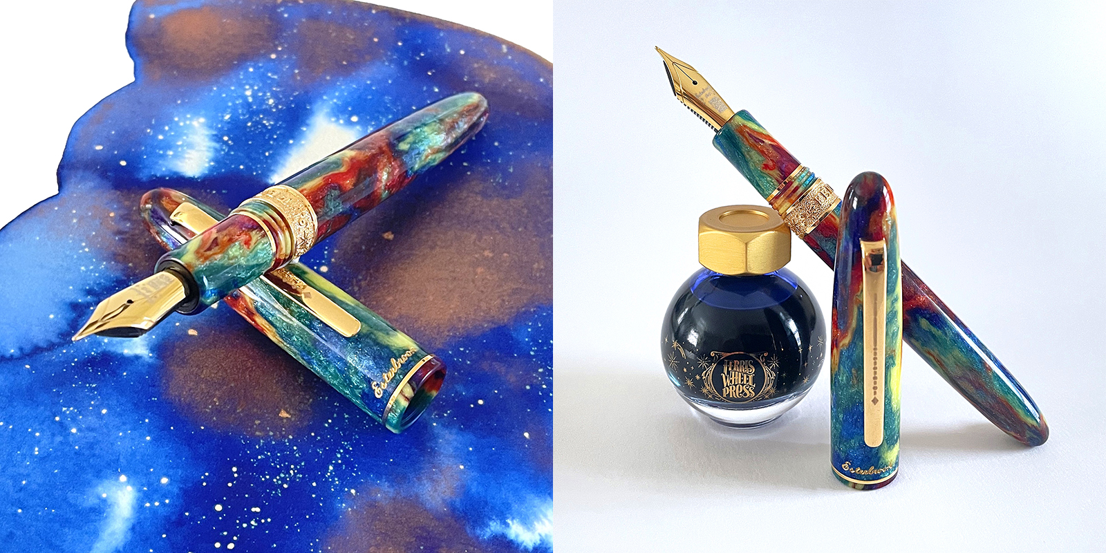
So, turning our attention to the ink bottle – and this is where, in my opinion, things get interesting. The 20ml bottle is one of the FWP standard vessels. Spherical in design it looks fabulous with the gold branding but has a fundamental flaw. The neck is too narrow for a fountain pen to access! This isn’t an issue for an ink geek who has syringes to hand to get around this, but for anyone else, especially someone who has just received this as a gift, this could be frustrating. How are they going to get the ink into the pen?
And what about that blue leatherette finish on the gift box? The colour and faux texture is just not satisfying my expectations nor the magnitude of this concept and partner collaboration and I think that FWP have the skills and imagination to do better.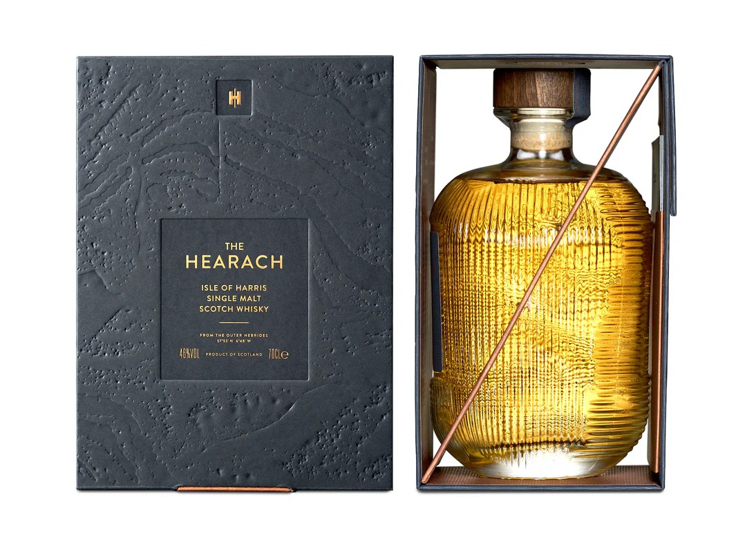
Packaging by Stranger & Stranger
Think space, the final frontier, blackness, stars, planets, galaxies, nebulae, infinity etc. The one colour I don’t think of is cobalt blue. Don’t you think that the outer box could have been enhanced maybe using a black card featuring wonderful blind embossed graphics with gold foil graphics and text? See the left image above to help you visualise what I am. It’s more sophisticated and it’s got a wow factor!

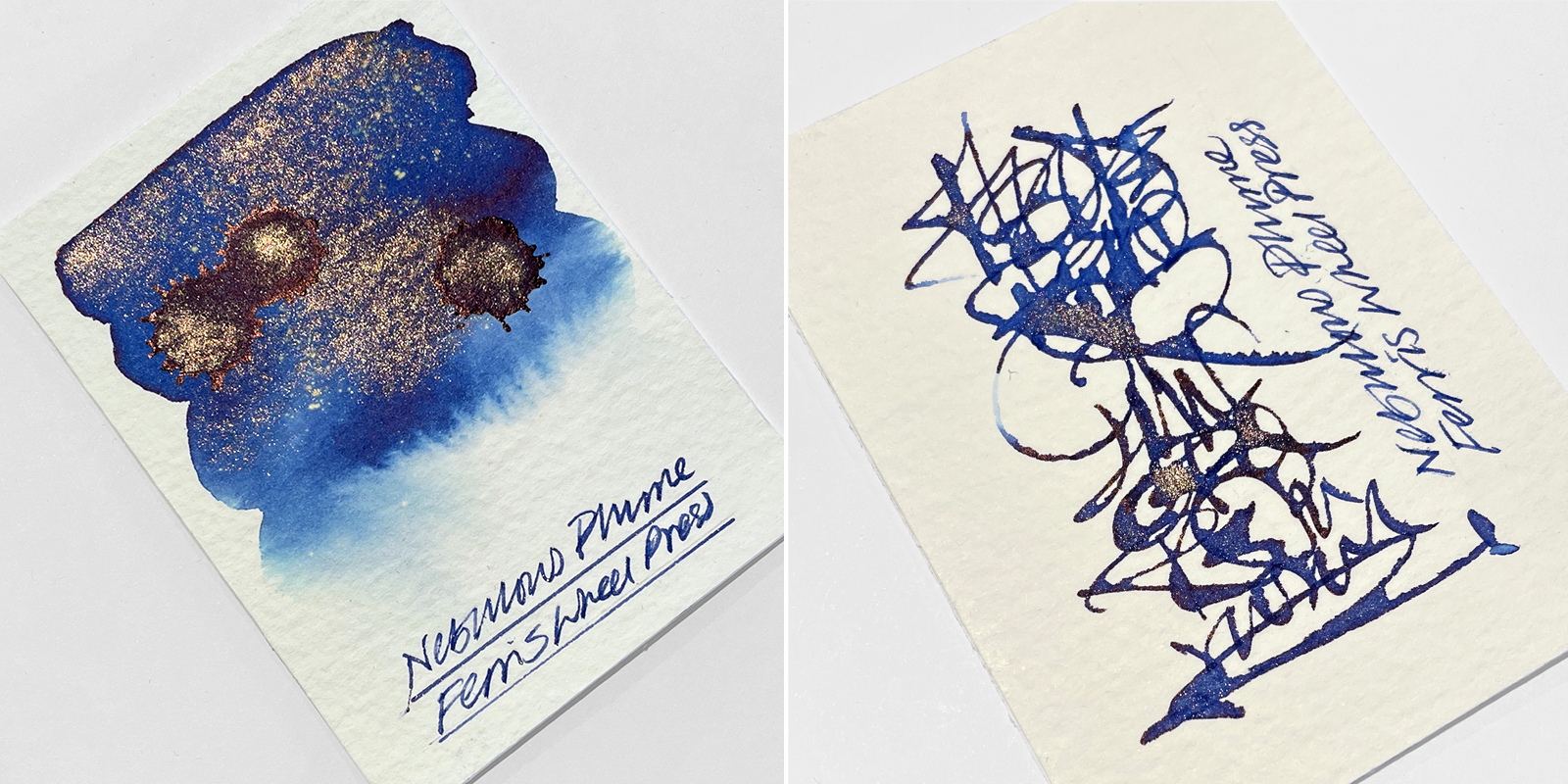
And finally – what about the ink colour chosen? Again, think space, the final frontier, blackness, stars, planets, galaxies, nebulae, infinity etc. Cobalt blue with a rose gold shimmer and a hint of sheen (when used on Tomoe River paper) is lovely and yes, you can spot this in the acrylic, but in this context with this fabulous concept? I can see why FWP have gone down this route but I also think FWP can do better. A nebulous plume is a sight to behold, a stunning ethereal visual colour delight and an excuse to really showcase fountain pen ink technology. Chromo action with sheen and a dual shimmer has got to be the bare minimum here? Recent FWP releases including the fabulously sophisticated Poison Envy and Song of Scarlet (also visible in the acrylic) would have been perfect for this don’t you think?
So, to conclude, this is a brilliant concept and brand collaborations are an exciting way forward, and it will be wonderful to see more. Even with my whingeing’s, I think this project is a great success. Esterbrook have delivered a beautiful and unique Estie, but the perfectionist inside me feels that FWP could raise their game for future collaborations.
At circa £380.00 this is a good value purchase and if you can get hold of it, I do advise investing in an ink syringe if you don’t have one. In the UK, you should be able to get the Esterbrook x Ferris Wheel Press FerriTales Collection Nebulous Plume from Cult Pens who have started stocking Ferris Wheel Press as a brand (click the link). Or if outside the UK you could go the Ferris Wheel Press website and use NICK as your discount code – they may or may not give you discount on this as it says ‘sold out’. I’m not sure – worth a try though.
DISCLOSURE: Please be aware that I will earn a commission should you click the link(s) above to make a purchase.
And HEY! If you’re interested to know more about how to use fountain pen inks in more creative ways – whether it’s simply to observe their chromatic behaviours, or, to recreate one of my swatch cards, or, to learn how to use them in watercolour painting, illustration and calligraphy, why not check out my online course or, even better, sign up for a workshop?
