
Another Diamine Reddit ink creation project is happening and what’s not to like? Two previous projects saw the Reddit community vote for and name what have turned out to be 2 international best sellers – Earl Grey and Aurora Borealis. So, Phil Davies (Diamine) and Yun Xu (Reddit) have asked me to test and review the nine selected ink samples that the Reddit Fountainpens community asked for, so that you can check them out and cast your votes. At this stage, the ink has NO official name – you vote for that later.

The nine ink samples are very close in colour. As you are aware, inks can appear differently depending upon the type of paper used. So what I’ve done is to test them on four paper types: Tomoe River, Rhodia Dot Pad, Seawhite Cartridge and Bockingford watercolour using them as pure inks and also chromo testing them to reveal those very subtle colour variations.
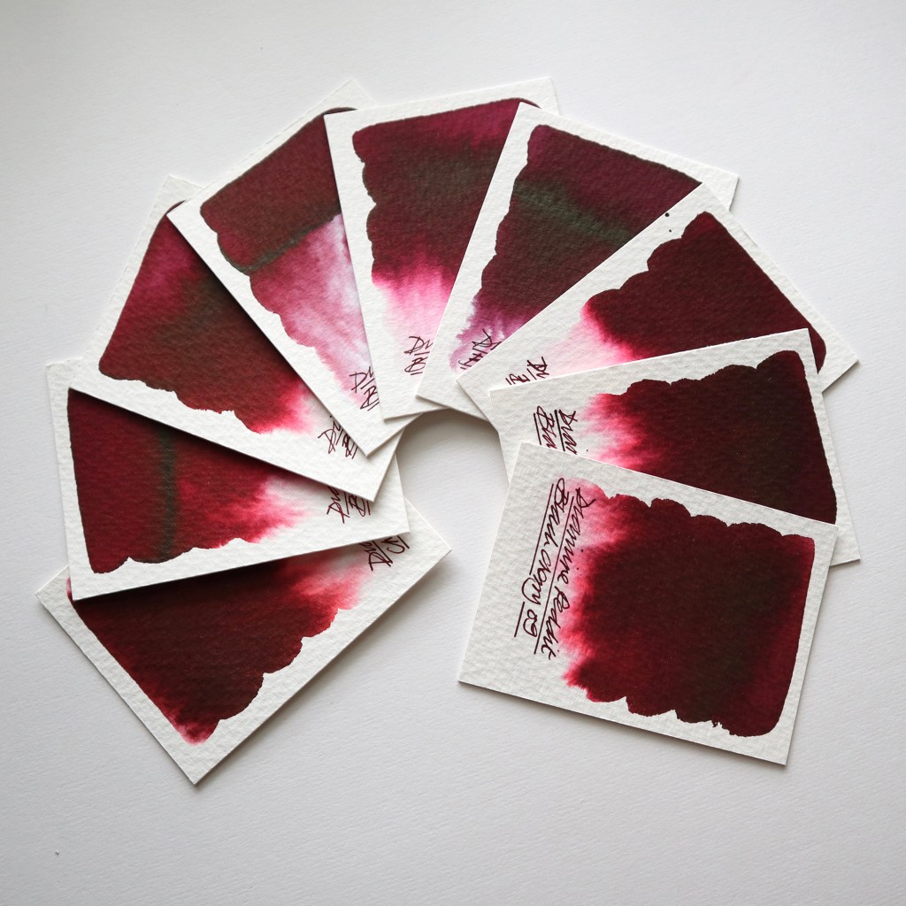
As instructed by Yun, I have grouped the ink sample tests together into three groups of three by colour hue and at this stage of the process you can vote for one sample ink from each group. Group 01 is three dark reds with a faint yellow hue to them.
Sample 01 – when used on Tomoe River and Rhodia papers, the ink appears very dark red with negligible shading qualities. When swatch tested on cartridge paper the colour is flat and could almost be mistaken for Oxblood. It’s not until it’s chromo tested on Bockingford that we can see the dark red bleed out a dusty vermilion.
Sample 02 – when used on Tomoe River and Rhodia papers, the ink reveals shading qualities. When swatch tested on cartridge the colour is flat and slightly lighter that sample 01. It’s not until its chromo tested on Bockingford that we see that dark red bleed out bright vermilion red which is cleaner and brighter that sample 01.
Sample 03 – when used on Tomoe River and Rhodia papers, the ink reveals shading qualities, although not as pronounced as sample 02. When swatch tested on cartridge the colour is flat and slightly lighter that sample 01 but darker than sample 02. It’s not until its chromo tested on Bockingford that we see the dark red bleed out more rubine red which is less yellow and more pink than the other 2 samples.
Please click click here and vote for one sample ink from this group. Group 02 is three darker reds with a faint blue/purple hue to them.
Sample 04 – when used on Tomoe River and Rhodia papers, the ink appears very dark red with negligible shading qualities. When swatch tested on cartridge the colour is flat and in my opinion more cherry coloured. It’s not until it’s chromo tested On Bockingford that we can see that dark red bleeding out deep crimsons.
Sample 05 – when used on Tomoe River and Rhodia papers, the ink reveals very subtle shading qualities. When swatch tested on cartridge the colour lays flat and is a darker cherry colour than 04. It’s not until its chromo tested on Bockingford that we can see that dark red bleeding out deep rich pinky crimsons.
Sample 06 – when used on Tomoe River and Rhodia papers, the ink shows negligible shading qualities. When swatch tested on cartridge the colour is flat but to my mind has a real black cherry feel to it. But it’s not until its chromo tested on Bockingford that the colour really pops like a luxury black cherry gateaux.
Please click here and vote for one sample ink from this group. Group 03 is three dark reds which have a crimson hue to them
Sample 07 – when used on Tomoe River and Rhodia papers, the ink appears very dark red with shading qualities. When swatch tested on cartridge paper the colour is a flat dark cherry. It’s not until it’s chromo tested on Bockingford that we can see the dark red bleed out beautiful bright vermilion and fuchsia reds.
Sample 08 – very similar to sample 07 with a hint more yellow and less obvious shading.
Sample 09 – Very similar to sample 08 but not as clean when chromo tested.
Please click here and vote for one sample ink from this group.
Shown above is a sample of Diamine Oxblood – just in case you thought that there might be a similarity – and a test template showing which papers were used where. All of the images were taken in natural daylight using a Canon EOS M50. Colour balancing was achieved using Mac Photo and Photoshop software and the screen monitor I use is an Apple LED Cinema Display. I fully appreciate that there are colour variations from screen to screen but I want to assure you that the images I am showing are as true to the originals as I can get with my equipment.
So there we have it. Nine exclusive and unique Diamine colours to choose from and an opportunity for you to vote for one ink sample from each of the three groups to help create another international best seller!
And HEY! If you’re interested to know more about how to use fountain pen inks in more creative ways – whether it’s simply to observe their chromatic behaviours, or, to recreate one of my swatch cards, or, to learn how to use them in watercolour painting, illustration and calligraphy, why not check out my online course? It’s a great way to pass the time while self isolating!
