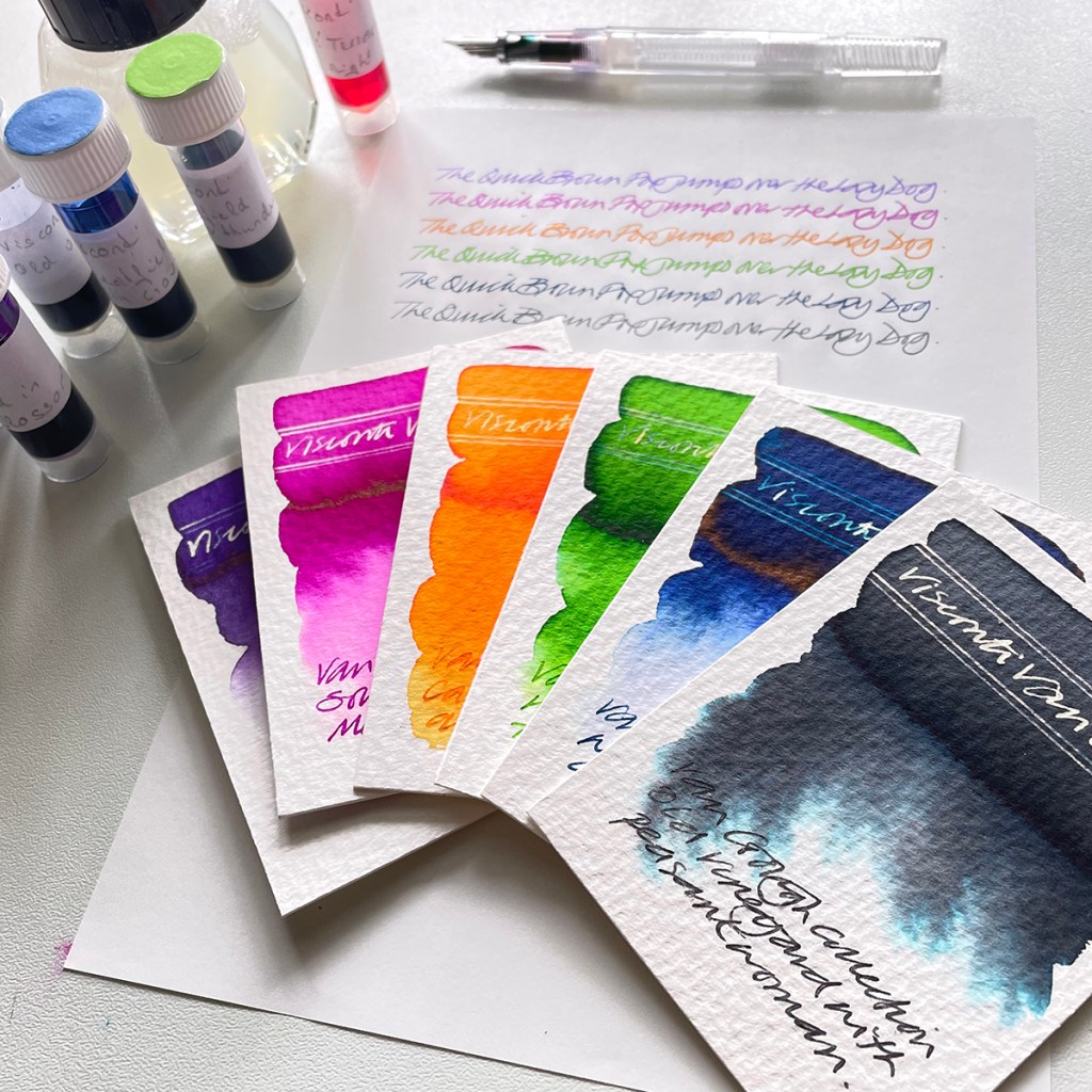
The relatively recent range of Visconti Van Gogh inks allegedly pay homage to the Dutch artist’s great passion for colour and are inspired by some of his more well known paintings.
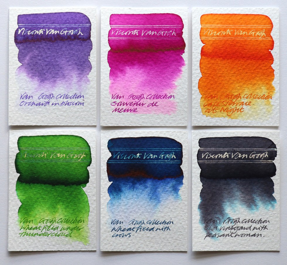
Each ink colour is named after a painting (from top left): Orchard in blossom (purple); Souvenir de mauve (pink); Cafè terrace at night (orange); Wheatfield under thunderclouds (green); Wheatfield with crows (blue); Old vineyard with peasant woman (grey)
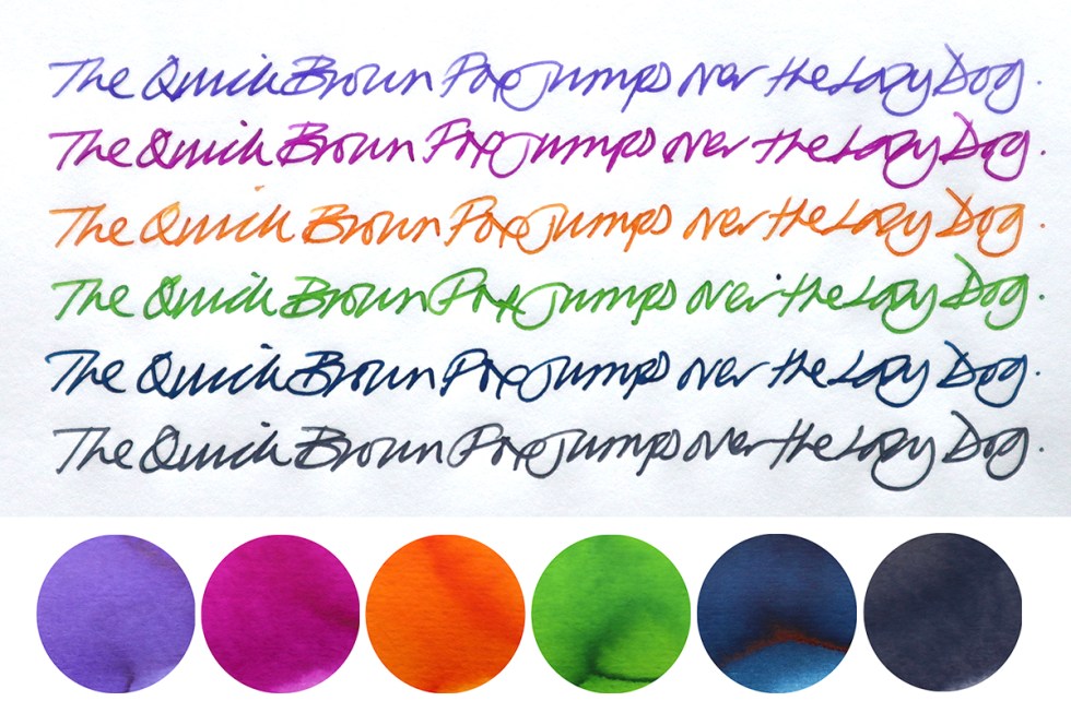
All of the colours are bright and vivid with a decent reaction to bleach and the blue even has a slight sheen to it but if I had to pick out one that interests me, the grey is the one with the attitude. It’s quite a deep grey and has a lovely chromo effect bleeding out lighter greys and turquoise when swatched with water on watercolour paper.
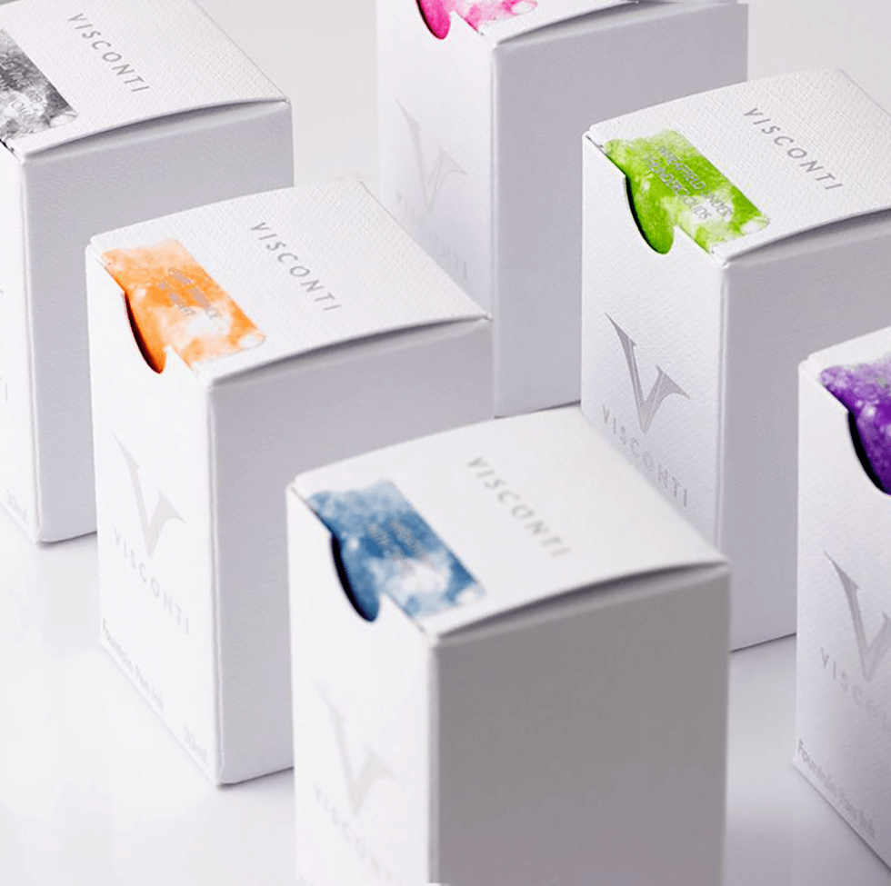
These inks directly correspond to pens of the same name and come as part of six very elaborately packaged fountain pen sets. They are also available as an ink boxed set of six or as separates. But, this supposed homage to Vincent Van Gogh is troubling me. He was a genius and his work is both distinctive and delightful. To associate a product with an artist of his stature does imply that the product has to be exceptional. My question is – do these colours honestly reflect Van Gogh’s very definite colour palette used in the original artworks and are they truly worthy of an association with such a talent? As a comparison, Taccia recently released their artist homage inks. Click here and here to have a look at how they went about it and then see if you feel the same way I do? A little more time and effort needed in colour matching the inks to the original artworks?
To conclude, I’d say these inks aren’t unique (but they could have been) and aren’t disimilar to Caran d’Ache and de Atramentis in terms of colour and price. They come in 30ml bottles and a flashy box and if you like bright colours – here you go.
All tests on Bockingford Rough 200lb watercolour paper, Seawhite cartridge paper and Tomoe River paper with handwriting using a Noodler’s Creeper pen.
Many thanks to Anja at Papier und Stift for sending me the samples.
AND HEY! If you’re interested to know more about how to use fountain pen inks in more creative ways – whether it’s simply to observe their chromatic behaviours, or, to recreate one of my swatch cards, or, to learn how to use them in watercolour painting, illustration and calligraphy, why not check out my online course ?
