
This is final part of my swatch test investigation into the rustic world of L’Artisan Pastellier Callifolio. Many thanks to Jon Rabbet, who runs Pen Sharing, for organising a group buy of these.
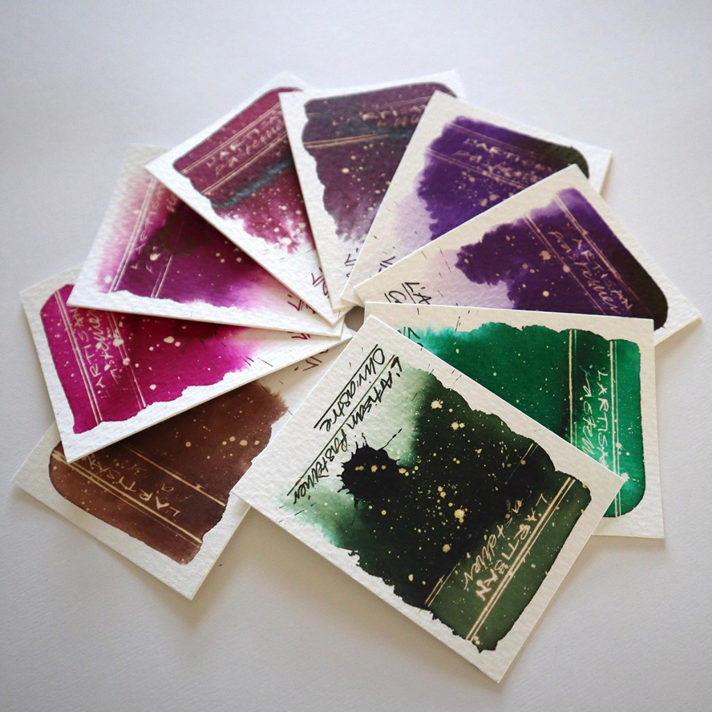
 GROUP FAN with pinks, purples and greens – the ochres feature in the previous post
 The above crops were photographed in strong sunlight at an angle
The Callifolio range currently consists of 36 rustic fountain pen ink colours and this post takes a look at the next nine colours which are the Blues. Click here for my first post featuring the Greys and Blue Greys, click here for my second post featuring the Blues and click here for my third post featuring the Ochres.
I have photographed all the swatches in two ways. Firstly, head on in the studio and secondly at a slight angle in bright sunshine. The studio shots are true to the actual swatch cards when viewed inside. The more vivid and dramatic crops are the latter, and reveal very subtle and beautiful sheen accents where the ink is more concentrated.

sepia, andrinople, bordeaux

grenat, borgogne, violet

cassis, teodora, olivastre

The above crops were photographed in strong sunlight at an angle.
As handwriting inks, these are faultless. I used a Serendipity dip pen with a Noodlers flex nib – the flow was easy and the colours dried quick and even.
In spite of very limited chromatic action the colours are rich and vivid. As you’ll see from the pics, in ordinary light the colours are slightly flat in appearance (watercolours) but in strong sunlight they really pop! Particularly the pinky reds.
All of the inks here react easily with bleach with a range of neon, white and gold effects. Although these are not sheening inks you can detect a feint gloss at the edges of the more concentrated marks made. Please ref the square block of nine above.
So, want to say about this range? I think rustic is a very apt word to use to describe these and as I’ve said this throughout, they all appear to have a painterly quality to them. Give me more time and I’ll try them out for this purpose.
Tests conducted on Bockingford 140lb rough using a Noodler’s Creeper fountain pen and a Serendipity dip pen with a Noodler’s flex nib.
Many thanks to Jon Rabbet for Sourcing these. If you are interested in fountain pens and like the idea of trying a pen before you buy, check out Jon’s very successful pen rental website PenSharing.com.
AND HEY! If you’re interested to know more about how to use fountain pen inks in more creative ways – whether it’s simply to observe their chromatic behaviours, or, to recreate one of my swatch cards, or, to learn how to use them in watercolour painting, illustration and calligraphy, why not check out my online course ?
