
This is part two of my swatch test investigation into the rustic world of L’Artisan Pastellier Callifolio. Many thanks to Jon Rabbet, who runs Pen Sharing, for organising a group buy of these.
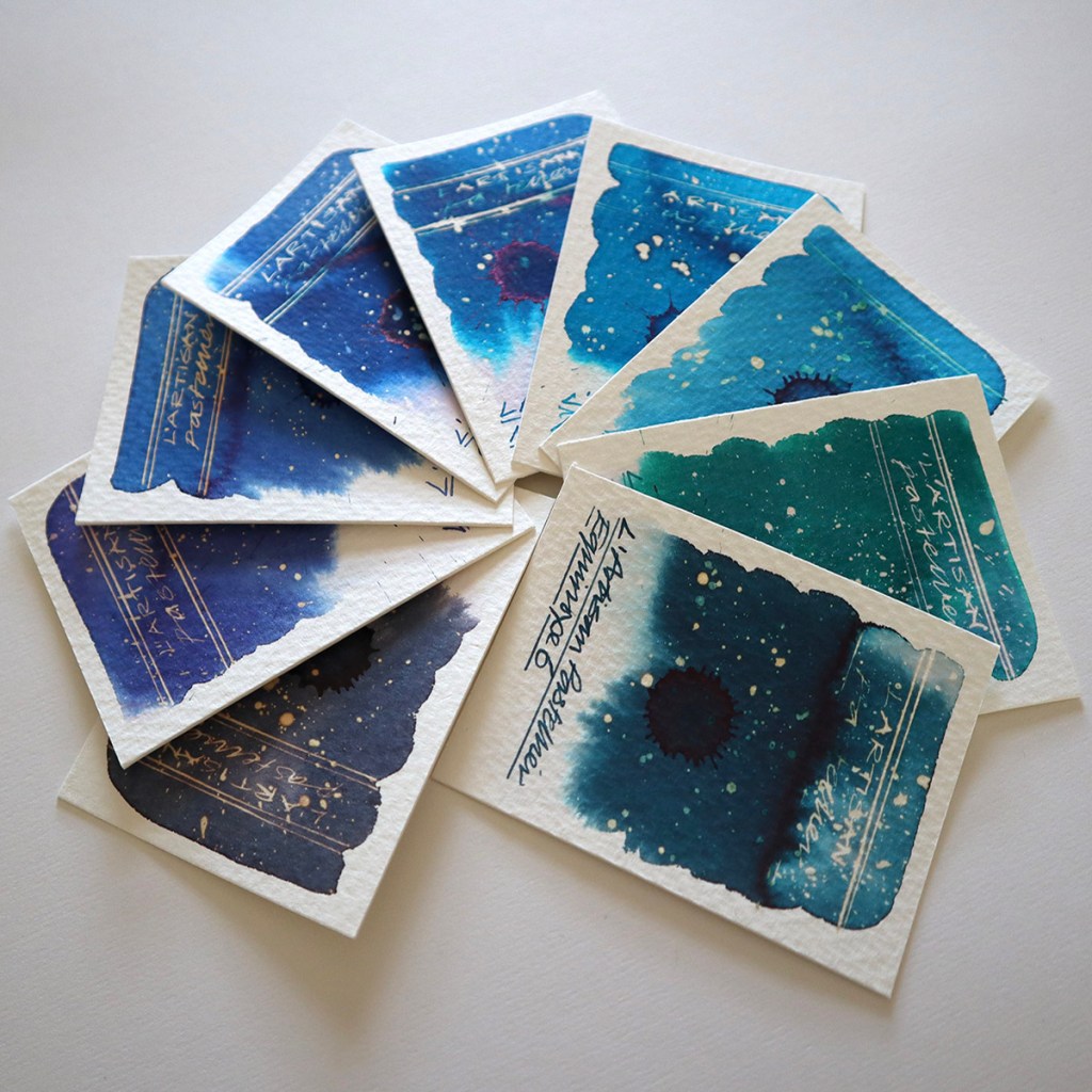
 GROUP FAN with the blues – the greys and blue greys feature in the previous post
 The above crops were photographed in strong sunlight at an angle.
The Callifolio range currently consists of 36 rustic fountain pen ink colours and this post takes a look at the next nine colours which are the Blues. Click here if you’d like to check out my first post featuring the Greys and Blue Greys.
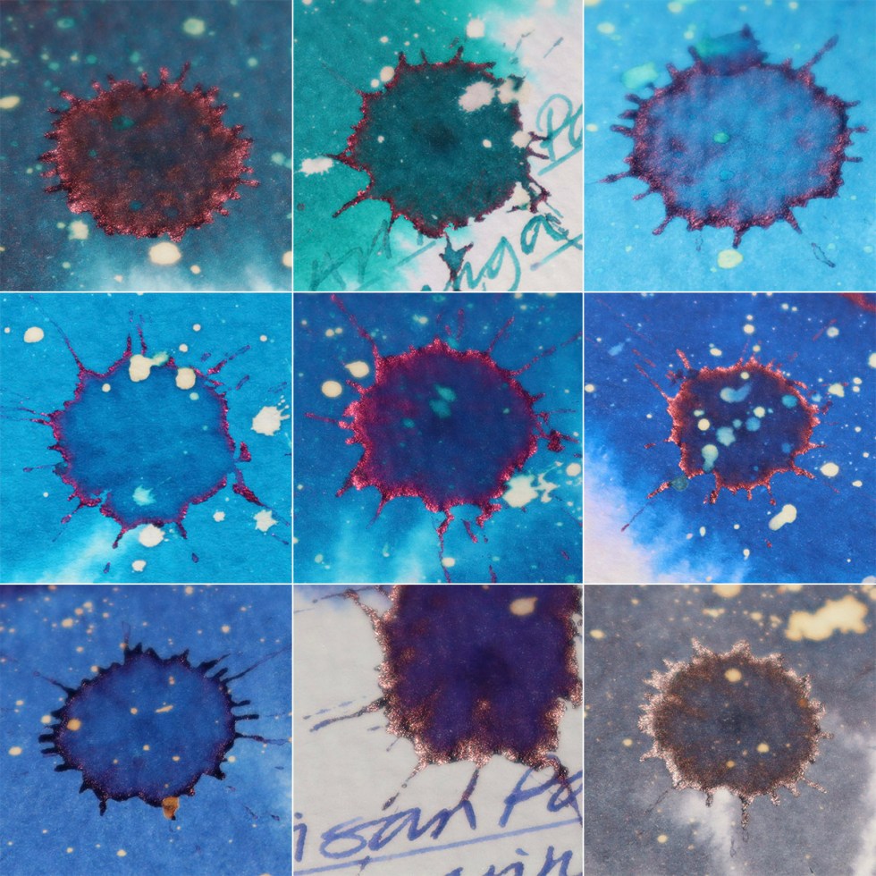
I have photographed all the swatches in two ways. Firstly, head on in the studio and secondly at a slight angle in bright sunshine. The studio shots are true to the actual swatch cards when viewed inside. The more vivid and dramatic crops are the latter, and reveal very subtle and beautiful sheen accents where the ink is more concentrated.
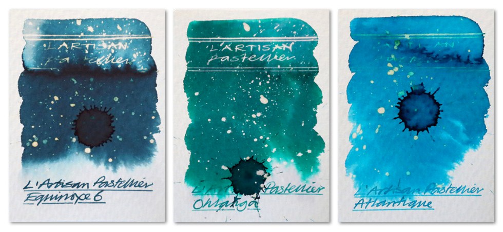
equinoxe 6, ohlanga, atlantique
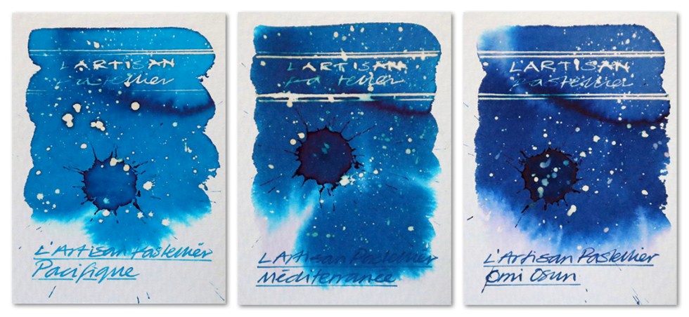
pacifique, mediteranee, omi osun
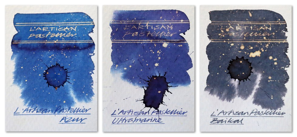
azur, ultrmarine, baikal
The above crops were photographed in strong sunlight at an angle.
As handwriting inks, these are faultless. I used a Serendipity dip pen with a Noodlers flex nib – the flow was easy and the colours dried quick and even.
What is noticeable with all of these these inks during the swatching process, is the very subtle chromatography. It’s there, for sure, but not as visually dramatic as in some brands.
These inks are more vivid than the Greys and Grey Blues. Sadly my cameras couldn’t quite catch the vibrancy of Pacifique which has a real Robert Oster visual intensity to it – sorry about that. But all the other swatch cards are true to the originals.
Apart from Atlantique, all of the inks here react well with bleach with a range of neon, white and gold effects. Although these are not sheening inks you can detect a red sheen at the edges of the more concentrated marks made – which is common with many blue and green fountain pen inks. Please ref the square block of nine above.
Of interest, L’Artisan Pastellier came about when an experienced chemical engineer decided to follow his passion for the more traditional methods of making inks, pigments and pastels, using natural ingredients. The company is based in Albi, in the South of France, an area with a very long history of making dyes, especially blue dye and pigment from woad plants, which brought the region great prosperity in medieval times. The inks certainly have a rustic look and quality to them.
There are two more posts to follow. Tests conducted on Bockingford 140lb rough using a Noodler’s Creeper fountain pen and a Serendipity dip pen with a Noodler’s flex nib.
Many thanks to Jon Rabbet for Sourcing these. If you are interested in fountain pens and like the idea of trying a pen before you buy, check out Jon’s very successful pen rental website PenSharing.com.
AND HEY! If you’re interested to know more about how to use fountain pen inks in more creative ways – whether it’s simply to observe their chromatic behaviours, or, to recreate one of my swatch cards, or, to learn how to use them in watercolour painting, illustration and calligraphy, why not check out my online course ?
