
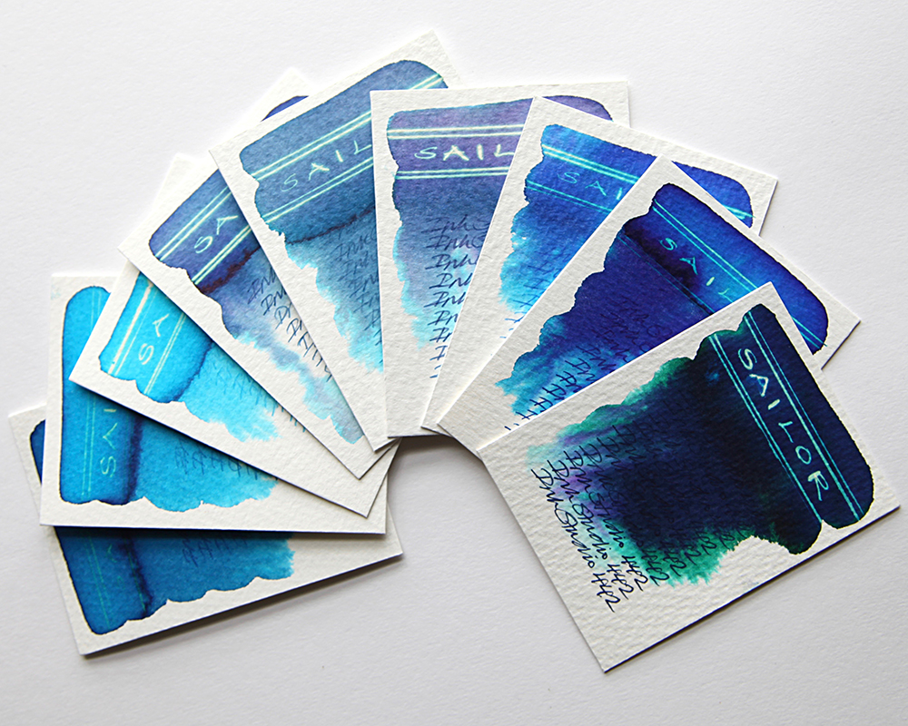
This is the fifth part of my Sailor Ink Studio swatch tests. The swatch cards shown are the third and final part of an extensive range of blues. Once again, what is instantly striking is the dramatic chromatography.

Sailor 442 – A heavy and deep dark blue with hints of purple that blends easily with water and bleeds out blue, green and purple at the edges. A very dark ink with a neon white effect when subjected to bleach in the lesser ink concentrated areas. Very close in behaviour to the 642.
Sailor 740 – Another royal blue that blends easily with water and feathers out turquoise with hints of grey at the edges. A slight sheen in evidence with a neon blue effect when subjected to bleach in the less inky areas. A variation of the 743.
Sailor 440 – A light royal blue that blends easily with water and feathers out turquoise with hints of grey at the edges. A slight sheen in evidence with a neon blue effect when subjected to bleach in the less inky areas. A lighter variation of the 740.

Sailor 540 – A dusty mid blue that blends easily with water and feathers out turquoise and feint purple with hints of grey at the edges. A sheen in evidence with a neon blue effect when subjected to bleach in the less inky areas.
Sailor 240 – A dusty grey blue that blends easily with water and feathers out turquoise with hints of grey at the edges. A sheen in evidence with a neon gold effect when subjected to bleach in the less inky areas.
Sailor 243 – A dusty purple blue that blends easily with water and feathers out turquoise with hints of grey at the edges. A sheen in evidence with a neon gold effect when subjected to bleach in the less inky areas.

Sailor 741 – A heavy flat cyan blue that blends easily with water and feathers out turquoise at the edges. A sheen in evidence with a negligible effect when subjected to bleach.
Sailor 441 – A flat cyan/turquoise blue that blends easily with water and feathers out turquoise at the edges. A sheen in evidence with a neon gold effect when subjected to bleach. A lighter variation on the 741.
Sailor 141 – An uneven turquoise blue that blends easily with water and feathers out lighter turquoise at the edges. A sheen in evidence with a dull gold effect when subjected to bleach.
All tests on Bockingford Rough 200lb watercolour paper with handwriting using a Noodler’s Creeper pen.
Many thanks to Catherine at Sakura Fountain Pen Gallery from whom I sourced the samples.
Swatch cards are now available to buy. Click for details. If you’d like to know how to create these yourself, why not check out my tutorials course? Click for details.
