
I do keep asking this question, but no one can give me a definitive answer. So, continuing with the ‘Countdown’ idea for my Inktober 2017, here 23 more examples of fountain pen ink illustration. If you haven’t seen or read about the previous eight, please click here
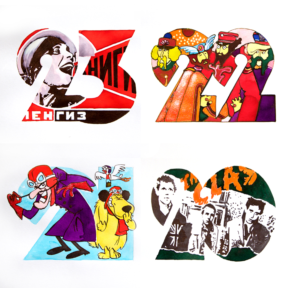
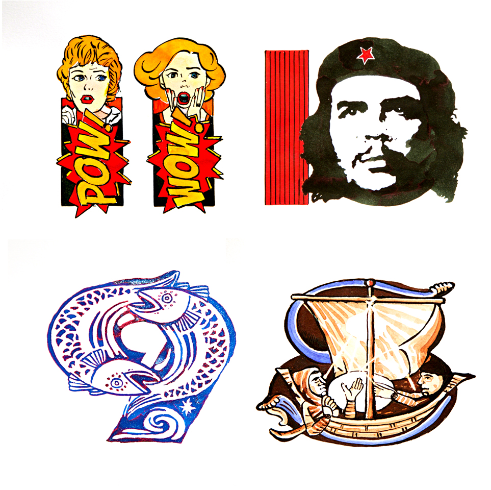
23. Constructivism – Created with my own four colour CMYK kit, which I’m hoping to get produced for sale in the New Year, this was a homage to the Constructivist exhibition in London which showed at the Tate gallery towards the end of 1981. It was a strange time – I was just about to start my degree course in Brighton when quite suddenly, everything went linear and angular. Type became sans serif and condensed, red became the ‘in’ colour and the mood turned serious. The influence of this exhibition was everywhere and graphic design changed forever.
22. Fab Four in Pepperland – As mentioned previously, Yellow Submarine is recurring them for me. The psychedelic colours and flowing shapes are just so appealing. Using Diamines for colouring and Robert Oster Marone Mustard for the linework, I added my own little twist, with bleach detailing and John Lennon’s shimmer ink trousers.
21. Dastardly and Muttely – The two most loveable scoundrels ever created. Whenever they appear on TV everything just stops to watch them. Created with various Diamine inks and bleach. Diamine Quartz Black is excellent for linework
20. Clash – Many people claim it was the Sex Pistols, but for me, it was the Clash who heralded the dawning of a new age. The combination of that sleeve with that sound was jaw dropping. Sleeve designed by Rosław Szabo with photos by Kate Simon. Created with Diamine Orange, Green Umber and Quartz Black. It still stands out nearly 40 years later.
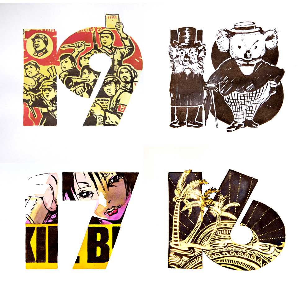
19. Children of the Revolution – This is a follow on from the Constructivism artwork and a reflection of the retro soviet / revolution styling at that time. The very early 1980’s were a tough time here in UK and we weren’t just going to sit down and take the prescribed establishment medicine. Demonstrations, group marches and mass rallies were a big part of student life. Ken Livingstone (leader of the GLC), Rock Against Racism, CND and Greenham were just a handful of some very big issues at the time! Created with Diamine Scarlet, Sunshine Yellow and Quartz Black.
18. Bunyip Bluegum – Created with Robert Oster Graphite, these characters come from a children’s book I’ve had since a toddler ‘The Magic Pudding’. Written by Australian Norman Lindsay (1879-1969) an Uncle of mine gave it to me and as far as I’m aware I was the only one who had a copy or had even heard of the characters. I thought the 2 characters fitted the numerals rather well? A great story and beautifully illustrated – give it a go!
17. O-Ren Ishii – Created with my own four colour CMYK kit, Quentin Tarantino is a fave of mine. Yeah! I know, but so what, I enjoy his films immensely. Kill Bill was superb and the animated sequence just sublime! I was pleased with the end result too. The colours mixed perfectly!
16. Beach Mandala – Based on the Zentangle style this was a quick and easy Quink and Bleach job.
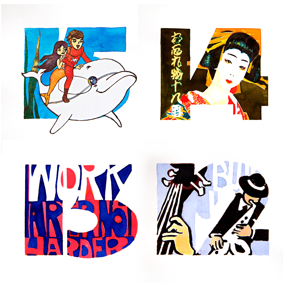
15. Marine Boy – Of all the super heroes, Marine Boy was the first that I connected with. He was the James Kirk of the oceans, passionate, fair and just. A marine eco warrior through and through, he was very cool. With a dolphin he could converse with, a great looking mermaid for a girlfriend and an addiction to oxygum, admit it…we all wanted to be him. Created with my Cyan for the background with Diamine Shimmerinks for the detailing.
14. Geisha – I had this image for a while so rearranged it to fit the numerals. I used Robert Oster Signature inks – Ruby, Yellow Sunrise, Amber and Graphite for this with Bronze for the background knowing full well that using bleach for the calligraphy would look stunning. It turned out very well.
13. Peggy’s Poster – For you Mad Men addicts, this an extract from the wonderful David Weidman lettering poster that Peggy had on her wall. Created with Diamine Hope Pink and Kensington Blue. My daughter Daisy is a doppleganger (identical!) for Elizabeth Moss.
12. Jazz – Just love these shapes. As you’ll have noticed, all the images used for my Inktober 2017 have been re-worked to fit the numeral shapes. Breakouts, negative spaces and contrasting colours all help make an image more visually powerful. This was created with Parker Blue and Robert Oster Peach, Lipstick and Blue Black.
11. Roy – A tribute to Roy Lichtenstein who is undeniably one of the biggest influences in Pop Art and mainstream marketing and communication. Powerfully encapsulating type, illustration and colour I used Robert Oster, Ruby and Graphite to do the business.
1o. Che – One of those iconic poster images. At the time, I didn’t have a clue who he was or what he did but one thing I did know – that was a bloody cool image. Created with Robert Oster Ruby and Graphite.
9. Fishes – I’m into most things to do with the sea. As a keen offshore sailor it’s par for the course to dally with the fishermen and seafaring types. Woodcuts and lino cuts have that great rustic look – apply them to any marine theme and they just work! I created the design to fit the shape and painted it up in Diamine Arctic Blue Shimmering. Worked well.
8. Ship of Fools – This could almost be autobiographical with me at the helm. It’s a great allegorical theme. Loved doing this. Based on a simple medieval style I used Parker Blue, Diamine Raw Sienna and Robert Oster Dark Chocolate. I was very pleased with how this turned out.
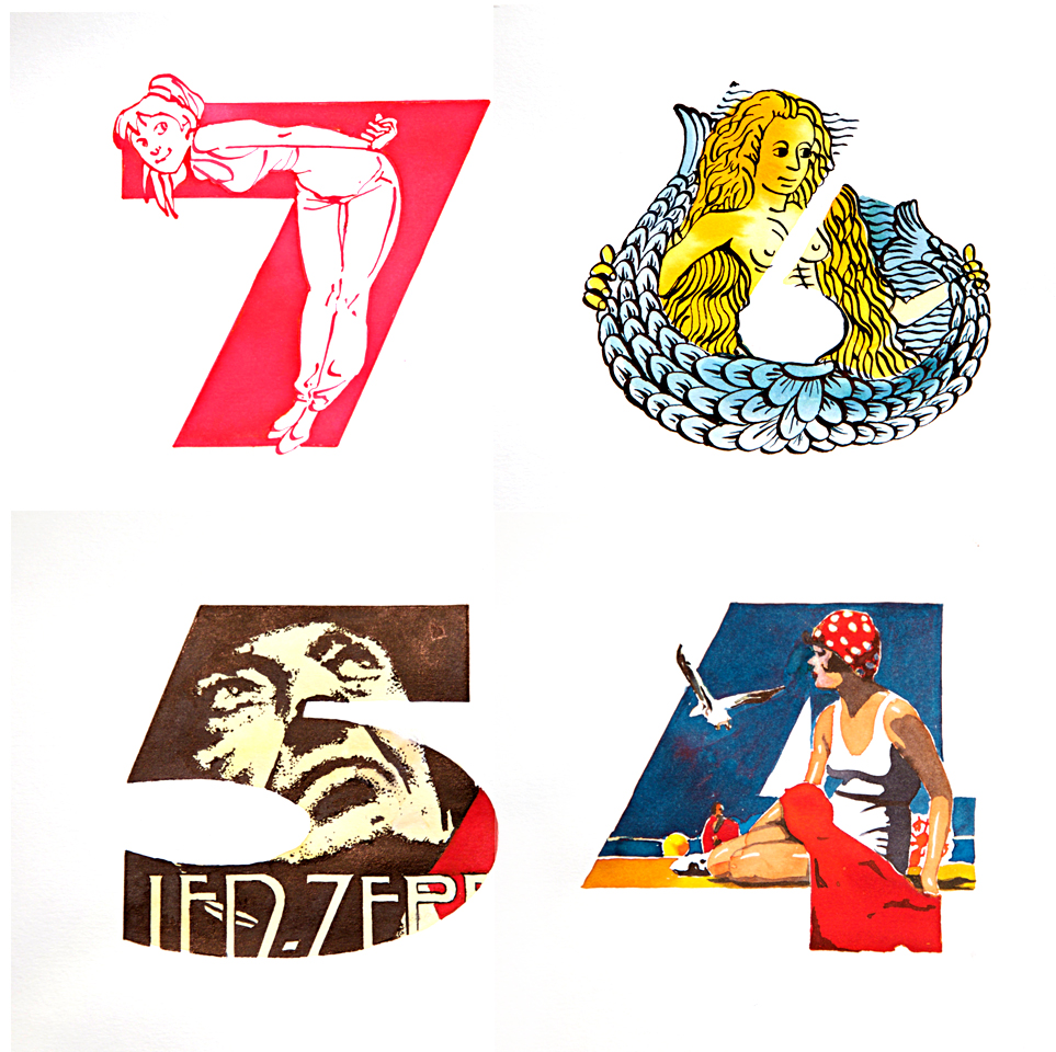
7. Seven – Short on time – I found a comic style to fit the numeral. Created with Diamine Hope Pink. Sorry.
6. Mermaid – Based on a medieval wood print, I’ve re-imagined the two tailed mermaid to fit the numeral. I used Diamine Amber and Teal for the wash backgrounds and used the Teal again with a flex nib for the linework.
5. Led Zep – I have a very wide taste in music but at one time Led Zep were THE band for me. Based around a tour poster which I’ve re-worked to fit the shape, I used my CMYK fountain pen ink colours for the final artwork. Love that brown in the black!
4. Beach Belle – Loosely based on a California tourist poster I used my own CMYK fountain pen ink colours for the art with bleach highlights. I am over the moon with the result. I wasn’t sure about achieving some of those colours. They really work well.
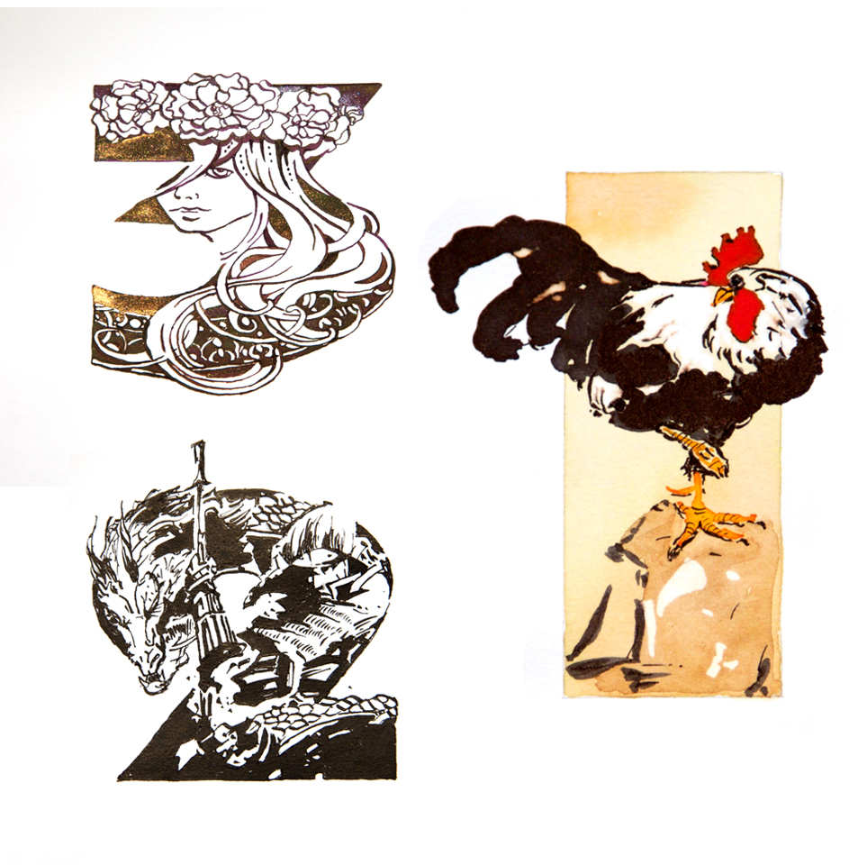
3. Three – I came up with this idea a couple of weeks ago when in Brussels. I went to the Fin-de- Siecle Museum and saw the amazing collection of Art Nouveau. Did you know that Brussels was one of the main centres for Art Nouveau? Also, an amazing place if you’re into cartoon characters especially Tintin. Created this with Herbin Caroube de Chypre and Amethyste de l’Oural.
2. Samurai – This was a last bit of fun before the final piece. A Samurai warrior about to slay a dragon of some description. I used Hero black, brush and dip pen with flex nib.
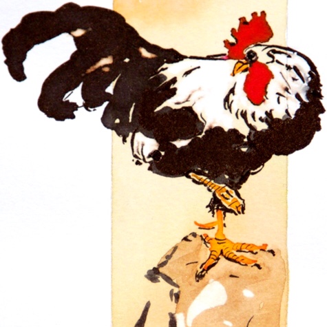
1. Rooster – At the end of the day, the best art is art that happens spontaneously. This took ten minutes from start to finish. I used my CMYK fountain pen ink colours with a brush for most of it and a little bit of pen work on the claws, head and some plumage. Used a bit of bleach at the end to whiten up the feathers and add a little ‘bird mess’ on the rocks, but it’s not just the colours that work here – it’s the economy of line. It’s probably my favourite piece of all. I think it epitomises what I want to really achieve with this project. Less is more. Keep it simple. For art journaling, I think this is the way forward and I believe that this one piece alone answers my question: Are fountain pen inks an art medium? Of course they are!
It’s been a demanding 31 days but I’ve got a lot out of it. I’ve tried to showcase a wide variety of art styles from simple to complex and am hoping that they aptly demonstrate the versatility of what’s possible with fountain pen inks and bleach.
Looking at some of the thousands of other Inktober submissions, and purely as an observation, many of them may work as a ‘one off’ but as a series of 31? From my experience, to achieve that kind of success there needs to be a degree of planning ahead:
Concept – an idea or visual thread that will link a series of 31 artworks together – a storyline, colour theme, object theme, type style or countdown theme, as I have done. For good examples check out: @inaki.dma and @ivory_ocean. As soon as an audience identifies that thread of visual continuity, they’ll be ‘hooked’ and look out for the next piece.
Design & Composition – for a series of 31 artworks, design is essential, otherwise audiences will get bored after the first handful and the latter pieces won’t get seen – and it’s the last ones that are often the best. Put illustrations into frames – vary shapes and sizes – have parts of the illustration breaking out of the frames to add visual dynamism. Use asymmetry NOT symmetry – never place things in the middle and NO halos! Remember the thirds rule! The human eye is always drawn to things that are out of balance. Once the content is in the frame and the layout designed, its time to maximise the elements. Contrast the scale – BIG up things in the foreground, reduce TINY things in the background. Creatively crop – part of a head is often more impactful the a complete one. Depth of field – sharp detail in the foregrounds / out of focus for backgrounds. Variety – zoom in for one frame, zoom out for the next. Vary the visual angles – looking up, looking down, from the side, upside down. Use that creative licence!
Well done to everyone who took part. Inktober is the perfect event in which to explore fountain pen inks! It would great see more coloured fountain pen inks and bleach used next year. Let’s face it – there is definitely no shortage of coloured fountain pen inks. It’s probably the biggest and most diverse colour range of any medium with the added extras too: sheening, chromatogragraphy and bleaching. So come on, let’s see more of it in action.
At the outset of this project I wanted to investigate whether it was possible to find a seamless bond between illustration and the written word through using just the one medium and Inktober has been the perfect excuse for me to fully investigate. For art journaling, I really think that fountain inks are fabulous and for those ‘on the hoof’ with limited space in the ruck sac, my four Nick Stewart colours will provide everything that a journaler could wish for both writing and illustrating.
If there is any interest out there, it could be that I create a series of tutorials – from easy to complex – along with a detailed colour wheel for colour mixing reference to go with the inks. Would love to hear what you think? Please let me know?
If you’d like to know more about this project, please take a look at the Mission Statement.
