What a gorgeous fountain pen ink. A great range of tone and ideal for winter scenes with a hint of cyan adding that icy chill. And all from one ink! I used a da Vinci […]
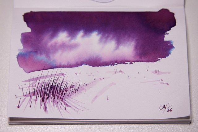

What a gorgeous fountain pen ink. A great range of tone and ideal for winter scenes with a hint of cyan adding that icy chill. And all from one ink! I used a da Vinci […]
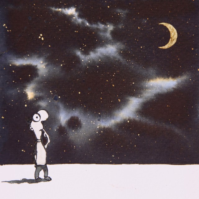
I have been a fan of Michael Leunig for many years. Just love his style. I was looking at one of his books the other evening and just started doodling. I didn’t want to just […]
Following on from last years runaway success and Christmas 2016 approaching fast, Diamine are currently releasing a new range of Shimmer Inks which Christine Joynson very kindly sent me a batch to test. Now whether […]

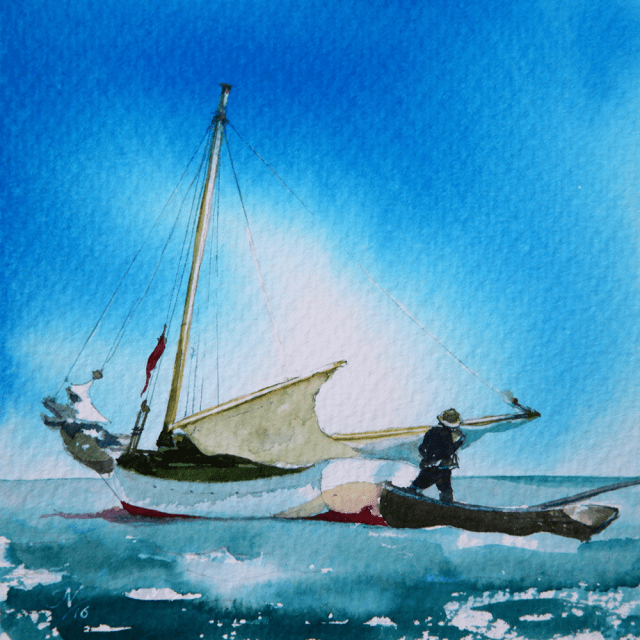
This is based on an image I took over the weekend. I was sailing from Upnor to Ramsgate when 2 miles from Ramsgate the sky turned Diamine Eclipse and sea a Diamine Twilight. What was visually […]

Quink black freeform blend onto 300gsm Saunders watercolour paper with bleach and ink illustration and lettering. Using lyrics by Depeche Mode this is a wonderfully self indulgent journey into the dark side. Seven pieces in total for the […]

For all you Preacher fans, here he is created with De Atramentis Ebony, Coral Red, Yellow Orange and a flick of bleach. Great colours eh? Just look at the depth and tone of that Ebony and […]
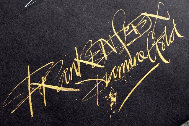
For the cost of the pen customisation money isn’t really an issue. Okay, it needs instant cleaning afterwards! But for the freeform calligraphic effect of the Diamine Silver and Gold on black paper… it’s worth every penny! […]
Taking just 5 of the Robert Oster colours: Khaki, Chocolate, Blue Night, Deep Sea and Aussy Sky. The sky and sea were achieved using? Yup pretty obvious. So what about the wood colours and darker tones? Khaki and […]

Background of Diamine inks blended togther on watercolour paper. Abstract calligraphy created with automatic pen. These four ink cards commissioned by Pure Pens Here are the other 3 designs with bleach detailing for the illustrations: The […]

J Herbin 1670 – Caroube de Chypre samples very kindly donated by Ross at Pure Pens and Mishka at Bureau Direct
