

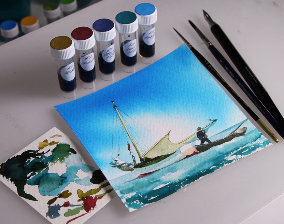
Taking just 5 of the Robert Oster colours: Khaki, Chocolate, Blue Night, Deep Sea and Aussy Sky. The sky and sea were achieved using? Yup pretty obvious. So what about the wood colours and darker tones? Khaki and Blue Night are just fab for this and mix together a real treat. Red anti fouling stripe? Chocolate. And the highlights? Bleach of course. This image was based on a fantastic watercolour sketch by Homer Winslow. If you check out the original you can see that his watercolour paints are good, but in my opinion, fountain pen inks enhance the environment better. What do you think? Go on! Give it a go?
Wishing you all a creative weekend! N
