
Following the previous releases of Virgilio and Caronte, Visconti continues its journey through Dante’s Divine Comedy with Paolo & Francesca, opening a new chapter in the Comedìa collection dedicated to love—the most profound and universal force of human experience. A symbol of an eternal passion, suspended between desire and damnation, the two lovers take form in a single writing instrument, expressing an inseparable bond that transcends time and death.
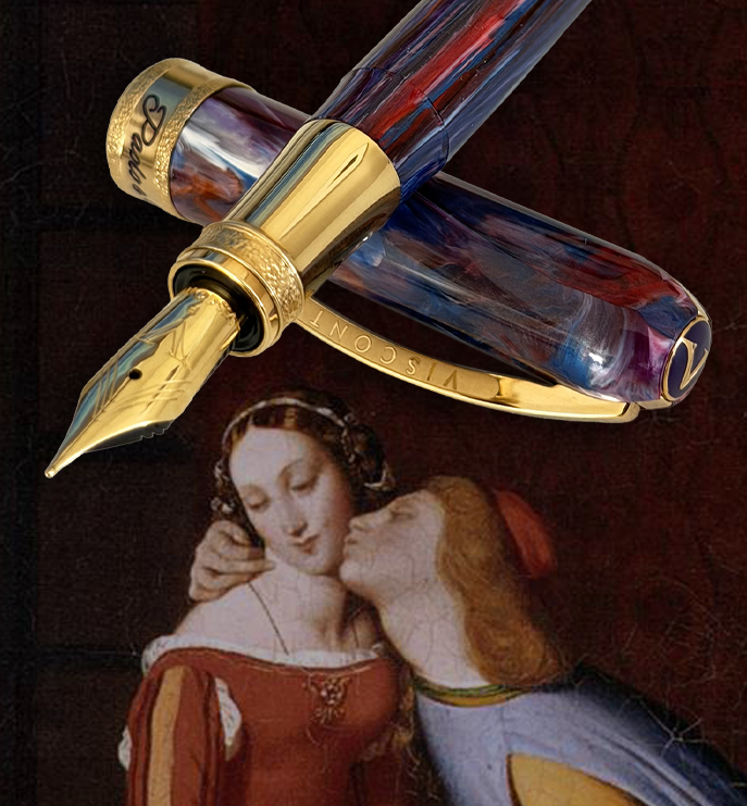
Paolo and Francesca are among the most celebrated figures in Dante’s work. Lovers in life, they were killed by Francesca’s husband—who was also Paolo’s brother—after being discovered together. Placed in the second circle of Hell among the lustful, they are condemned to be swept forever within an endless storm. Yet within this punishment, their love finds its most powerful expression: an eternal union, fragile and absolute, suspended between guilt and beauty.
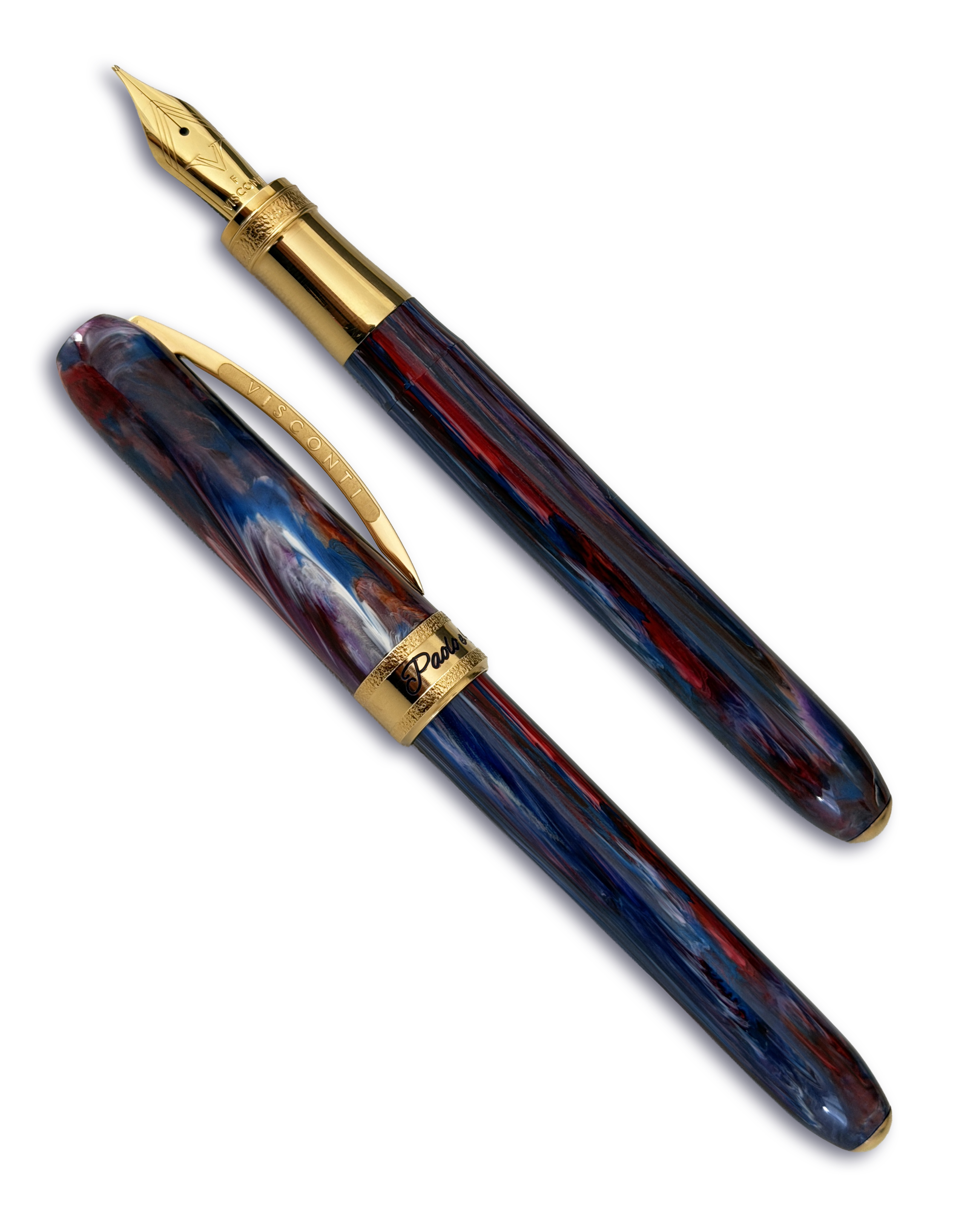
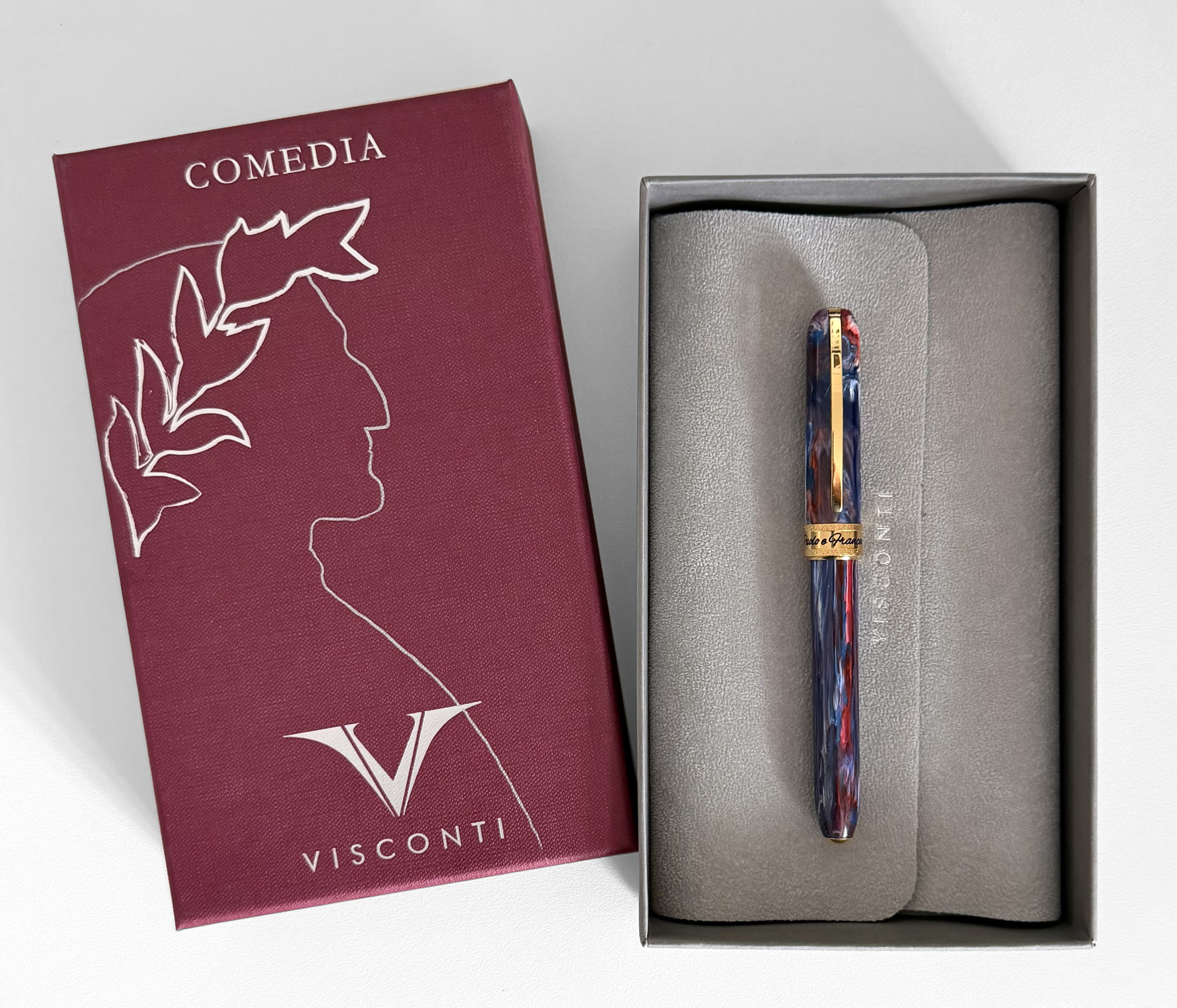
This intensity of this story is reflected in the design of the pen, where the resin body comes alive through a fluid interplay of red, purple, blue, and white. The red of Francesca and the blue of Paolo merge into a deep violet, symbolizing their union, while gold metal trims illuminate the composition, creating a refined balance between light and matter. Their names, engraved and enameled on the central ring, seal this bond with a discreet yet meaningful gesture.
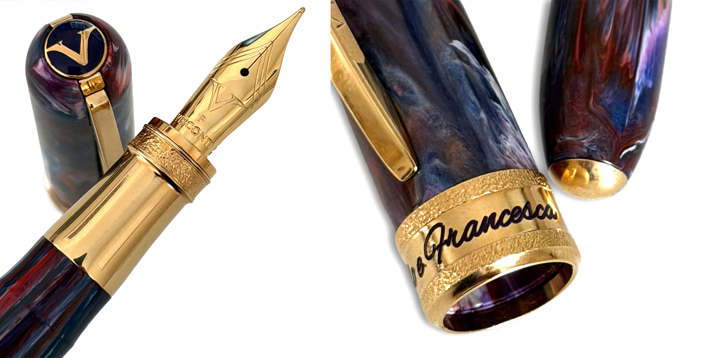
Limited to 999 pieces, Paolo & Francesca is more than a writing instrument: it is a story brought into form, an emotion transformed into a sign. Each piece is unique, thanks to the natural variations of the acrylic resin material, with the edition number engraved out of gold trim at the top of the cap opposite where the iconic clip, inspired by the Ponte Vecchio bridge in Florence, meets the encircled V.
And it should be noted, that because each acrylic resin body is unique, some pen bodies may appear brighter with more dramatic variation than others. The pen I have photographed does appear to have more blues than reds and less swirls than the pen featured on the Visconti website.
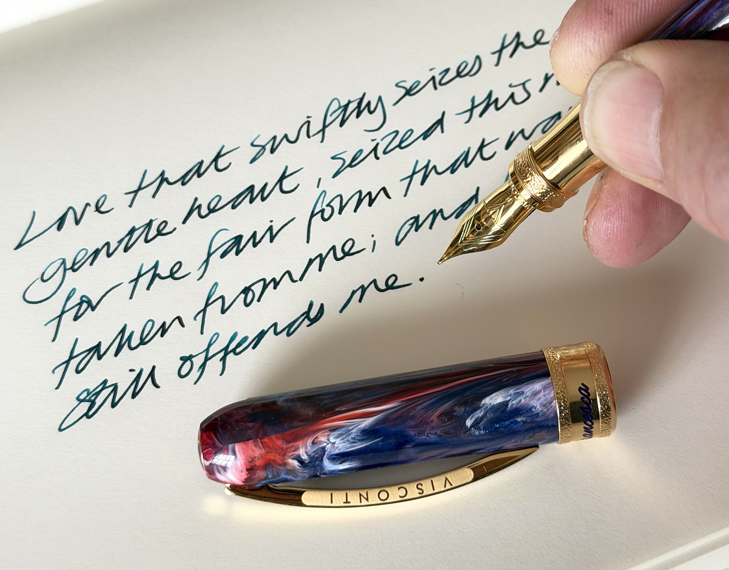
Surprisingly, the nib, although somewhat standard when compared to Visconti’s higher-end, gold-nib lines (like the Homo Sapiens), actually writes beautifully and is really smooth!
Also of note is the magnetic pen cap which allows you to remove and replace the cap easily with style, elegance and a click. Classy!
The pen comes sleeve packaged in a cloth bound box with: a concertina booklet with information about the pen, an ID card with the pen number and other details, and, a converter.
I think this pen is visually stunning with a great story too. Visconti are a renowned brand at the higher end of the luxury market and well known for producing what are known as ‘grail’ pens. So when you consider what you are getting for circa £320, I think you have a very classy pen with good value for money. In fact, for that price, this could almost be used as an EDC (Every Day Carry). It’s lovely!
Many thanks to Stephan Lucht at Tinte Im Blut. for sending me the pen to review.
And HEY! If you’re interested to know more about how to use fountain pen inks in more creative ways – whether it’s simply to observe their chromatic behaviours, or, to recreate one of my swatch cards, or, to learn how to use them in watercolour painting, illustration and calligraphy, why not check out my online course or, even better, sign up for a workshop?
