

For anyone seriously into illustration and calligraphy, the search for that one true flex nib fountain pen that can properly do both is an ongoing quest.
With a lifelong interest in both disciplines, to achieve lines of varying width for imagery and lettering I, and many others, have used a dip pen and the nib of choice for us has often been the Zebra G.
The Zebra G nib is manufactured by the Zebra Pen Corporation, a Japanese manufacturer of writing instruments whose founder, Tokumatsu Ishikawa, registered the name “Zebra” as a trademark in 1914. He thought Zebra was an appropriate name because his goal was to build a business culture that resembled a family and zebras have a strong herding instinct. Zebra stripes resembling calligraphic pen strokes may also have been a reason for the name.
 The beauty of this steel nib is the easy flex of the tines which can produce a variation in line width from hairline to just over 2mm in a single stroke. So no surprise that it has been a weapon of choice for illustrators and calligraphers for well over a century.
 When I left art college I went to London and for many years worked in some of the top visualising studios creating storyboards and mock-ups for the big agencies and design studios of the day. This was pre-computer graphics. Everything was created by hand and so I had the pleasure of working alongside some of London’s greatest commercial artists.
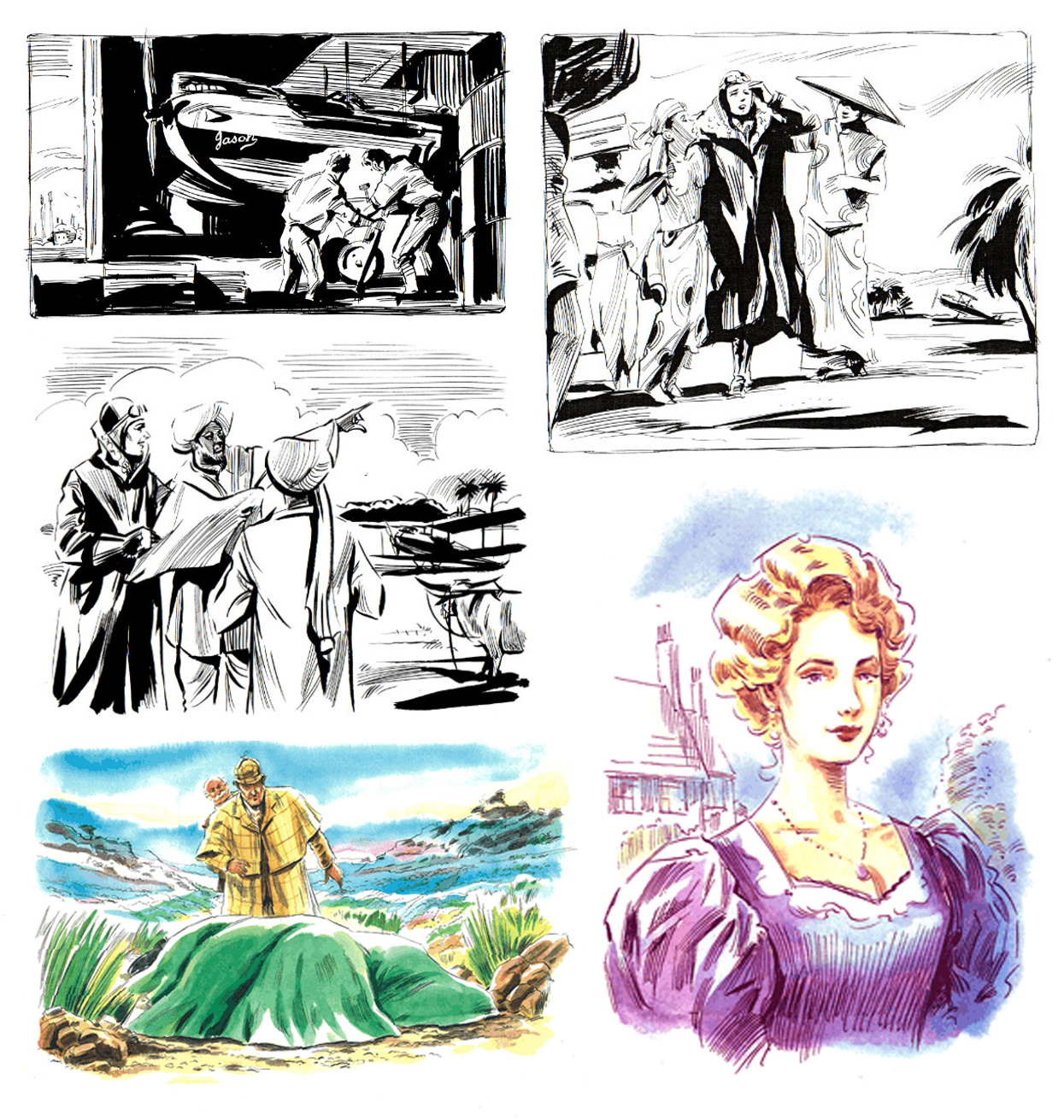 Linda Clark (Click here) is one of many artists I worked with. She was also on my Graphics and Illustration course at Brighton. As well as being a fabulous storyboard artist and all round visualiser, she also illustrates for publishing. I love her illustration style (see above) and economy of line. The way she uses that Zebra G as a dip pen is simply astonishing. And that gorgeous sensitive use of ink and watercolours together – just lovely.
The impact of the Zebra G cannot be underestimated. Ralph Steadman and Gerald Scarfe amongst hundreds of famed illustrators developed their styles with this nib.
Not surprisingly, many pen makers spotted an opportunity and attempted to incorporate this nib into a fountain pen. And I too have spent time and money on such pens including making my own. The issue has firstly been the feed. The nib curve is slightly tighter than a standard size 6 pen fit, so jamming one onto a size 6 feed can work, but won’t for long as the ink flow quickly drys up and stops. Some custom ebonite feeds have also been produced and some fit really well but ink flow, again, becomes an issue. You see, when you really flex those tines, the ink draw from the converter is substantial. Some feeds can’t deliver enough ink, so the only way to stop railroading is to really slow down and that can impact the fluidity of the line. Other feeds, give great delivery, but when you stop creating the wide lines, the ink will still continue to be delivered and the feed starts to drip.
What Tom has done is to design a feed ‘from the bottom up’. He has created a 3D printed custom feed that not only accommodates the nib exactly but also copes with ink demand. Taking an ‘extra inky’ approach and to stop the dripping after heavy flexing, he has created a sump in the feed to store the extra ink flow and be reused with further pen use afterwards. Very clever! And finally, he has created what I think is a custom unit for the feed and nib, which, if you are into making pens, you can get a nib unit from Tom and fit into your own creations.
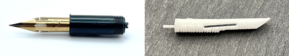
Nib unit and feed with sump
It’s still early days for me, but below are some bits that I have created with the pen and had no issues at all. Fabulous continuity and line width variation. I have also used Octopus pigmented inks with very pleasing results which allow you to over paint with fountain pen inks and watercolours once dry. Do wash out the pen immediately after using pigmented, shimmer and heavy sheening inks. NEVER use drawing or calligraphy inks in a fountain pen!

 Using Octopus Write and Draw Violet Giraffe (a fountain pen friendly pigmented ink)

Courtesy of Cherry Stewart @prune_and_fork

Using standard fountain pen ink Nick Stewart Twilight Black
With regards to the actual look of the pen, the body is minimalist in design and finished to a very high standard. As there is no clip or anti rolling stop – I would recommend a pen sleeve. The metal body is slick but for all day art, an acrylic body option would be good too. That aside, what Tom has done is not only commendable it’s revolutionary. If you are an illustrator, calligrapher or both, the investment is definitely worth it. Click here for more: https://tomsstudio.com/collections/fountain-pens
And HEY! If you’re interested to know more about how to use fountain pen inks in more creative ways – whether it’s simply to observe their chromatic behaviours, or, to recreate one of my swatch cards, or, to learn how to use them in watercolour painting, illustration and calligraphy, why not check out my online course or, even better, sign up for a workshop?
