
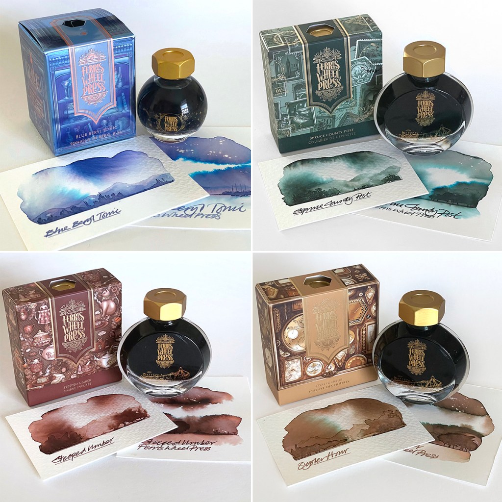
Firstly, many thanks to Ferris Wheel Press for sending these four inks to swatch test. This is my first actual contact with this brand although I readily admit that the quality of their eye catching design and packaging caught my attention some time ago.
Ferris Wheel Press is a design and stationery company based in Markham, Ontario, Canada, and have been making fine stationery for over ten years. Of significant interest to me is that this is the first ink producer that is offering the consumer an ‘experience’. It’s not just the ink that’s the hero here – the bottle and printed box are all equally as important. Each individual product has an in-depth story to tell. There are many visual clues featured on the packaging and within the ink but for the full story you will need to visit the website and get hooked into the magical world of the Ferris Wheel Press.
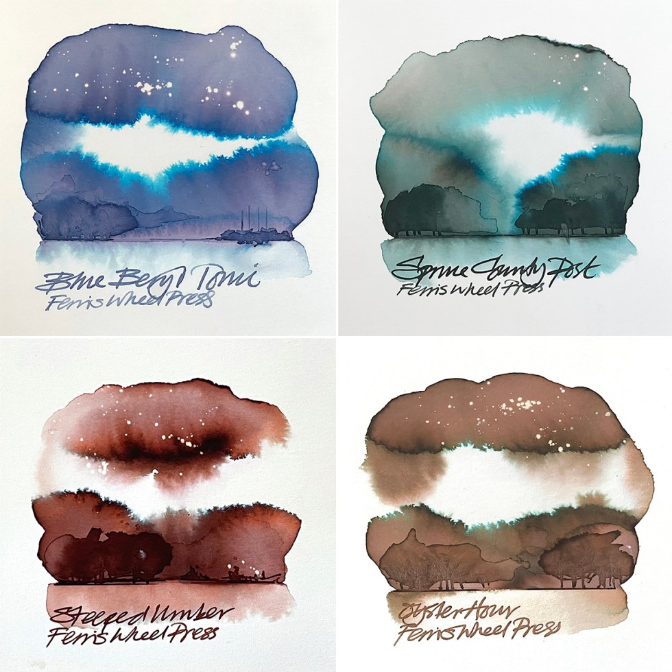
In order to review these inks in a way that helps augment the stories I have swatch tested the inks on various watercolour papers, thereby releasing the chromatic behaviours of each one. What I notice is that all the shades, tones and subtle colours released, all feature within the images on the individual ink packaging! Sheer brilliance or a happy coincidence?
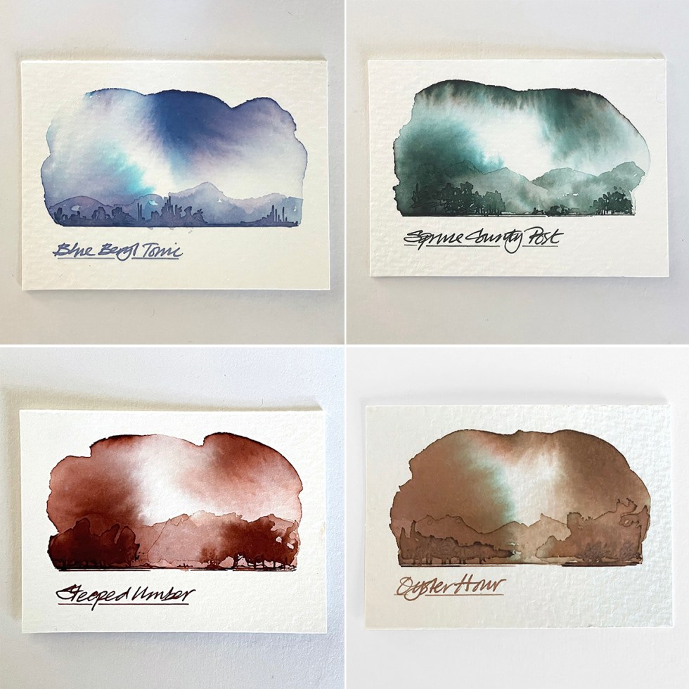
And the swatches cards also become their own magical worlds – which relate quite closely to the stories as revealed on the website.
The inks supplied are:
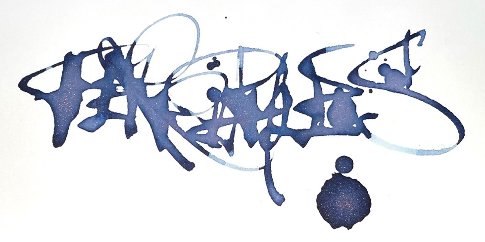
Blue Beryl Tonic from the Down the Rabbit Hole collection – based around an Alice in Wonderland theme which is part of the FerriTales range. This is a shading translucent blue with subtle chromo and a rose gold shimmer. Click for the full story.
Spruce County Post from the Finer Things collection which is part of the Everyday Ink range. This is a spruce tree green with great chromo and tonal range. Click for the full story.
Steeped Umber from the Finer Things collection which is part of the Everyday Ink range. This is a cognac brown leather with great chromo and tonal range. Click for the full story.
Oyster Hour from the Finer Things collection which is part of the Everyday Ink range. This is a creamy oyster latte brown with more subtle chromo and tonal range. Click for the full story.
So there you have it. Something quite different but very lovely. If you like what you see and are tempted to try something out, Ferris Wheel Press have given me a discount code that will get you 10% discount off any of their products. All you have to do is click here and use NICK as the code. Have fun!
And HEY! If you’re interested to know more about how to use fountain pen inks in more creative ways – whether it’s simply to observe their chromatic behaviours, or, to recreate one of my swatch cards, or, to learn how to use them in watercolour painting, illustration and calligraphy, why not check out my online course or, even better, sign up for a workshop?
