

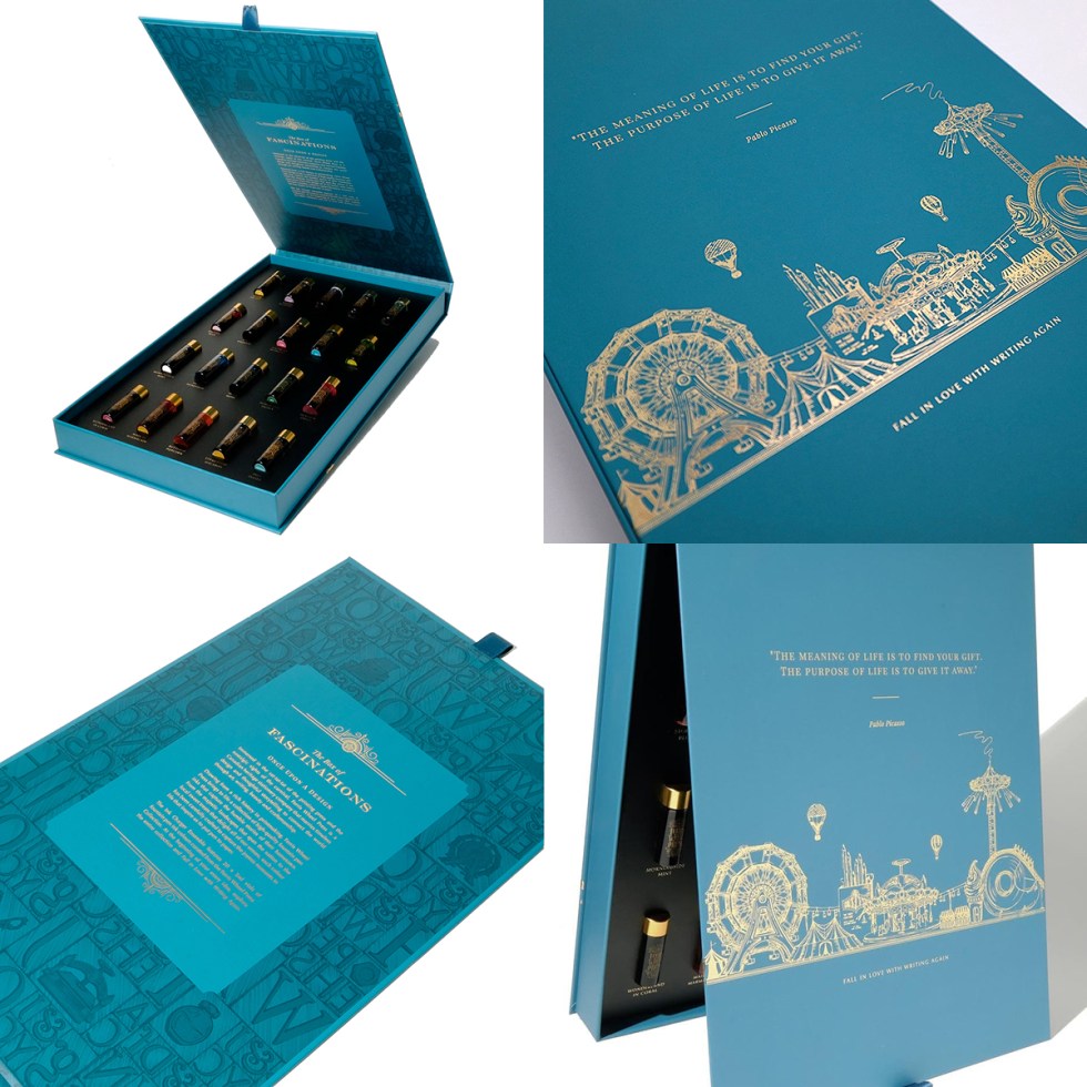
Firstly, many thanks to Anja at Papier und Stift who very kindly sent me The Box of Fascinations (Vol 2) by Ferris Wheel Press to swatch test. This is my first physical experience with this brand although I readily admit that the quality of their eye catching design and packaging caught my attention some time ago.
Ferris Wheel Press is a design and stationery company based in Markham, Ontario, Canada, and have allegedly been making fine stationery for over ten years. This particular collection comes as 20 beautifully presented 5ml vials of various standard fountain pen inks with four of them containing shimmer. If you’re looking for sheening or duo tone inks you won’t find them here.

So, using my swatch carding process of deconstructing the inks with water to explore chromatic behaviours and then subjecting them to household bleach on 200lb Bockingford water colour paper cards you can get a good feel for the character of each ink.
All of the inks blend with water, some not as readily as others, but all respond to bleach. What I found interesting was the range of tone. From the heavier Stroke of Midnight, Beaver Dam Brown and Peppermint Drop inks (all verging on the edge of sheen), to the very transluscent Cream of Earl, Sweet Honeydew and the near invisible Blue Cotton Candy. For chromo geeks, Storied Blue, Edwards Gardens and Morningside Mint offer a little limited action. You will notice in the selection card that four colours are marked as sparkling. These vials do contain shimmer but try as I might, I didn’t get any real shimmer action and it didn’t photograph. Buy the bigger bottles and I’m sure you’ll enjoy better success.
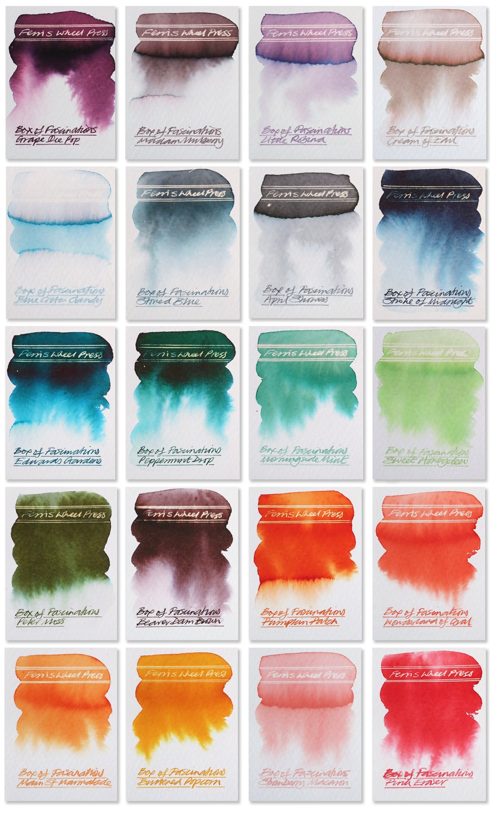 I used a Serendipity dip pen for all of the handwriting and can confirm that all of the inks flowed well through the feed and nib. As always, inks behave differently depending on what paper you choose. I used watercolour paper and a Rhodia dot matrix paper – on both surfaces the inks appear somewhat different (more vivid) to the colour dots on the selection card, so do be aware of this discrepancy.

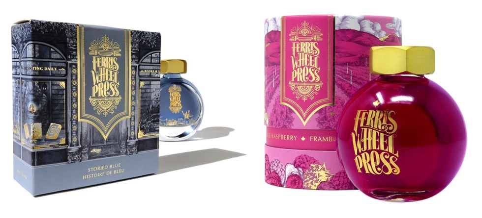
In summary, as a mini collection of standard fountain inks, I think they’re very good. Are they as dynamic and creative as the Diamine Inkvent collections? Hmmmn, well, I think you know my answer there. But as a gift for someone, the quality of the packaging has to be some of the highest, if not the highest, I have seen in this sector. When I first saw the packaging I thought it was for expensive perfume! (see the last 2 images for evidence). To be honest, some ink brands could certainly learn a thing or two from these guys in terms of product presentation. Although these are now all sold out, the boxes were retailing at circa £80.00 which I would say for the ‘all round’ package and quality is a very fair price.
As a commercial designer myself, judging a book by it’s cover is always something to be cautious of. But in this case, Ferris Wheel Press really do deliver and certainly prove that they love and care about what they produce. If you want to get hold of Ferris Wheel Press products here’s a link to Anja’s shop. Click here.
And HEY! If you’re interested to know more about how to use fountain pen inks in more creative ways – whether it’s simply to observe their chromatic behaviours, or, to recreate one of my swatch cards, or, to learn how to use them in watercolour painting, illustration and calligraphy, why not check out my online course or, even better, sign up for a workshop?
