

I was first introduced to Robert Oster Signature Inks by Claudia Astorquiza who helped me to find a place within the Fountain Pen Network forum to post articles about this project. And over the last five years, I have used these inks in much of my art.
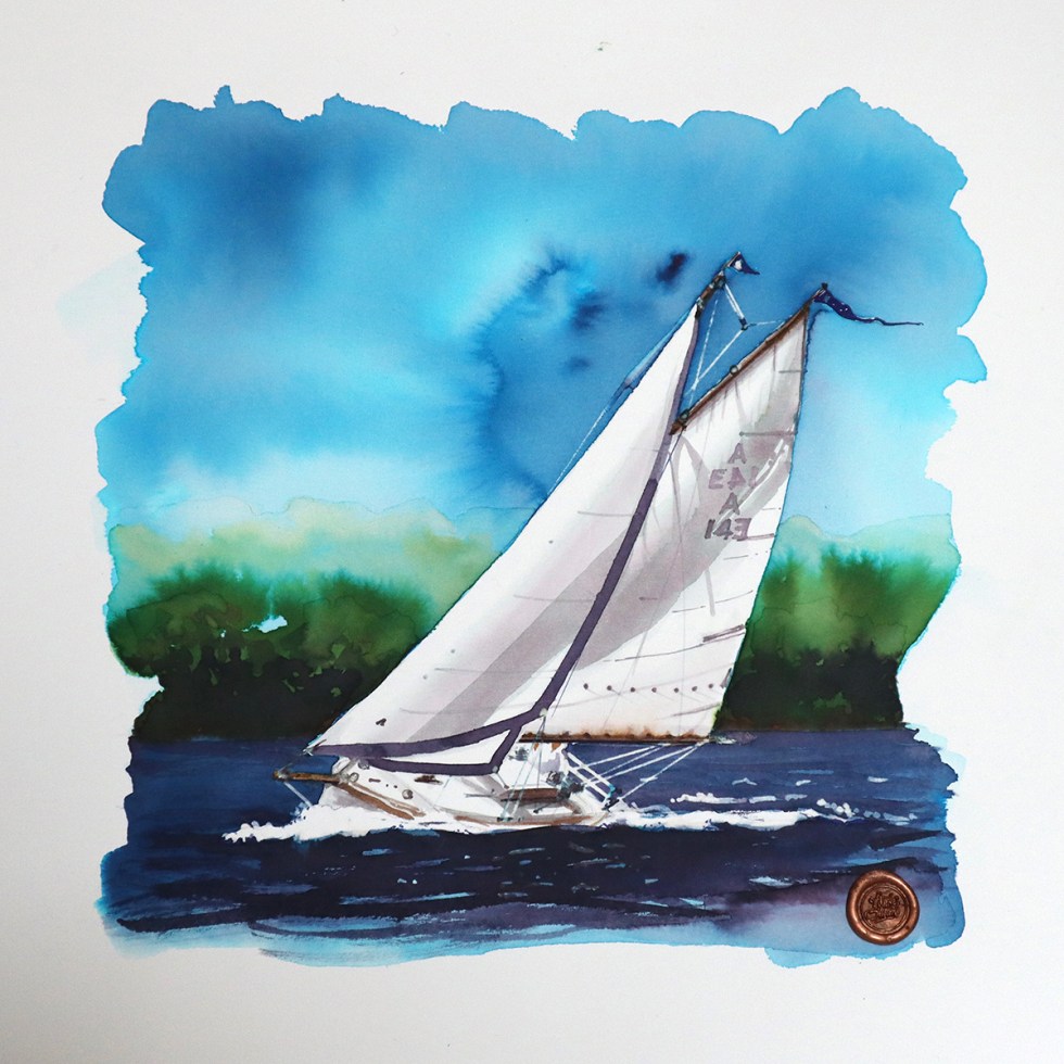
 ‘Close hauled on the Parramatta’ using School Blue, Blue Black, Forest Green, Black is Black and Marrone Mustard on a smooth Bockingford
The range of colours is fabulous but what really stands out for me is that dramatic chromatography inherent in all the inks – which I utilise as best I can and in so doing have created something that is now fundamental in all my art. A signature or maybe even a style? Which is something I have spent a long time searching for.
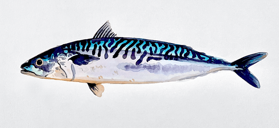 ‘Mackerel’ using Velvet Crush, School Blue, Caffe Crema and Blue Black on a smooth Bockingford paper.
If you type Robert Oster into the search engine on this blog, plenty of threads will appear featuring his products, swatch tests and artwork. The last five years have been brilliant in terms of developing this project and Robert Oster has been a huge part of it. Here’s to the next five years.
AND HEY! If you’re interested to know more about how to use fountain pen inks in more creative ways – whether it’s simply to observe their chromatic behaviours, or, to recreate one of my swatch cards, or, to learn how to use them in watercolour painting, illustration and calligraphy, why not check out my online course ?
