

Wow! And what a beautiful A5 notebook it is too. Hand bound in a stunning Liberty London fabric called Wiltshire, the 160 sewn pages inside are made up of Cosmo Air Light – a fairly new 75gsm micro-coated fountain pen friendly paper produced by Yamamoto. Similar in ways to Tomoe River Paper, Cosmo Air Light is beautifully smooth for fountain pen nibs and provides a lovely writing experience.

For any serious ink geek, paper choice is absolutely critical for the outcome you wish to achieve. For example, any projects looking to utilise the chromatic behaviours of fountain pen ink would be best served with a heavy watercolour or cartridge paper. Conversely, any projects looking to maximise the effects of shimmer and sheening inks would most definitely seek out something along the lines of Tomoe River paper, but as we know, all inks are individuals and quite often the unexpected can and will happen.

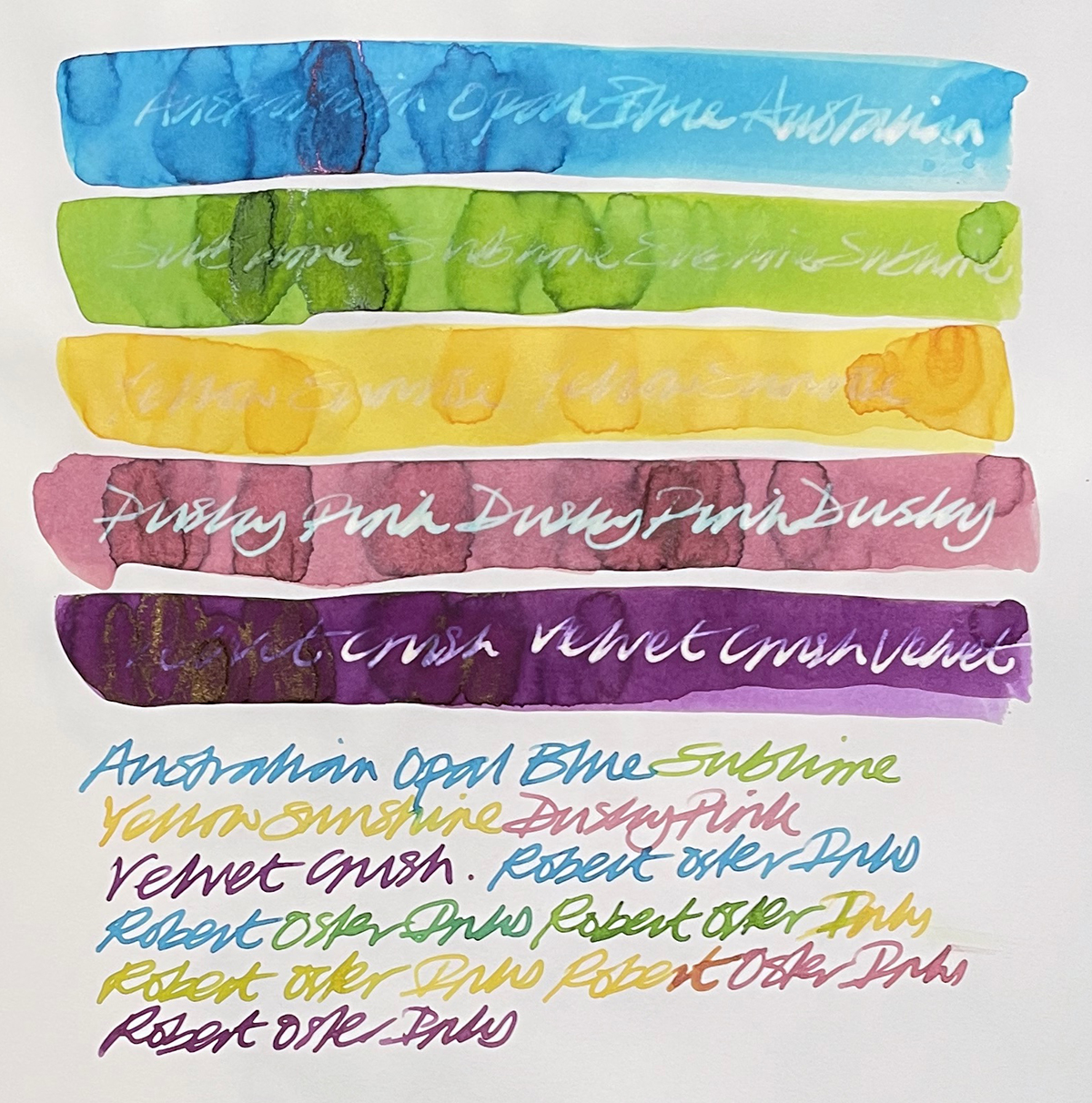
So what I did first off is see how some standard inks behaved in a swatch test. The first thing noted is that that pen moves incredibly easily over the paper surface and the ink dries very quickly, but strangely, the inks I used, when dry, appeared slightly dull. When adding ink to the wetted paper surface the chromo action was subdued.
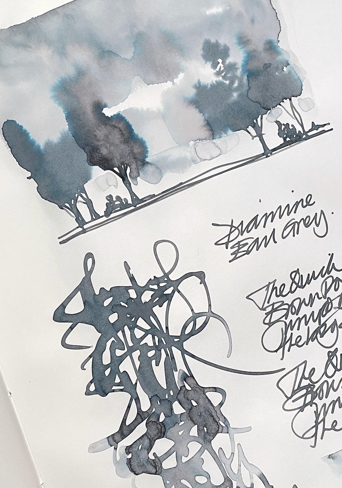
Diamine Earl Grey is a very vibrant colour with plenty of tonal and chromo action but not here. And likewise for Cult Pens Diamine Louise and Matthew. But the real test was with the Robert Oster inks. These inks are known ‘poppers’ but here they too appeared a little dull. So, for any swatching or painting activities, maybe this paper isn’t ideal. But on the plus side, a pen nib moves very smoothly and easily on the paper surface, so for handwriting and the pure joy of that, this is very pleasurable. It is noticeable that even the slightest hint of sheen does come to the fore.
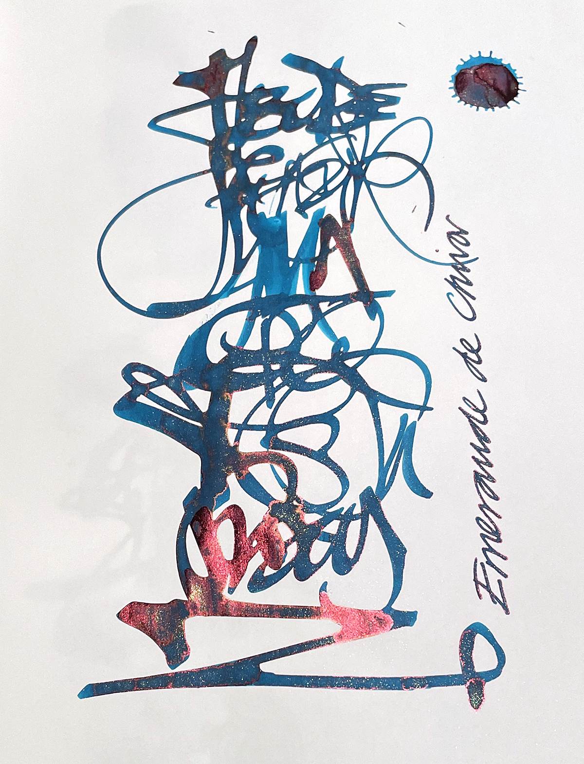
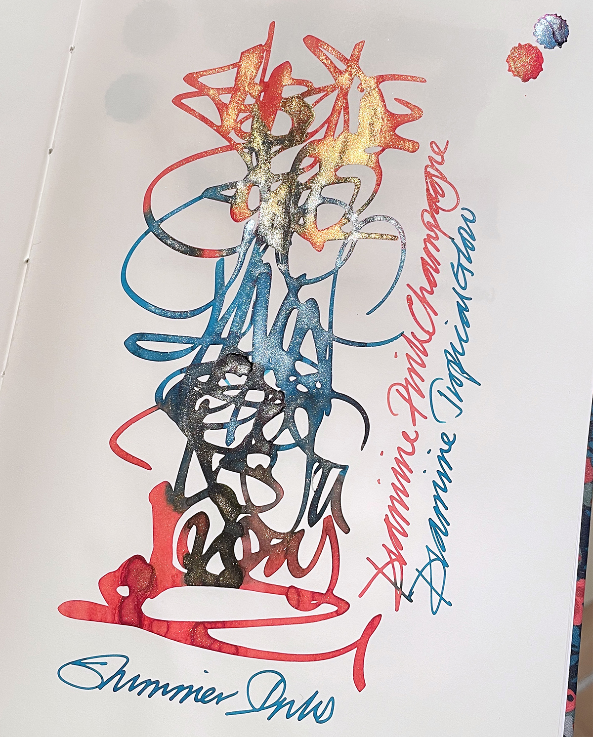
So the next thing I did was get out the sheen and shimmer inks. As you’ll see from the Herbin Emeraude de Chivor alphabet, that teal, to me, looks dull, BUT the sheen and shimmers are very much in evidence. So next was an alphabet using shimmer inks Diamine Pink Champagne and Tropical Glow and WOW! Very smooth to write with, no bleeding or feathering and the shimmers really do pop!
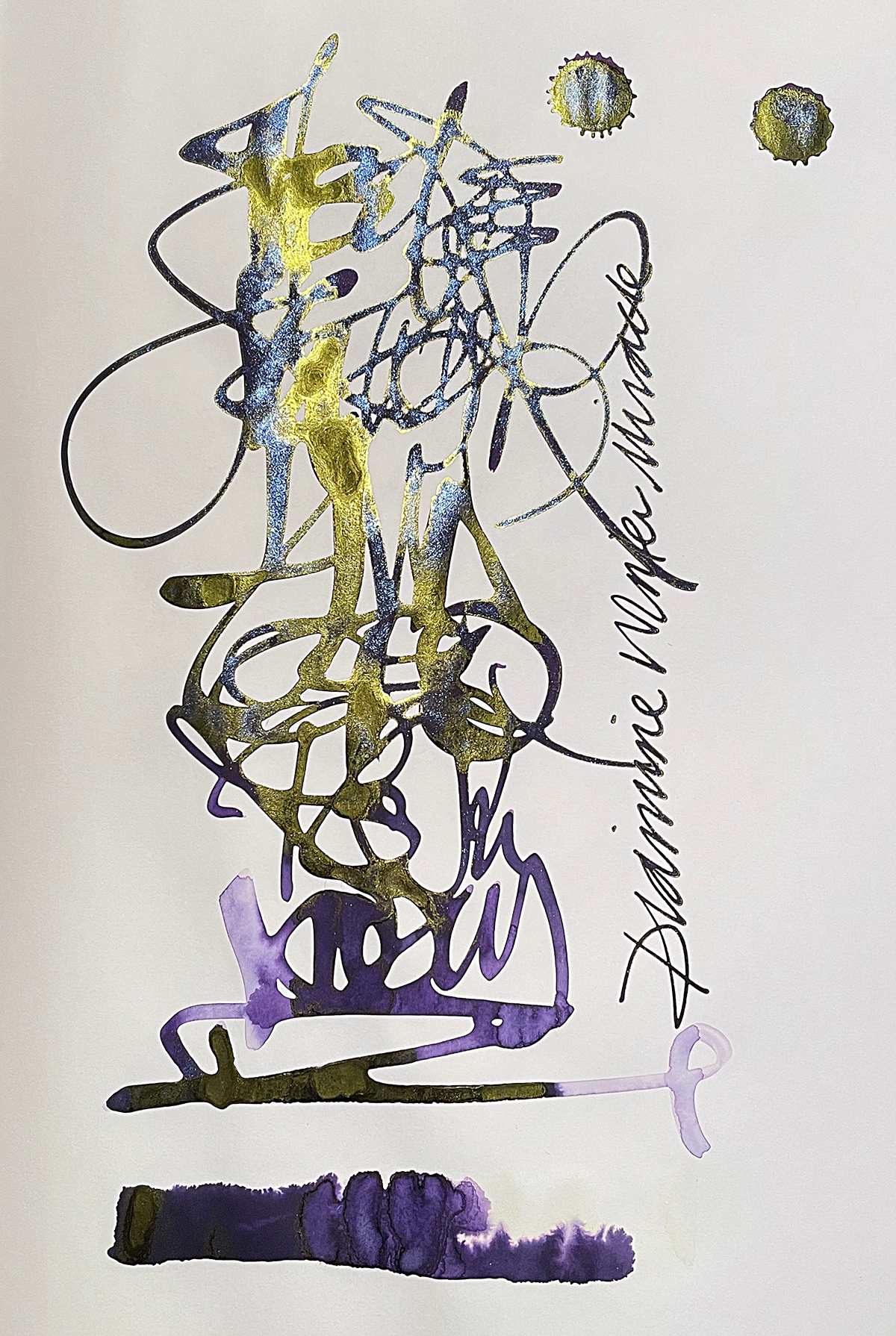
So there you have it. Not great for all standard inks but superb for sheens and shimmers as that Diamine Winter Miracle below demonstrates.
Tomoe River is usually the go to paper for sheens and shimmers BUT as it’s only 50gsm it is prone to crinkling and there is show through or ghosting. So here is an alternative with negligible crinkling and show through.
What I really like about this notebook is it’s exclusivity. I’m not aware of any other notebooks using this paper stock at the moment. It’s beautifully hand bound in a heritage fabric of international renown. Although the paper stock is new to me, it is not ideal for everything I do, but if you’ve invested in the Diamine Blue Range for example, or you’re going to, this notebook is, in my opinion, an ideal companion to help bring the best effects out of your sheen and shimmer inks.
OF NOTE: I would say that the dulling or flattening of the colour is maybe around 10% and the pronounced uplift of sheen and shimmer is also around that 10% figure. So, when you have a 20% contrast between the colour and the shimmer/sheen effects, visually it is going to appear more impactive and looking at what I’ve done, that kind of adds up to support what I have experienced.

This gets a thumbs up from me. Here’s a link to Pebble Stationery Co’s website: https://www.pebblestationeryco.com/collections/artisan-notebooks
Many thanks to Lois for sending me this to test. Another dream job!
(Note: All images taken in bright light).
If you’re interested to see my mini notebooks review which includes the Pebble Stationery Co Tomoe River paper pocketbook, click here.
AND HEY! If you’re interested to know more about how to use fountain pen inks in more creative ways – whether it’s simply to observe their chromatic behaviours, or, to recreate one of my swatch cards, or, to learn how to use them in watercolour painting, illustration and calligraphy, why not check out my online course ?
