

For painters and illustrators, practicing monotone art is relevant for understanding light, as it allows us to perceive shape and form. How that tonal range, from light to dark, is utilised will be key to the success of an illustration or painting. It is also the logical area to perfect before attempting to do the same thing with a full colour palette!
 Diver Down – Randall Blue Black and bleach.
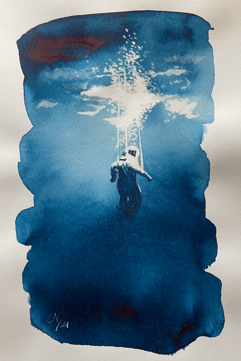
 Polar Explorer – Nick Stewart Twilight Black and bleach
For my previous post on monotone painting (with more pics) click here click here.
AND HEY! If you’re interested to know more about how to use fountain pen inks in more creative ways – whether it’s simply to observe their chromatic behaviours, or, to recreate one of my swatch cards, or, to learn how to use them in watercolour painting, illustration and calligraphy, why not check out my online course ?
