
The 30 day miniature portrait challenge is one of those things you see posted on social media by artists from time to time and something that I’ve always fancied having a go at.
So I set myself a few rules to abide by. Usually, the size of each image is 1 inch by 1 inch but for some reason or other I made mine 45mm x 45mm. I used 30 separate fountain pen inks with bleach and set myself a time limit of 30 minutes per image – in an effort to keep it fast and fresh and to put pressure on myself to concentrate on the key visual details that constitute a face. I used a Noodler’s Creeper pen for all detailing and a rigger brush for half toning. The stock used was Seawhite cartridge paper and all of the reference was sourced from Pinterest.
So, how did it go? Well, it was a lot more challenging that I thought and I learned a lot. I have posted everything as it is, warts and all. Some turned out, unexpectedly, really well, others failed miserably. So, below are 5 panels of 6 images with notes underneath for each portrait (going left to right and top to bottom).

01 – Diamine Winter Miracle – This isn’t an easy ink to use at speed but as a shimmer sheen with a good reaction to bleach the range of tone, colours and possibilities is worth the perseverance. I thought this worked very well.
02 – Diamine Earl Grey – I’ve used this ink quite a lot and know what it can do. Very pleased with the outcome and like the the way the bleach turned the ink fluorescent blue for the highlights on the lips and eyes.
03 – Nick Stewart Randall – Another ink I’m familiar with. Its very stable to paint with and has a great tonal range.
04 – Noodler’s Rome Burning – Love this ink but it is hugely unpredictable. I was lucky to get away with what I did. The purples yellows and browns all work very well.
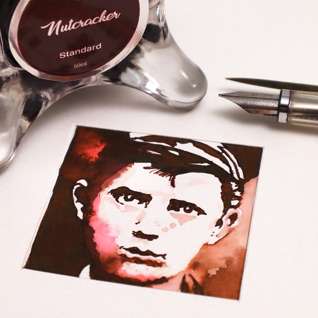
05 – Diamine Nutcracker – Have never used this before. This is a standard ink with good tonal range and subtle chromatography. The real surprise was the addition of bleach and the stunning fluorescent deep salmon pink it made. Will use again!
06 – Diamine Solstice – Took a total flyer with this one. Having laid a flat black green shimmery background, when dry, I went in with bleach and was pleasantly surprised with the creamy brown effect. Total serendipity.

07 – Nick Stewart Desert Rose and Diamine Ortloff – I initially started with the Desert Rose but the ink wasn’t dark enough for the contrast I needed. So I used Ortloff for the dark areas. As a heavy sheen red this was always going to be tricky and I had trouble with the eyes. I tried to mop out some of the excess but due to the strength of the ink had to use a tiny bit of bleach that immediately flared! And that was that.
08 – Nick Stewart Twilight Black – Another flat black ink wash which when dry I went in with the bleach. I lifted the bleached areas out with kitchen roll. A fabulous outcome.
09 – Taccia Kurocha – I did the heavy dark detailing first this time and then worked outwards with the water and washes. Worked very well.
10 – Taccia Nakamurasaki – I was hoping for a great outcome here but found the ink hard to work with and the image does look somewhat laboured. Shame.
11 – Sailor Ink Studio 935 – Another Far East ink that I was hoping would work well. No chromatography and the bleach did nothing. Fail.
12 – Sheaffer Black – You never fail with Sheaffer black ink. A really great ink and super reaction to bleach.

13 – Robert Oster Opal Mauve – Not sure what happened here. I broke my rules and tried too hard to salvage silly mistakes. Disappointing.
14 – Diamine Ortloff – Should have learned my lesson from last time. Heavy sheens are very difficult to work with! And with the bleach – a total nightmare. Not great.
15 – Troublemaker Petrichor – These inks do not have a great tonal range and I really did have to layer this on. This was hard work for very limited success.
16 – Robert Oster Melon Tea – A proven old favourite ink. The relationship with bleach is fabulous. Dependable and hugely enjoyable.
17 – Diamine Gold Star and Solstice – Something different here. Gold Star background with a beautiful yellow orange gradation with shimmer! And then the black Solstice on top with its green shimmer. Nice and easy!
18 – De Atramentis Ebony – I have used this before, but not on such a small scale as here. The lack of chromo effects was a disappointment.

19 – Parker Quink Black – No problems here. Good outcome.
20 – Diamine Oxblood – Haven’t used this before for art and halfway through thought I’d lost it but it turned itself around with a great outcome.
21 – Diamine Monboddo’s Hat – I know this ink quite well. Great tonal range and a strong sheen. Worked well. Great source reference.
22 – Diamine Midnight Hour – First time using this. Very heavy sheen and had to go very carefully. Strong image and good outcome.
23 – Robert Oster Marrone Mustard – Great tonal range. Straight in there!
24 – Nick Stewart Randall – As per 09 I did the detailing first with pen and then added the half tones. I know it’s my ink but it does work well for art!

25 – Troublemaker Milky Ocean and Diamine Polar Glow – As mentioned, the Troublemaker inks just don’t have the depth of tone needed for this kind of exercise. Went on top with Polar Glow which is a heavy sheen and met disaster on the mouth!
26 – Troublemaker Petrichor and Diamine Solstice – Petrichor has great chromo qualities and works well with the Solstice detailing. The shimmer looks great too.
27 – Troublemaker Abalone – As per 15, had to shovel this on and it just doesn’t work!
28 – Troublemaker Kelp Tea and Diamine Onyx Black – As per 26 used in conjunction, this works very nicely.
29 – Waterman Green – Wasn’t sure what to expect but the subject matter allowed this ink to shine I think.
30 – Krishna Cinnamon – No surprises here. A fabulous ink with excellent chromatography and tonal depth. Great outcome.
Lessons learned: Working at such a small scale is a challenge! Mistakes can happen easily and really stand out. The reference material is crucial and high contrasting images make life a lot easier. Heavy sheen inks are difficult – I wont use them again. Chromo inks with a limited tonal range work better as backgrounds in conjunction with a darker ink used for detailing. Shimmer inks are fun to use. You need to constantly vary the concentration of bleach to water. And you have to work quickly! I’m impressed with the variety of ways I could tackle the portraits. I think fountain pen ink art is about to get very very exciting! Well worth doing!
AND HEY! If you’re interested to know more about how to use fountain pen inks in more creative ways – whether it’s simply to observe their chromatic behaviours, or, to recreate one of my swatch cards, or, to learn how to use them in watercolour painting, illustration and calligraphy, why not check out my online course ?
