
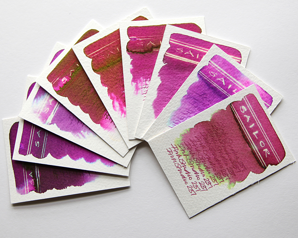
This is the sixth part of my Sailor Ink Studio swatch tests. The swatch cards shown are part of a lovely range of reds and pinky purples. Once again, what is instantly striking is the dramatic chromatography.

Sailor 931 – A heavy and deep dark crimson with hints of extremely dark red that blends with water and bleeds out light pinks. A black sheen in evidence. This is very heavy dark ink so there is only a neon white effect when subjected to bleach in the lesser ink concentrated areas.
Sailor 831 – This is a lighter variation of the 931 with a negligible reaction to bleach. A black sheen in evidence.
Sailor 531 – This appears to be an even lighter variation of the 931. The heavy crimson gives way to fuchsia pinks but still that black sheen in evidence and a better reaction with bleach turning gold.

Sailor 231 – A dusty purple pink that blends easily with water. A very feint sheen in evidence with a neon gold effect when subjected to bleach.
Sailor 237 – A dusty deep salmon pink that blends easily with water and feathers out turquoise, green and yellow. A black sheen in evidence with a neon white gold effect when subjected to bleach.
Sailor 135 – A bright pink purple blue that blends easily with water and feathers out turquoise with hints of grey at the edges. A sheen in evidence with a neon gold effect when subjected to bleach.

Sailor 935 – A heavy and deep dark purple with hints of extremely dark red that blends with water and bleeds out light pinks and blues. A black sheen in evidence. This is very heavy dark ink so there is only a hint of a neon white effect when subjected to bleach in the lesser ink concentrated areas.
Sailor 435 – A lively pink purple that blends easily with water and feathers out pinks and turquoise at the edges. A sheen in evidence with a neon white blue gold effect when subjected to bleach.
Sailor 235 – A dusty light purple that blends easily with water and feathers out lighter grey and turquoise at the edges. A black sheen in evidence with a white neon gold effect when subjected to bleach.
All tests on Bockingford Rough 200lb watercolour paper with handwriting using a Noodler’s Creeper pen.
Many thanks to Catherine at Sakura Fountain Pen Gallery from whom I sourced the samples.
Swatch cards are now available to buy. Click for details. If you’d like to know how to create these yourself, why not check out my tutorials course? Click for details.
