
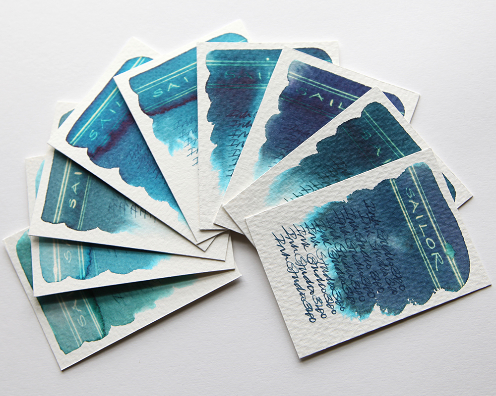
This is the third part of my Sailor Ink Studio swatch tests. The swatch cards shown are the first part of an extensive range of blues. These ones are what I’d call the dusty marine blues. Any one of these inks or a combination of inks would be ideal to consider for marine painting? Once again, what is instantly striking is the dramatic chromatography.

Sailor 640 – A delicate deep grey blue that blends easily with water and bleeds out greys and turquoise at the edges. No sheen in evidence with a very dull gold effect when subjected to bleach.
Sailor 641 – A delicate deep grey green blue that blends easily with water and bleeds out turquoise at the edges. No sheen in evidence with a very dull gold effect when subjected to bleach.
Sailor 340 – A delicate grey blue that blends easily with water and bleeds out greys and turquoise at the edges. No sheen in evidence with a very dull gold effect when subjected to bleach. A shade or two lighter than the 640.

Sailor 941 – A delicate deep grey green blue that blends easily with water and bleeds out turquoise at the edges. No sheen in evidence with a very dull gold effect when subjected to bleach. A shade or two darker than the 641.
Sailor 541 – A delicate grey green blue that blends easily with water and bleeds out turquoise at the edges. A slight sheen in evidence with a dull white gold effect when subjected to bleach. A shade or two lighter than the 641.
Sailor 841 – A deep grey green blue that blends easily with water and bleeds out greys and turquoise at the edges. A slight sheen in evidence with a very dull gold effect when subjected to bleach. A shade or two darker than the 541.

Sailor 341 – A delicate grey green blue that blends easily with water and bleeds out hints of turquoise at the edges. No sheen in evidence with a dull white gold effect when subjected to bleach.
Sailor 241 – A delicate grey green blue that blends easily with water and bleeds out turquoise at the edges. A slight sheen in evidence with a dull neon white gold effect when subjected to bleach in the lighter areas. A couple of shades lighter than the 341.
Sailor 264 – A delicate blue green that blends easily with water and bleeds out light green turquoise at the edges. A slight sheen in evidence with a dull neon white gold effect when subjected to bleach in the lighter areas. This is almost a proper green.
All tests on Bockingford Rough 200lb watercolour paper with handwriting using a Noodler’s Creeper pen.
Many thanks to Catherine at Sakura Fountain Pen Gallery from whom I sourced the samples.
Swatch cards are now available to buy. Click for details. If you’d like to know how to create these yourself, why not check out my tutorials course? Click for details.
