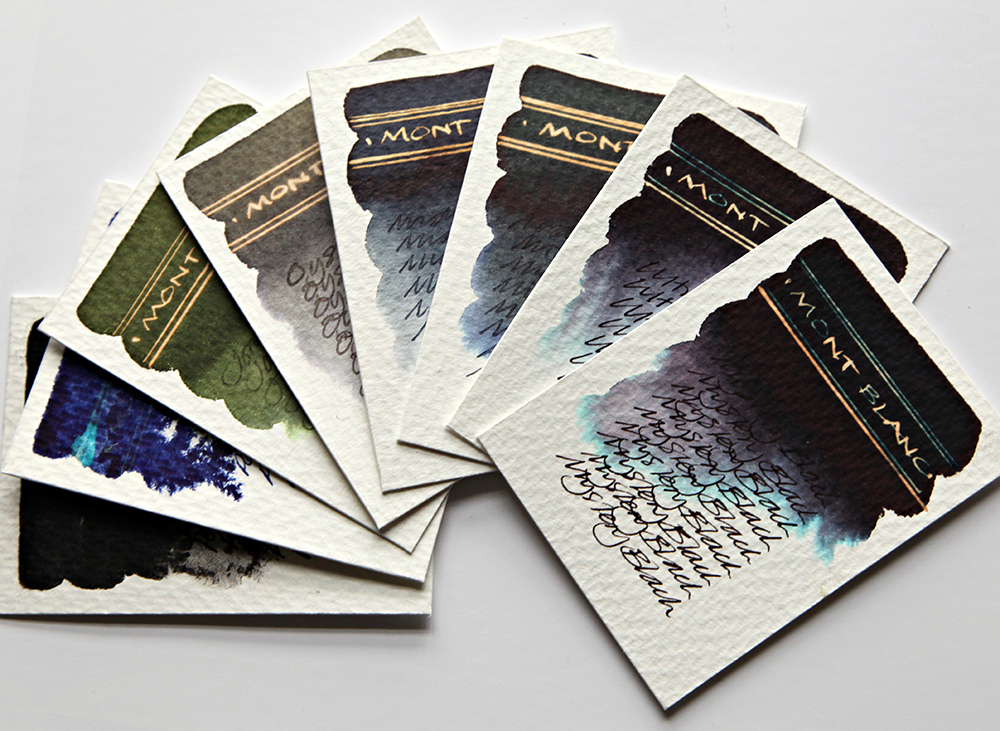
This is the second part of my Montblanc swatch testing.
Stationery Shop Scotland very kindly sent me some samples of Montblanc ink to swatch test. Incidentally, if you’re just getting into swatch testing and you’re looking for the biggest range of 2ml ink samples in Europe, then I suggest you email Vijay for his extensive stock list. Here’s his email address: stationeryshop.scotland@gmail.com

Ultra Black – Deep rich black with great tonal depth. Gold reaction with bleach. Lovely ink flow through nib. Fabulous chromatography with purple greys and bright turquoise feathering at the outer edges.
Mystery Black – Deep rich black with great tonal depth. Gold reaction with bleach. Lovely ink flow through nib. Fabulous chromatography with purple greys and bright turquoise feathering at the outer edges.
Midnight Blue – Deep grey blue with great tonal depth. Dull gold reaction with bleach. Lovely ink flow through nib. Good chromatography with blues and greys both in evidence.

Midnight IG – Deep Grey Blue with great tonal depth. Gold reaction with bleach. Lovely ink flow through nib. No chromatic behaviour. Interesting that there is a definite reaction with bleach if this is an Iron Gall?
Oyster Grey – A Mottled Grey with great tonal depth and very subtle evidence of chromatography with feint olive greens and purple warms greys in evidence. Dull gold reaction with bleach. Lovely ink flow through nib. Great possibilities for artwork.
Jonathan Swift – Rich dark green. Dull gold reaction with bleach. Lovely ink flow through nib. No chromatic behaviour.

Permanent Black – A jet black. No chromatography. No reaction with bleach. Lovely ink flow through nib.
Permanent Blue – A deep blue. No chromatography. No reaction with bleach. Lovely ink flow through nib.
As stated previously, these are quality inks, although a little on the pricey side, you do get a unique and very chunky looking paperweight of a bottle to boot. From a chromatography and serendipity angle, the black inks look good, and they do react well with bleach. The colours are rich and flow well through a nib and they do look good.
All tests on Bockingford Rough 200lb watercolour paper with handwriting using a Noodler’s Creeper pen.
Next workshop on Saturday 30th March 2019 – click for details.

