For the last 3 years I have been deconstructing fountain inks in the name of creative investigation to see if it’s possible to reimagine them as something other than just a handwriting agent for fountain pens. To see if it’s possible to help them defy the onslaught of digital visual software and find them a greater purpose within the analogue traditions that will guarantee their future and longevity.
Even within the fountain pen communities, disciples and followers with huge collections of coloured inks, are not necessarily fully aware of the potential that these magical fluids have to offer. And outside of the communities, fountain pen inks are increasingly an endangered species – a rare sighting.
My challenge has been to find a way of reintroducing fountain pen inks to both old and new audiences and demonstrating how exciting, interesting, compulsive and essential these fluids can be. Certainly, the workshops that I lead in exploring chromatography, serendipity, blending and bleaching etc are popular, but they will need a lot more exposure and greater attendance in order to really spread the word.
So how does one move a product which has spent it’s entire existence in the stationery sector into an arts and craft sector? As mentioned in a recent post, I have been working on a 4 colour set of inks that are both stand alone fountain pen inks with their own characteristics but when used together, can create a complete palette of secondary and tertiary colours. Click here to read article.
 For many artists whether amateur or professional, an understanding of colour is an essential part of the creative process. And what I have created here, is exciting, interesting, compulsive and essential. The big advantage over the process watercolour and pure dye CMYK alternatives is that these fountain pen inks are unique colours that have been specifically created with base dyes and other chemical additives to ensure good ink flow etc – and it’s this alchemy that induces the chromatography and the serendipity. So, as a stand alone educational tool, this 4 colour ink set warrants your attention!

But as well as for use in colour theory, these four inks are absolutely ideal for painting and illustration – in particular for travel journalling as they are extremely portable, mix readily and look great. The examples shown are some initial writings and images I created on a recent hike along the South Downs in East Sussex. I think the gentle chromatic interactions between the inks make for great secondary and tertiary colours. And they’re so vivid too! No sediments or sludges!
But the crucial aspect for me is the medium continuity. I have yearned to see journalling move on in a purist way, and now that’s possible. Image and text in harmony – ALL from the same source – fountain pen ink!

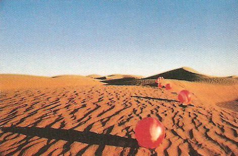
The story behind the names and bottle labels. I was browsing through my trusted copy of ‘Walk Away Rene’ – the work of Hipgnosis – and was reading about one of their first photoshoots for the album ‘Elegy’ by the Nice.

The image was taken in Morocco (there’s also a great story about what else they got up to) and features red plastic balls running along sand dunes at the end of of typical desert day. And then it hit me, there they were, my four fountain pen ink colours: Berber Blue, Desert Rose, Dune Yellow and Twilight Black. The labels are all created from the individual ink colours, demonstrating their depth of colour and tone and all feature 3 camels and 2 drivers making their way across the desert.

And don’t forget that Inktober 2018 starts in a few days time! Why not grab yourself a set and create 31 images out of pure fountain pen ink? Click here for the Shop

