
Nick Stewart is a creative designer, artist, calligrapher and educator from historic Rochester in England. In the word of fountain pens, especially inks, he is well known for his serious ink tests, exceptional chromatography swatches and experimenting with bleach, which results in incredible and pleasing ink-creations which I believe many of you have seen already. His blog /site is extremely inspirational and serves as a wonderful database of modern inks and colours available in the market, and I can assure you – he knows his stuff! If you have not seen it yet, forget my post and go to his blog straightaway.

After three years of swatch testing and experimenting with inks, making stunning chromatograms and checking responses to strong agents (like bleach), he decided to release his own ink. His knowledge and understanding helped him to design a unique ink. To do this he teamed up with famous British brand Diamine. However, instead of just putting his label on ink botlle produced by Diamine he was deeply involved in the making process.
A few weeks ago Nick kindly sent me a sample of his ink to play with and asked for my feedback. Here it is:

So what is this ink then?
Well, Nick’s creation is called Randall, after Randall Reeves who is an inspiring sailor currently engaged with the figure of eight challenge. The ink is a blue-black and I believe it to be reminiscent of the dark blue colour of deep seas and oceans where Randall is sailing. I think Nick and the Diamine team did a good job matching this colour and mixing components. The colour is well saturated, I must say but I like that. It gives richness and body to writing.

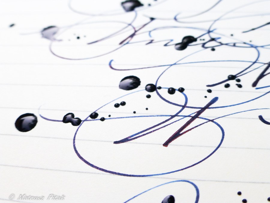
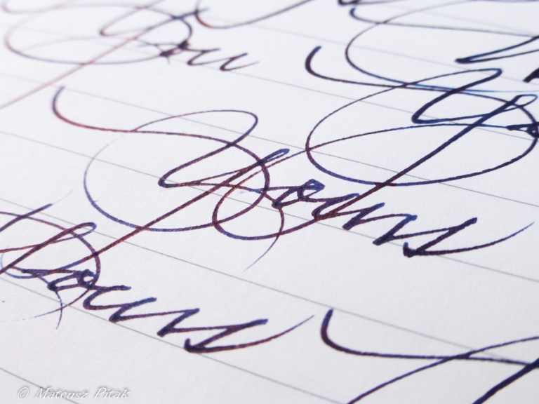
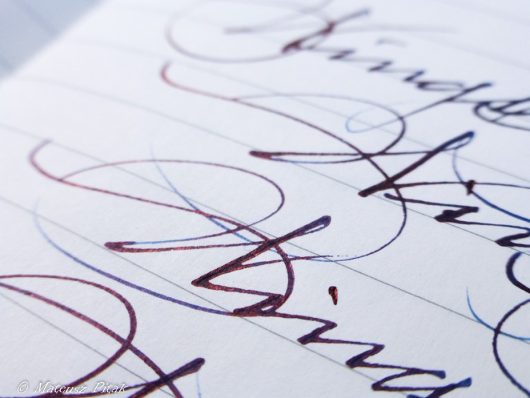
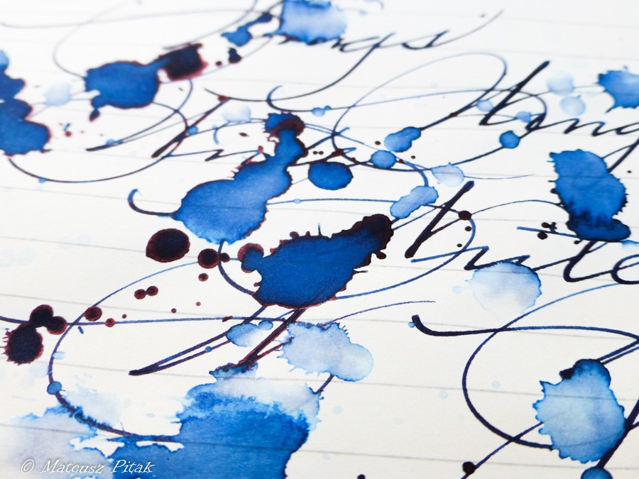
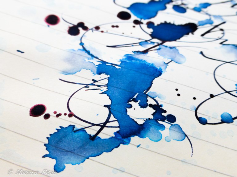
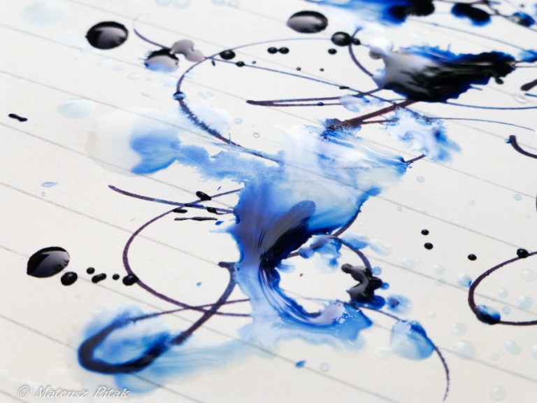
Depending on how you write and what pen and paper you are using at the moment – the blue or black component can be more pronounced, but in general this is a dark ink. However there are lighter hues towards royal blue, especially when it is diluted. The advantage of such high saturation is that Randall produces a satisfying reddish shen – very popular and welcome by fountain pen ink enthusiasts nowadays.
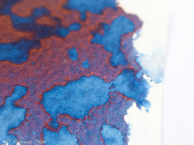

This not only enhances the colour about gives an additional edge to written text, as you can see in pictures below.


His ink flows very well and I have not noticed any problem with hard starting or skipping. This is a good result, especially taking into account how well the Randall dyes are saturated. It dries fairly quick too, which is another advantage. On Rhodia paper, text written with a Bock F nib was dry completely within 7-10 seconds. Not bad at all. Nick’s ink has very little scent – almost negligible.

…Sheen!
Nick’s Randall ink is not water resistant and it dissolves in water easily. This is actually good news, since some users were concerned that it may not be easy to flush pens. It should be relatively easy task to do, unless you leave the pen unused for few a weeks the ink may completely dry. In which case it may need a serious soaking.
Summarising, I really enjoy Nick’s Randall blue-black ink. The colour is not flashy and many pen users may say that is boring, but I think the purpose of Randall ink is different. If you are looking for a good quality ink you can depend on and use on a daily basis in the office, taking notes on important business meeting or simply journaling on the go, this ink will be for you. It flows well, it dries quick enough. It does the job done. Additionally, it is manufactured by Diamine, which gives assurance of quality too. I was really trying to find any significant downside, but I can hardly find any.
If you would be interested and you simply want to give it a try, please make contact with Nick. The 50 ml bottle costs £15.00 which is not super cheap but not too expensive either. If you are into the maritime that this ink is a must!
Much more about this ink you can read directly on Nick’s blog where he covers all aspects and gives a greater amount of examples and tests.
For all manner of ink and pen reviews, please check out Mateusz Pitak’s website: clumsypenman.com
