

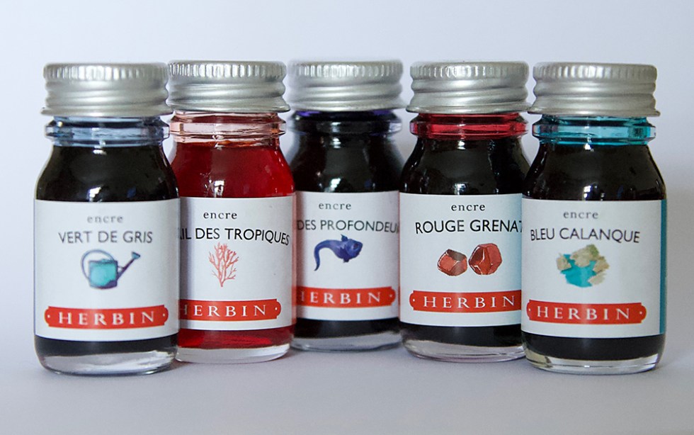
Anja from papierundstift.de has very kindly sent me the 5 new Herbin colours, not available in UK as yet. Please note that the ‘J’ is no longer there! It’s HERBIN. And what is immediately comforting is that these are most definitely from the Herbin family. That classic dull matte appearance with micro subtle chromatography is all part of that classic Herbin heritage. I’m actually very fond of this brand – great inks to paint with – and they have a vintage retro feel about them. Click for previous reviews.
Rouge Grenat – a rich dense ink compared to the norm and the bleach doesn’t have much of an effect in the more dense areas. This is a deep crimson in colour and now becomes the deepest red in the range.
Coral des Tropiques – is a thin reddish orange with a translucent quality to it. Flat and even with no hidden surprises.
Bleu Calanque – is pastel green that sits colourise between Bleu Pervenche and Diablo Menthe
Vert de Gris – is my favourite of the five and looks great with that beautiful retro dull gold bleach reaction.
Bleu de Profondeurs – appears very close to Bleu Nuit although there is a sheen in evidence and the colour is much darker when used for writing.


If you like what I’m up to, you can also follow me on social media:
Instagram: @quinkandbleach
Twitter: @nickistew
Facebook: Fountain Pen Inks & Bleach
I also have a portfolio of test art pieces at: www.behance.net/Nick_Stewart
