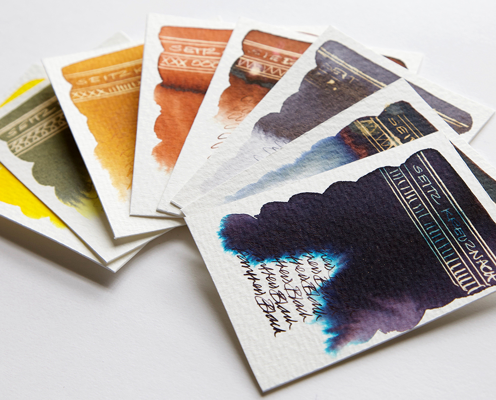
Seitz Kreuznach are the second to last mass batch of ink samples that I have left in the studio to swatch test. There are apparently 26 ink colours available of which I have 22. They seem an interesting outfit as they don’t just sell pens and inks! As to where these are made – there are theories that these possibly come from the same source as Mont Blanc and Montegrappa, somewhere in Austria? (I’m testing the Mont Blanc range after this batch so maybe there might be some similarities). But what did become apparent while I was testing, was the lack of any identifiable brand behaviour, which is a little odd. These inks really do look as though they could come from several different ink makers. It could be the way I have grouped them, but even so – I think they look a little awkward with each other?
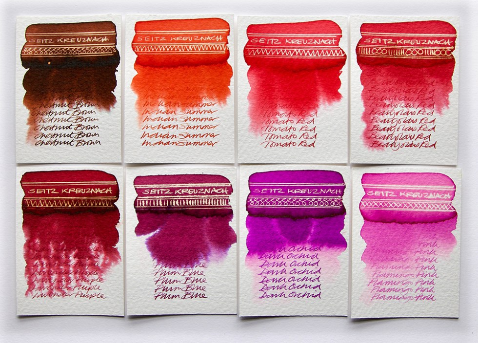
Let’s take the reds first. First of all, the Lavender Purple was wrongly labelled and I have a strong suspicion its actually Strawberry Red but it bizarrely behaves like a gall ink – look at the feathering! Plum Blue is a thick ink with some chromatography in evidence. Chestnut Brown, Indian Summer, Tomato Red and Dark Orchid are all of a medium density with no chromatography present just a little grade out at the edges. Flamingo Pink and Burgundy are thinner inks and bleed easily with water. A weak sheen is evident in all the swatches, they all react with bleach and have a decent definition when used for handwriting.
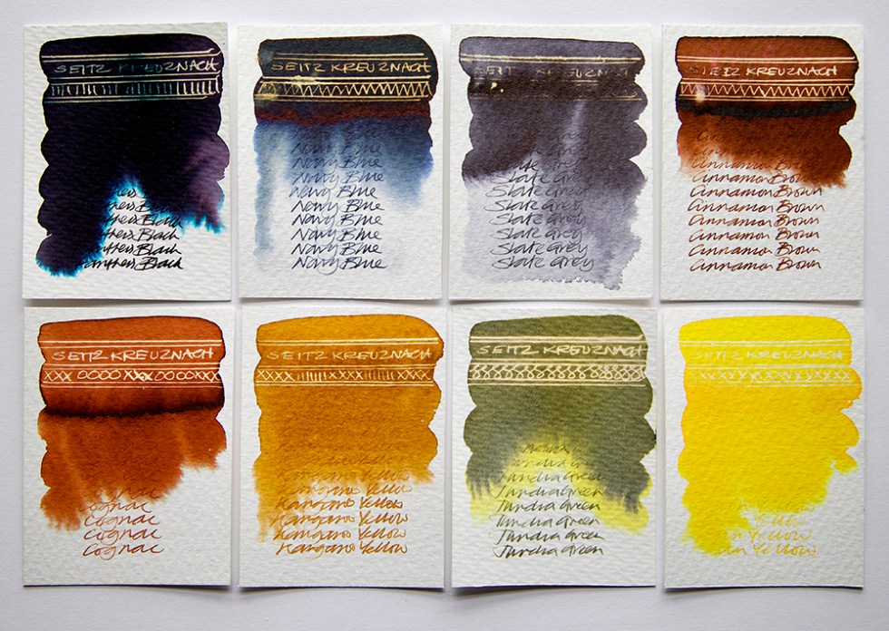
This next batch are the most awkward. Panther Black is a purple based black with a stunning bright turquoise bleeding out at the edges. Navy Blue is tonally weak with a hint of chromatography evident and has a great sheen. Slate Grey is resistant to bleach and blends erratically with water. Cinnamon Brown and Cognac are both dense inks with strong sheens. Kangaroo Yellow and Sun Yellow are just very flat. Tundra Green is another flat ink but with some interesting canary yellow chromatography going on. But do they look related? As handwriting fluids, they are weak.
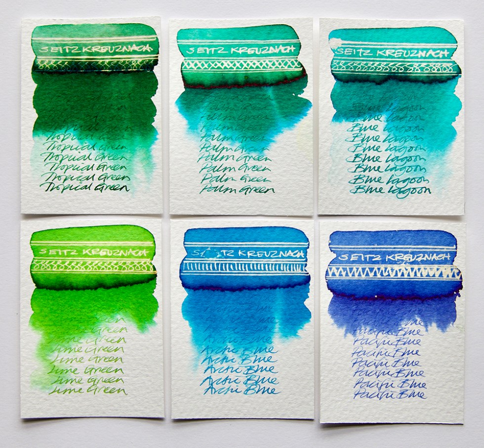
At least with this last batch, we can at least see some relationship between them, chromatography, strong sheens and a bright reaction to bleach. Pacific Blue is the only misfit, as it didn’t want to blend with water that much. Tropical Green, Palm Green, Blue Lagoon, Lime Green and Arctic Blue are in my opinion the most interesting of the range.
Maybe because the ink bottles look good with a convincing label, perhaps I was expecting a lot more from them? A strange bunch of inks, but hey! Swatch tested and done.
If you like what I’m up to, you can also follow me on social media:
Instagram: @quinkandbleach
Twitter: @nickistew
Facebook: Fountain Pen Inks & Bleach
I also have a portfolio of test art pieces at: www.behance.net/Nick_Stewart
