


Beaufort Inks describe themselves as manufacturers and distributors of high end products for discerning pen enthusiasts and pen makers. One of those high end products is a range of 6 fountain pen ink colours that United Inkdom have asked me test.
And lovely deep colours they are too. These are well made quality inks and the behaviour traits of all 6 appear familiar!
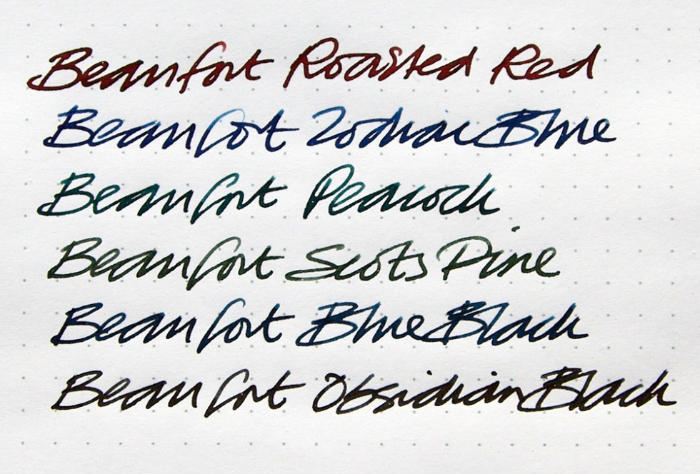
Roasted Red – A gorgeous red anti-foul colour that bleeds erratically when applied to a wetted surface and bleeds out pinks at the outer edges. A deep sheen is also evident. A well defined gold effect can be seen when subjected to bleach. A deep brown red when used for writing.
Obsidian Black – Breaks down into a deep dark grey bleeding out greys and grey blues when applied to a wetted surface. A deep sheen is also evident. A dull gold effect can be seen when subjected to bleach. A dark black when used for writing.
Blue Black – A rich dark blue bleeding out royal blues when applied to a wetted surface. A deep sheen reflecting reds is also revealed. A well defined gold effect can be seen when subjected to bleach. A deep blue black when used for writing.
Zodiac Blue – A deep deep royal blue that bleeds out turquoises when applied to a wetted. A deep sheen reflecting pinks is also evident. A well defined white gold effect can be seen when subjected to bleach. A fairly dark blue when used for writing.
Peacock – A deep teal colour that bleeds out dirty turquoises when applied to a wetted paper. A deep sheen reflecting reds is also evident. A well defined white gold effect can be seen when subjected to bleach. A green blue when used for writing.
Scots Pine – A deep dark green that gradates out evenly when applied to a wetted surface. A deep sheen is also evident. A well defined white gold effect can be seen when subjected to bleach. A green when used for writing.

These inks are all rich dark colours. Whether or not there could have been some lighter colours to vary the tone of the range, is open to debate. From a creative perspective these are good and if I have recognised the manufacturer correctly, the quality is assured.
But as a little sign off, and a little bit of mischief too – if I had to select an ink manufacturer to produce me a range of colours that summed up the essence of The Scottish Highlands…. KWZ would be my one and only choice. Just saying. Click here.
If you’re interested in inks and want to know more about to utilise them in creative ways, I’m running 2 workshops on Saturday 17th March at my studio here in Rochester. Click here for details.
If you like what I’m up to, you can also follow me on social media:
Instagram: @quinkandbleach
Twitter: @nickistew
Facebook: Fountain Pen Inks & Bleach
I also have a portfolio of test art pieces at: https://www.behance.net/Nick_Stewart
