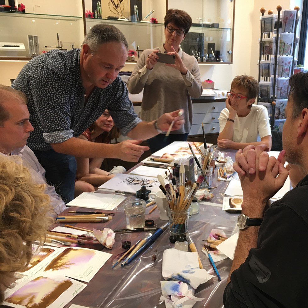

Saturday 23rd September was my first first proper ink and bleach workshop and an international one at that! Very kindly hosted by Catherine Van Hove at her gorgeous Sakura Fountain Pen Gallery in Diest, Belgium, with ink kindly supplied by Robert Oster.
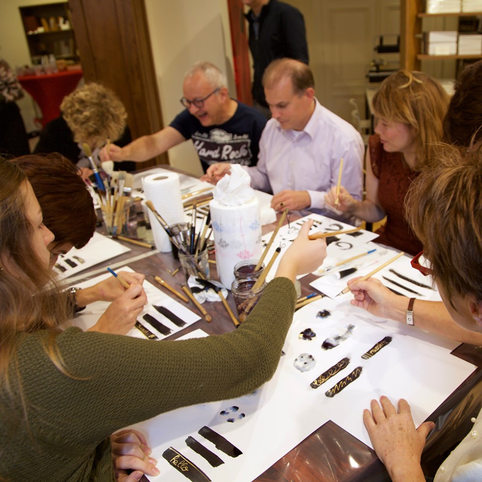
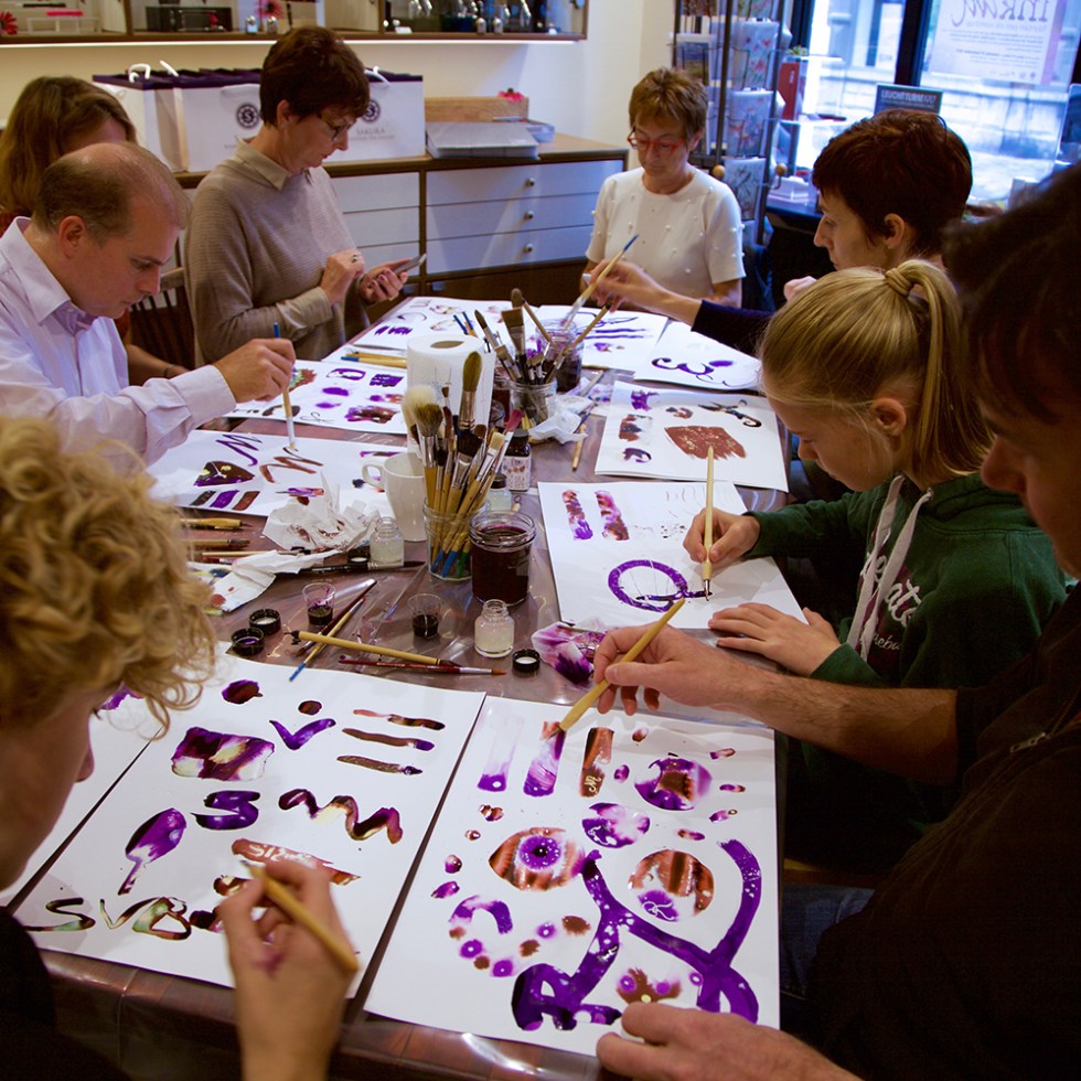
I took the ink enthusiasts while Janine took the handwriting enthusiasts. Twenty two students attended my morning and afternoon sessions. With only two hours a session I set the students four tasks to complete with approximately twenty five minutes per task.
The first task was to investigate a few drops of Parker Black ink and observe their chromatic behaviours when added to wetted areas on cartridge paper. We looked at the colours that came out solution and the serendipity effect of the drying patterns.
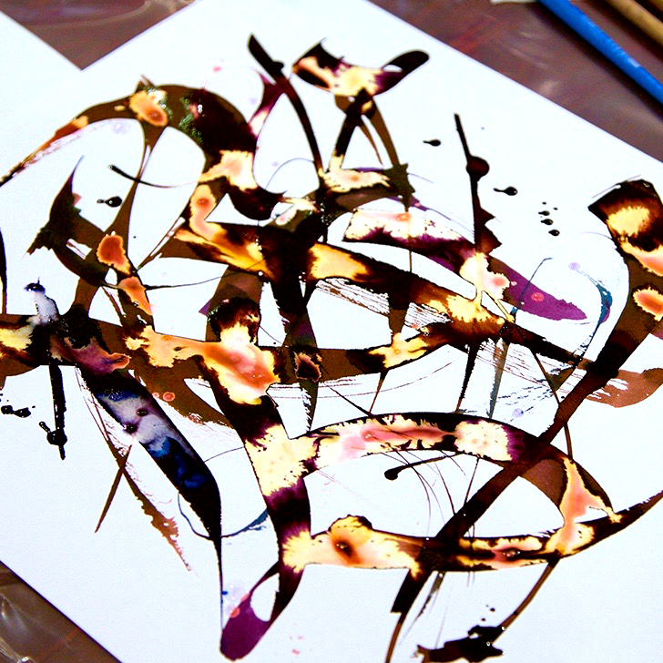
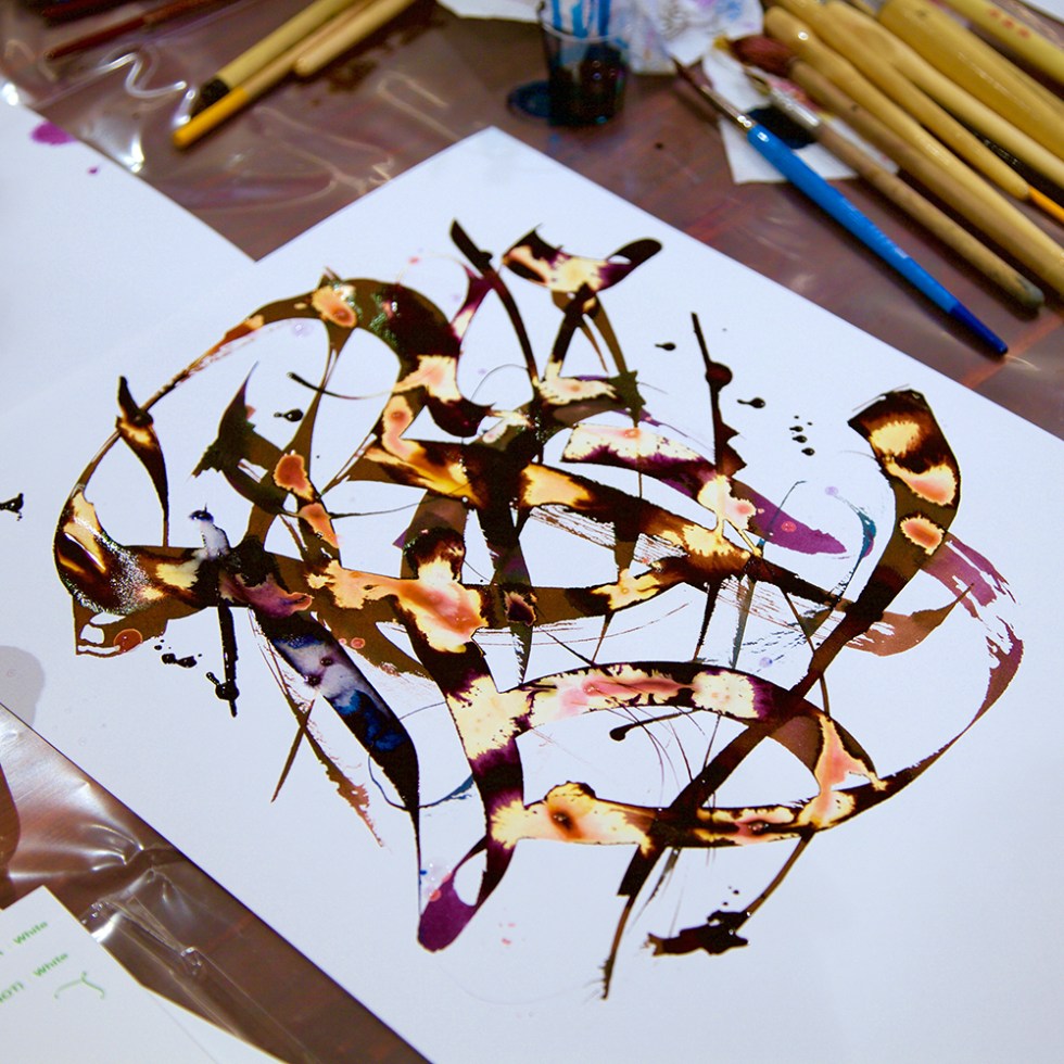
The students were then asked create a series of black shapes which once semi dry, were decorated with marks created with dip pens and a 50:50 concentration of bleach and water. Which is how I achieve the patterning on my swatch cards.
Task two involved blending two coloured inks together and repeating the task one again.
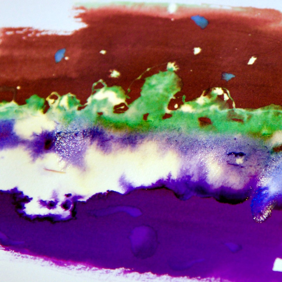
As well as observing the subtle chromatography and blending outcomes between the colours, they noticed that the bleach can affect different colours in different ways. In this case turning areas of the brown ink green and areas of the purple ink electric blue.
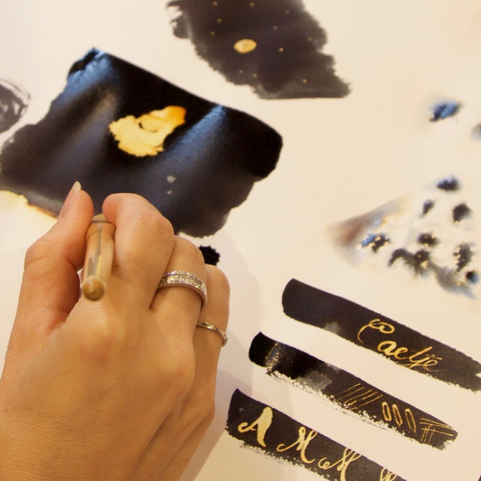
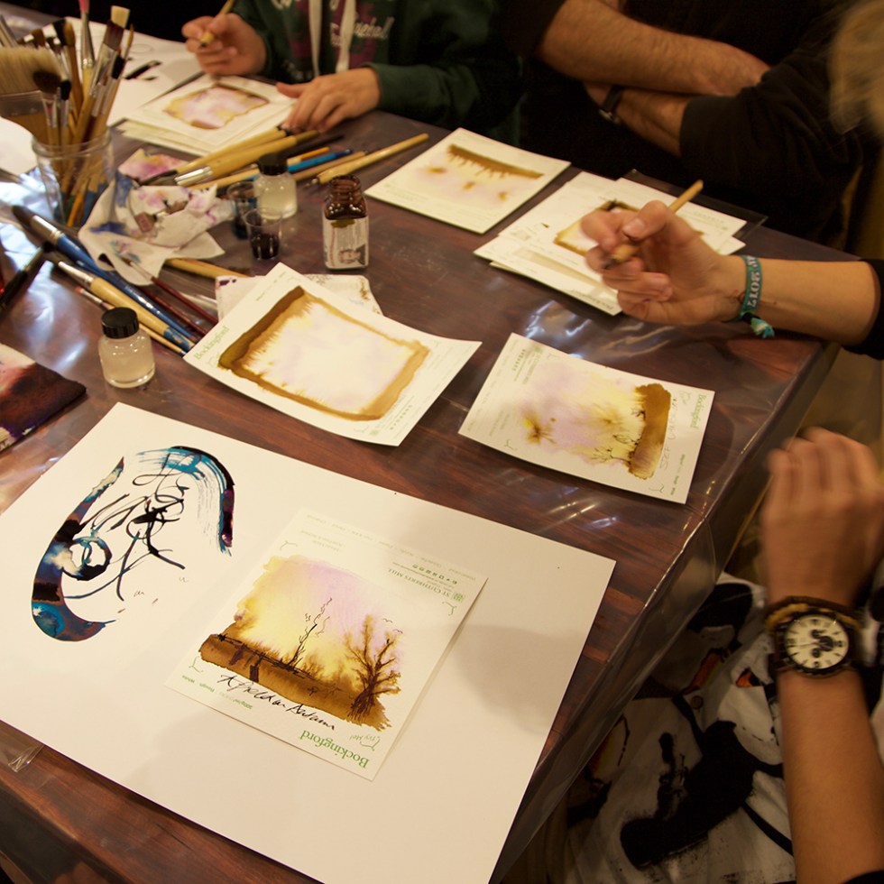
Task three involved looking at paper textures. St Cuthberts Mill very kindly provided some watercolour paper samples which were perfect for allowing the students to de-construct a few drops of Noodler’s Rome Burning.

The heavier the water colour paper, the more intense the colours will appear with beautiful purples and yellows bleeding out of the brown. The lesson learned here, is that if you use cheap paper, you will always be disappointed. Use a 300lb Bockingford watercolour paper and you’ll never use anything else!
Once dry, they used their dip pens to add illustration and handwriting with the original Noodler’s Rome Burning Ink. Now that really is a lot from a little!
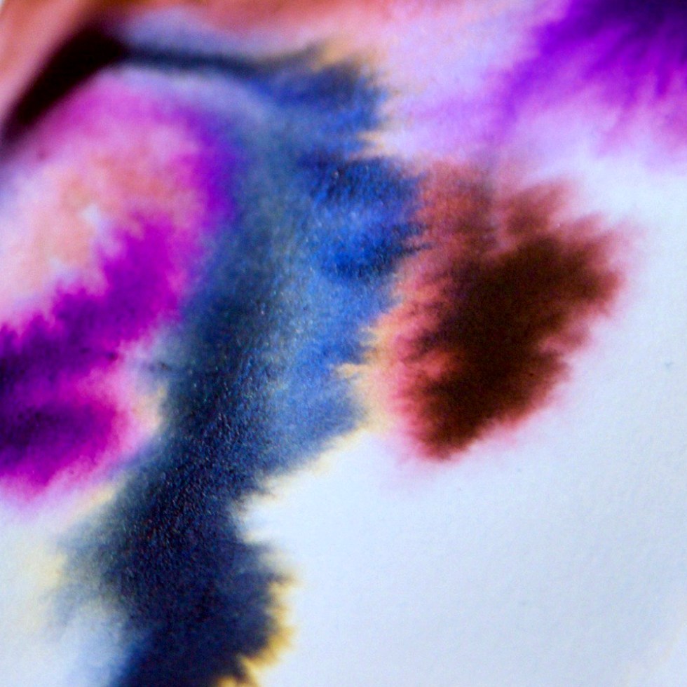
The final task involved blending metallic inks together using automatic pens. A good quality cartridge paper is perfect for this. Using Herbin Amethyste de l’Oural, Caroube de Chypre and Emerald de Chivor the students were encouraged to use both the full width of the pens and to then turn the pens sideways to achieve a thin line giving a lovely linear contrast. Alternating the colours and then flooding colours and bleach into the lines while still wet gave some stunning outcomes. And once they were fully dry, the sheens and the metals appeared too. So, by blending 2 or 3 metal inks they got the base colours, the sheen colours, the metal colours, the blend colours AND the bleach colours. So much from so little! What’s not to like?
I kept the tasks easy for the students to not only accomplish within the time available but also to easily understand – as not all of the students were fluent in English.
If you really want to understand your fountain pen ink collection – KEEP IT SIMPLE! Chromatography, paper surface, bleach concentration. Keep those three things in mind and you’ll be fine.
And as Ritsaert Lieverse commented “I didn’t fully appreciate the incredible potential this medium has to offer.” You do, once you know how.
Many thanks to all the students who attended. I think they found it easier than they feared. And the work they produced was outstanding. All the work shown is theirs.