
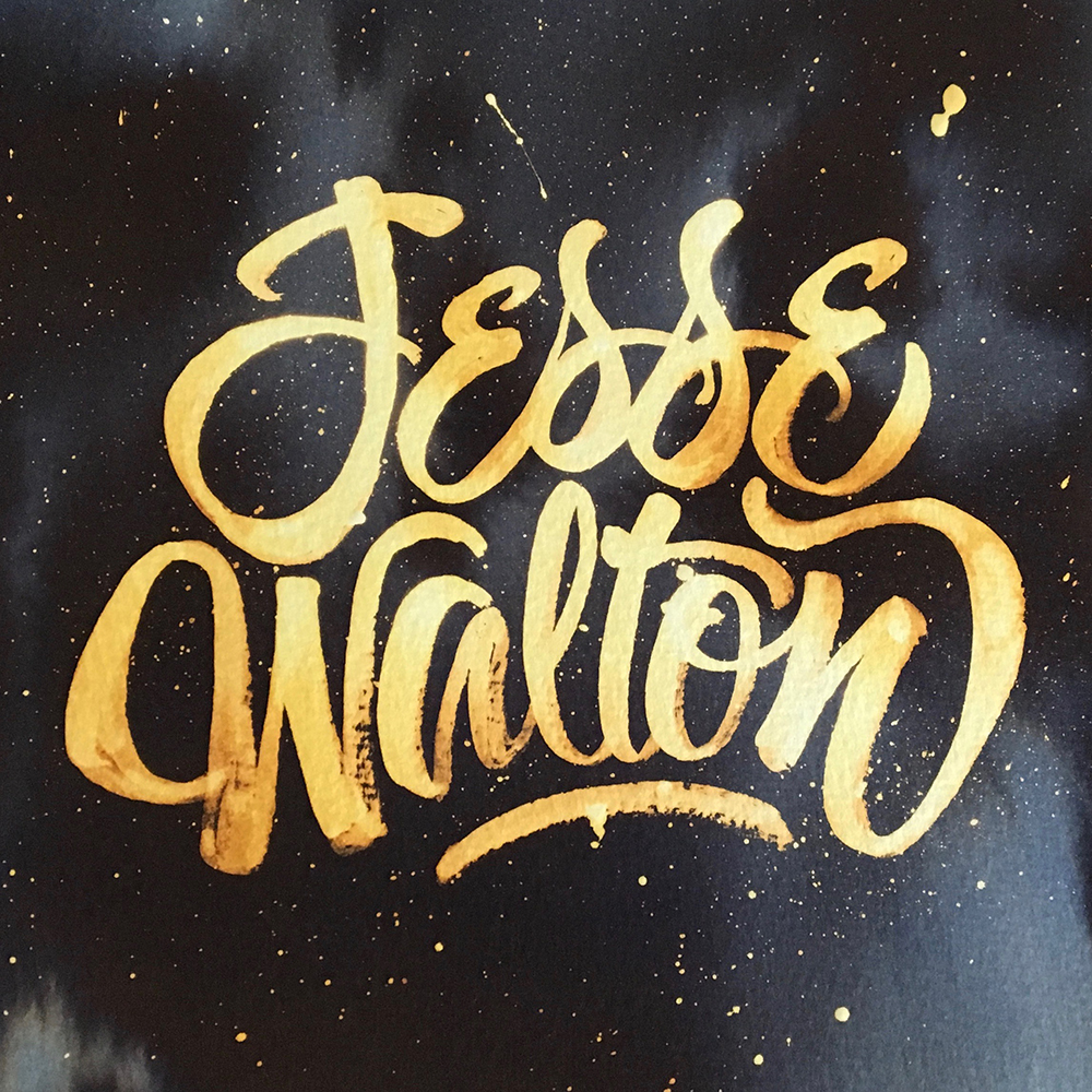
I have a keen interest in lettering, type and calligraphy. I’m by no means the expert but I can do it. I was recently asked to create an identity for an upcoming singer songwriter, Jesse Walton, whose style is fairly laid back – folk, retro, troubadour. He’s a good multi instrumentalist and has produced much of his initial album by himself – so good studio skills too. I wanted the marque to reflect his freedom, creativity, craftsmanship and professionalism. I’ll post the CD and CD case artwork once it comes back from the printers. In the meantime here’s a quick Quink and bleach version for you.
Just to say, the bleach effect may dull after a couple of hours, not always, but it can! It’s often a good idea to take a hi-res image of the artwork fairly soon after completion.
