

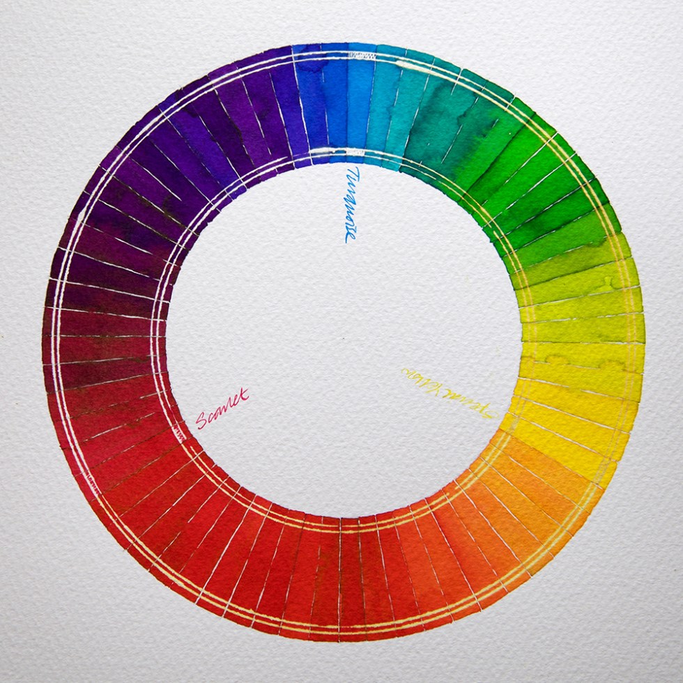
I have been trying to get a colour wheel completed for a while – just to demonstrate that for the ultimate art journal palette you don’t need every colour of ink available – you can travel the world with a limited palette for both your writing and illustration purposes. I also wanted to show how compliant and easy to use fountain pen inks are for creative purposes – other than handwriting.
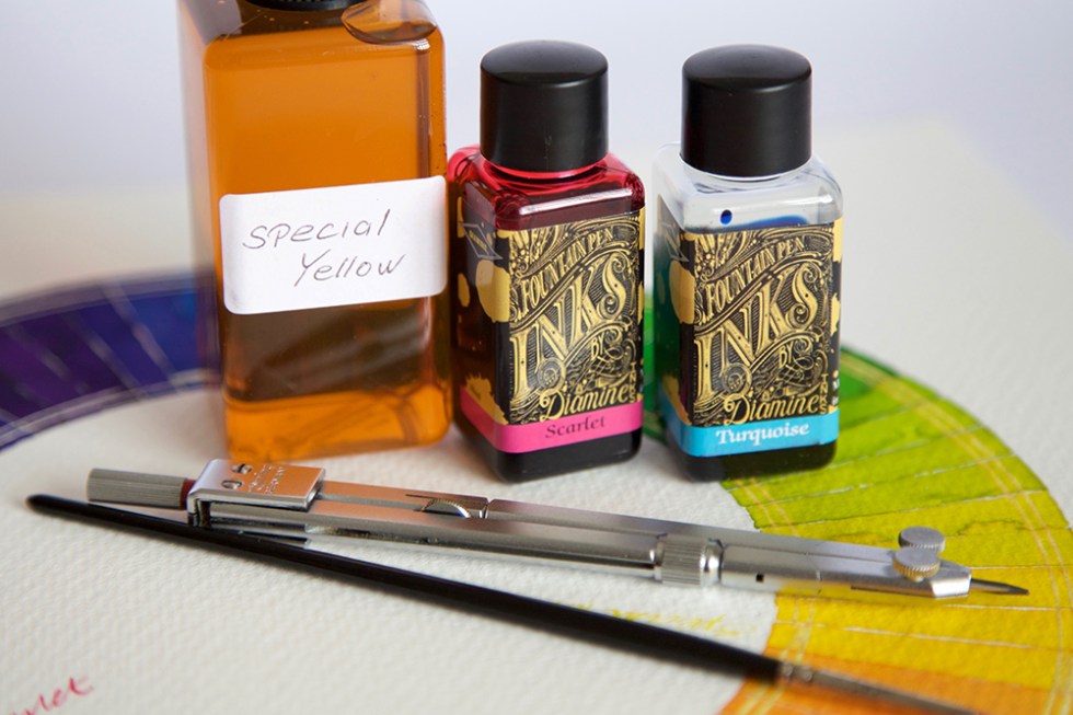
I took 3 Diamine colours: Special Yellow, Scarlet and Turquoise and carefully worked my way around the wheel. What I wanted to demonstrate is how similar fountain pen inks are to watercolour inks in terms of colour mixing – while still retaining their chromatic, shading and sheening qualities. ALL of these colours are from mixing 2 colours together! And if I wanted to create ochre variants, all I have to do is carefully mix the 3 colours together! You don’t use much ink. Literally a drop at a time. The colours are still vibrant with no cloudy sediment and we still have that wonderful and unique reaction with bleach. I haven’t shown it here, but adding various amounts of black ink will also add to the tonal values and ochre creation. Give it a try?
If you’d like to know more about this and what I’m doing with fountain pen inks, please take a look at the Mission Statement.
Artwork and test on Bockingford 200lb watercolour paper using a watercolour brush and dip pen with titanium zebra G flex nib. Inks kindly donated by Diamine.
Just for the record – I do this for myself, I receive no remuneration what-so-ever and I tell it exactly how I see it.
PS – I will shortly be swatch testing the complete range of Krishna inks! Just saying!
