
Claudia Astorquiza of Bauer Inks has very kindly sent me a rather large haul of ink samples to test. The tests are now complete and ready for viewing:
For those of you who follow my project, I have already reviewed the majority of the PW Akkerman range of fountain inks and you can see that review here>>. At that time I was somewhat dismissive of the range because of the similarity in behaviour and appearance with Diamine Inks. There are those who believe they are Diamines and those who don’t.
My unique swatch test indicates that they are one and the same but that’s not an issue for me, as Diamine are superb and PW Akkerman package their inks in the most gorgeous bottle. I still need to get hold of one of them!
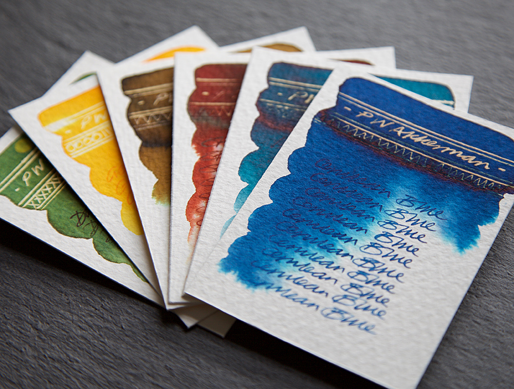
So, here are 6 colours from the Dutch Masters Series – thanks Claudia. I couldn’t find exact matches for these BUT once again some of the Diamines were very very close indeed. As these are rich inks, their behaviour and colours are similar to colours from the Cult Pen Diamine and the Diamine Anniversary collections both of which are excellent and have been reviewed on this blog. Check them out.
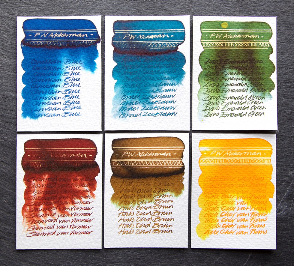
Cerulean Blue – A strong mid blue with turquoise evident when blended with water. A decent reaction with bleach turning gold. Strong dark glossy sheen.
Israel Zeeblauw – A strong dark turquoise blue with no evidence of chromatography when blended with water. A decent reaction with bleach turning gold. Strong dark glossy sheen with hints of pinky red.
Dou’s Emerald Green – An uneven forest green revealing subtle yellows and blues when blended with water. A great reaction with bleach turning a yellow gold. Deep dark green sheen.
Steenrood van Vermeer – A strong dark red clay colour with a hint of chromatography when blended with water revealing wisps of salmon pink. Bleeds an abstract pattern with water. A muted reaction with bleach turning gold. Very strong dark glossy sheen.
Hals Oud Bruin – A beautiful ochre brown washing out greens and blues when blended with water. A great reaction with bleach turning neon gold. Heavy dark brown sheen.
Gele Oker van Frans – A gorgeous uneven cadmium yellow washing out light yellows when water blended. A great reaction with bleach turning a white neon gold.
No duds here. All 6 are lovely inks, write beautifully, look great and with great creative possibilities to boot – as you’d expect!
Buy my artwork: I have finally given into pressure and opened an ETSY shop. If you’d like to buy any of the original art featured on my site you can purchase it here. I will do my upmost to add value to your investment over time – click here to access the shop . I am also accepting commissions for swatch tests. So, if you have a favourite ink(s) and some words for someone special, or maybe just for yourself, drop me a line and we can discuss further.
If you’d like to know more about this project, please take a look at the Mission Statement.
All tests on Bockingford 200lb watercolour paper using a dip pen with titanium zebra G flex nib for the bleach work and a Noodler’s Ahab for the ink work.
Ink samples very kindly donated by Bauer Inks
Just for the record – I do this for myself, I receive no remuneration what-so-ever and I tell it exactly how I see it.
