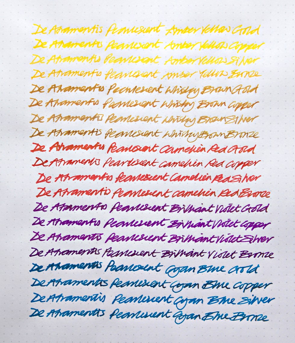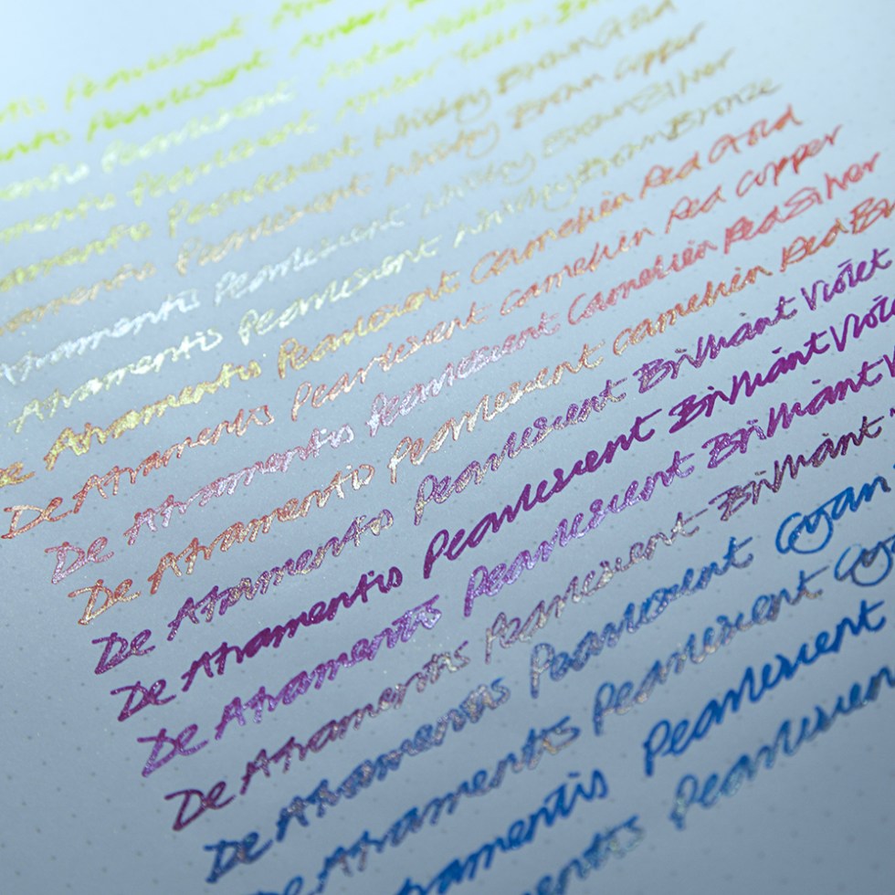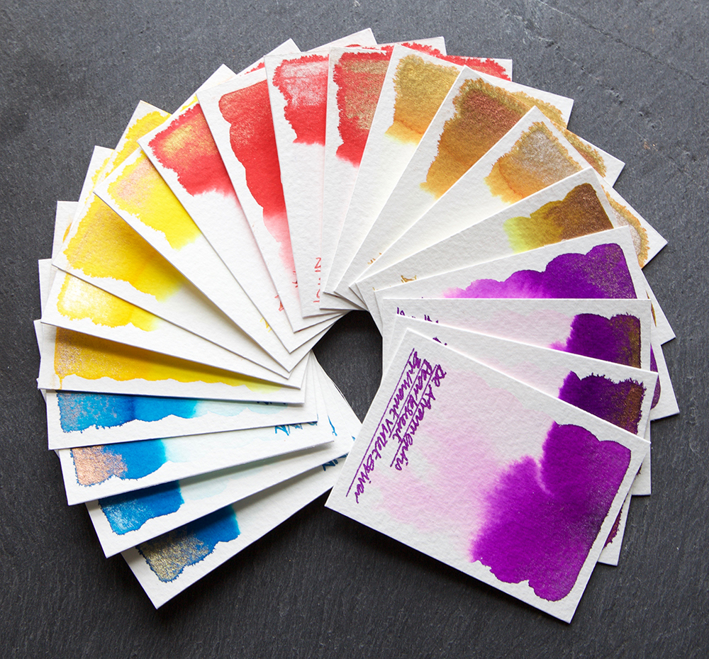

Here is half of the De Atramentis Pearlescent range. The range consists of ten colours – each colour has four metal finishes – Bronze, Silver, Gold and Copper. Here we have Cyan Blue, Brilliant Violet, Carnelian Red, Whiskey Brown and Amber Yellow and their compliment of metal finishes. Apart from one colour – Whiskey Brown Bronze which shows a hint of character, I found these inks boring and surprisingly unstable. Of crucial concern for handwriters is that all of these inks bleed – some very badly – even on Rhoda dot paper! But why so many metal finishes for a single colour? Copper and red for example, why bother, you can hardly see the shimmer? AND… once dry, the metal dust lifts off straight away at the slightest draught or touch! I don’t think that this was a very well thought out concept. If this was a rushed effort to jump on the Shimmer Ink band wagon, then these have failed… miserably.
NOW! De Atramentis Ebony or Apricot or Olive Green or Adular with a metal or metals would be worth getting excited about! De Atramentis are, without doubt, very good ink makers but these Pearlescents are VERY disappointing.
Both the Herbin 1670 range and The Diamine Shimmertastic range are far far better, more interesting, dynamic, beautiful and creative. In my honest opinion, if metallic inks are your thing, Diamine Shimmers are the best value on the market, and with the poor value of Sterling, what are you waiting for! Check out my Shimmer Ink reviews here and here>
All tests on Bockingford 200lb watercolour paper using a Desiderata Daedalus and a Noodler’s Ahab.
Many thanks to Amber Lea for the samples.
Just for the record – I do this for myself, I receive no remuneration what-so-ever and I tell it exactly how I see it.