
But first, as I predicted at the end of last year, 2016 was always going to be a good one, and it certainly hasn’t disappointed. Through the Fountain Pen Network I met Claudia of the recently launched Bauer Inks who introduced me to two new brands – Robert Oster Signature Inks, from Australia, and KWZ Inks, from Poland. If you haven’t tried them – these are a MUST HAVE for any serious Ink Geek! Many thanks Claudia! Also of note was the launch of Blackstone Inks also from Australia. And more recently, it was great to hook up with Phil Davies at Diamine and put their new range of Shimmer Inks to the test which was great fun and of course J Herbin added another ink, Caroube de Chypre, to their 1670 collection. The Pelikan Edelstein and Faber-Castel ranges were both great fun to test as were the Kaweco and Caran d’Ache even though they might be one in the same? Akkerman also turned into mystery – with a distinct similarity to Diamine? For me though, Stipula, Cult Pen Diamines, de Atramentis and Rohrer and Klingner all proved to be test winners and unique, BUT, the biggest learning curve has to be the ongoing testing of the Noodler’s range…
It’s an been enlightening year to say the least. Far more than just a fringe art fad, this medium not only provides a greater visual continuity for combining illustration with calligraphy – but its unique combination of chromatography and bleach seamlessly unites art with chemistry! Art and science combined, now that really is food for thought. The last year has also revealed that there is a large and varied international audience interested in this ‘quirky’ niche area of fountain pen ink art. Follower numbers have increased on WordPress, Facebook, Twitter, Pinterest and Instagram combined with increasing hits via Reddit, FPN and Google.
Earlier in the year I ran a creative project on behalf of Rochester Cathedral under the banner of ‘Illuminating Beasts’. This was my third big public project using inks and bleach. With 68 students (ranging from ages 6 to 82 years – some with special needs) over 6 workshops, and each group revealed amazing outcomes. Of particular note – in spite of being forwarned that special needs students wouldn’t engage, they did exactly the opposite! They were totally engrossed. The elderly ladies group was also, allegedly, going to be challenging… once again, the total opposite. All of these ladies had gorgeous pre 1950’s cursive handwriting and following a few quick demonstrations just ‘ran with it’ and stayed for 4 hours! They had to be gently prised out of the studio. As a group, they have asked the cathedral to run the workshop again. Interesting?
So, looking ahead, if we dare, could fountain pen ink art potentially become:
• a creative hobby for leisure time and general mindfulness?
• an art and illustration medium for high school and college students?
• a creative and educational tool for special needs students and the elderly?
• a invigorating medium to promote creative thinking within a corporate environment?
• an accepted art genre/medium in its own right?
Questions questions questions. What do you think?
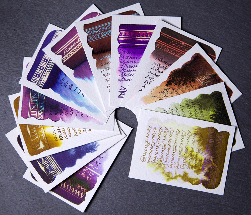
And so without further ado – 463 fountain pen inks put to the test in 2016 – here are my TOP 12:
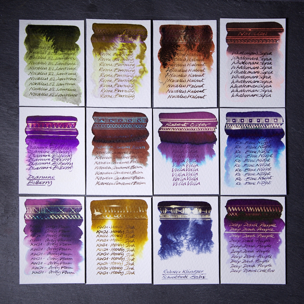
Noodler’s El Lawrence – A deep dark soot floating on top of a blend of bright lime green blending into an uneven dirty grey. No reaction with bleach. Writes as a deep olive green. Difficult to control but what a gorgeous swatch.
Noodler’s Rome Burning – A weird kind of water resistant brown ink that does the weirdest things. Bleeds weirdly from a mid brown into a bright yellow on top of a pale purple. A slight reaction with bleach with hints of purple. My number 1 ink of 2016! And I dedicate this to Jessica Seacrest – check her out! Great reviews and artwork!
Noodler’s Walnut – A gorgeous chestnut brown that floats a granular soot over a rust brown bleeding a light ochre into pink. A very slight reaction with bleach when used on the rust only. Difficult to control but what a gorgeous swatch.
Noodler’s Whaleman’s Sepia – A deep deep brown that bleeds greys and salmon pink. A beautiful dusky pink when subjected to bleach. Works well with Rome Burning!
Diamine Bilberry – A deep purple that bleeds out to pink with a stunning reaction to bleach of gold and pink.
Kaweco Caramel Brown – A lovely mid brown that bleeds a green blue at the edges and turns a curious turquoise when subjected to bleach
Robert Oster Viola – A gorgeous mid purple that bleeds lots of turquoise revealing a stunning neon gold when subjected to bleach. Great sheen too. The whole range is stunning!
Robert Oster Blue Night – A lovely deep blue purple that bleeds deep blue purple and turquoise with a stunning neon gold when subjected to bleach. Great sheen too. The whole range is stunning!
KWZ Ink Grey Plum – An uneven purple that bleeds feint pinks and turquoise at the edges. An uneven reaction to bleach with golds and turquoise. A gorgeous range of colours.
KWZ Ink Honey – An uneven olive coloured ink that bleeds honey and gold yellow. A limited reaction to bleach. A gorgeous range of colours.
Rohrer and Kingner Schreibtinte Salix – A deep dark blue that bleeds with a weird pattern common with galls additives. A bright neon effect when subjected to bleach.
Cult Pens Dark Purple – A deep dark purple with a fantastic tonal range. Bleeds out to blue greys. Great bleach reaction turning deep gold and crimson. The whole range is stunning.
Not an easy choice, but in the spirit of what this project is about, they are all stunning!
Created on Bockingford 200lb watercolour paper using a Desiderata Daedalus with titanium zebra G flex nib.
Just for the record – I do this for myself, I receive no remuneration what-so-ever and I tell it exactly how I see it.
