

Firstly, many thanks to Robert Oster for sending me these to test. All the hype about this new range of inks is certainly justified!
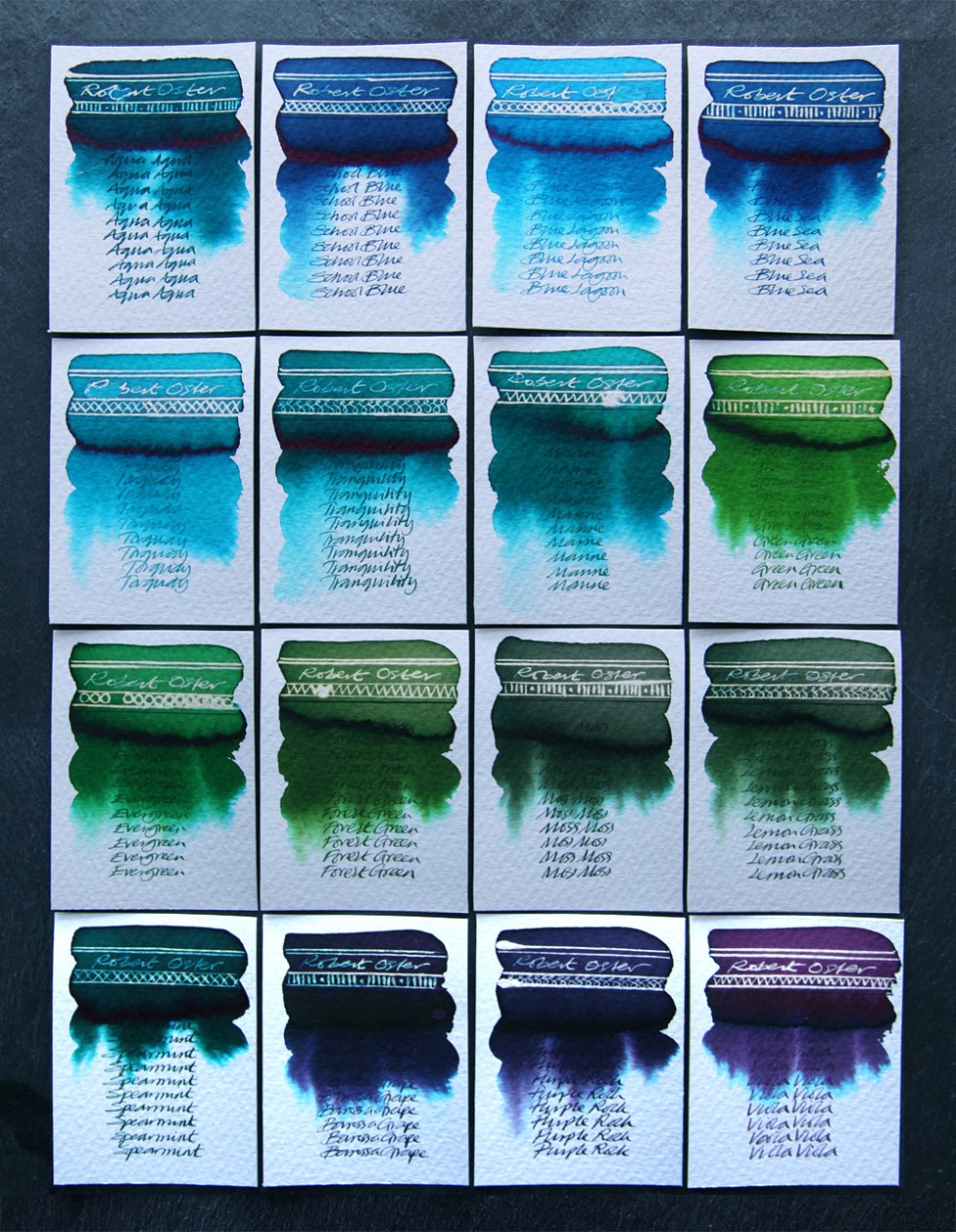
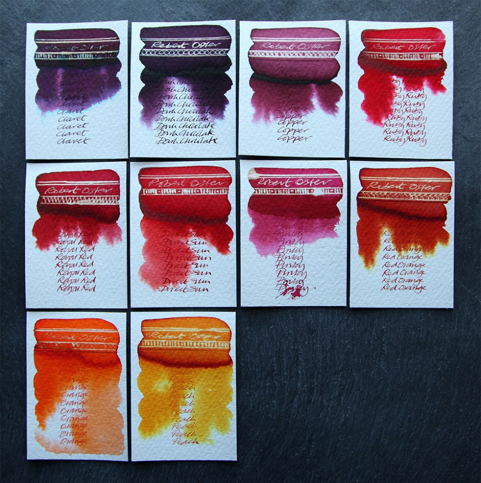
As you can see, the colours are vibrant and all react with bleach. They don’t readily mix with water but creep slowly revealing all their hidden hues at the outer edges of the swatch. One other bonus delight is that they all sheen beautifully in the more concentrated areas! I wasn’t really into sheening – but I am now. Check out that sheen colour on the Dark Chocolate!
I can’t not like these – hidden hues, a positive bleach reaction and sheening! From a creative angle these are a wonderful range of colours. As handwriting inks, I can’t fault them either – even the Torquay writes and reads well. If there is one tiny drawback, it’s when blending the inks with water. Because they creep slowly you will need to agitate the paper to ensure movement down the swatch card!
The test art was painted with Dark Chocolate, Pinky, Peach, Red Orange, Blue Sea and bleach on Bockingford 200b watercolour paper.
One thing I can confirm – these inks are consistent across the range. They are not watery like a Diamine but they are not too thick either. Interestingly, as writing inks they are all quite dark, so to see the range and intensity of colour they produce is a real joy. The Dark Chocolate is absolutely fabulous! Treat yourself!
Inks sourced from Robert Oster – https://www.robertoster.com.au
All tests on Bockingford 200lb watercolour paper using a Kaweco dip pen with a zebra G flex nib for the bleach work and a Desiderata pen with a titanium zebra G flex nib for the handwriting.
Just for the record – I do this for myself, I receive no remuneration what-so-ever and I tell it exactly how I see it.
