
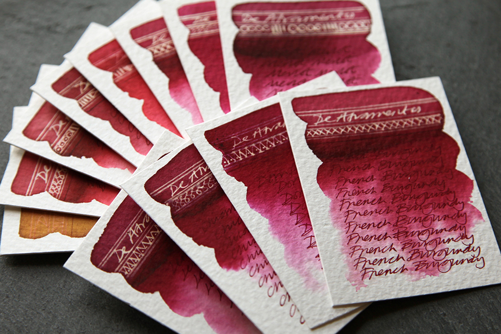
 This group of test swatches feature the De Atramentis Wine Inks of which I have managed to source twelve. Six are currently available and the other six more difficult to source.
Wine inks are particularly interesting, as back in the not too distant past, dark rich red wines were used for writing and illustration. As I only have very small sample vials, I can’t honestly say that I detect any heady wine aromas but allegedly, these inks are made from wine grapes and do have the corresponding wine aroma one would expect to smell when drinking the real stuff.
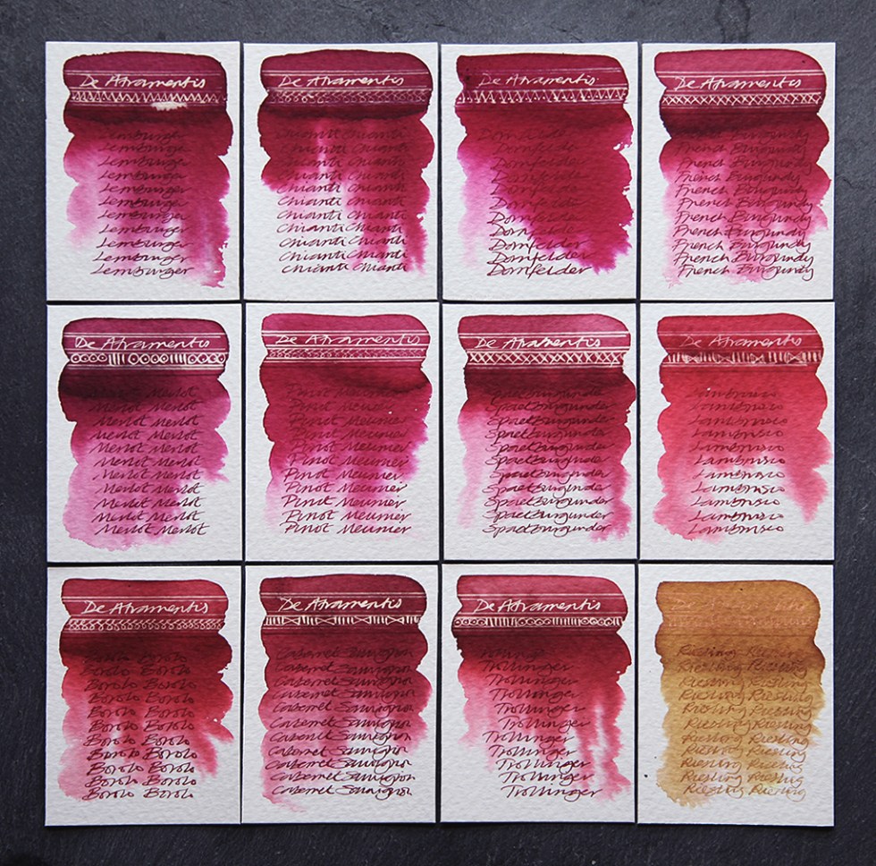
Now, whether or not the colours are absolutely true to the grape colour is open for further discussion as I’m certain all these inks have to have been colour enhanced as pure wine would be too translucent for the job in hand and the Riesling certainly demonstrates this. Interestingly, although the eleven red swatches are all very close in colour each one is unquestionably unique – and I hope that my photography is up to the job to show this.
Lemburger – A deep rich crimson that blends easily with water fading out with a hint of blue grey in the lighter areas. Turns a white gold when reacting with bleach. A deep crimson ink when written with but bizarrely, it’s a yellow crimson as opposed to the swatch which is a blue crimson.
Chianti – A deep rich crimson that blends easily with water fading out with a hint of blue grey in the lighter areas. Turns a white gold when reacting with bleach. A deep crimson ink when written with. A touch more yellow than the Lemburger.
Dornfelder – A deep rich crimson that blends easily with water fading out with a hint of blue grey in the lighter areas. Turns a white gold when reacting with bleach. A deep crimson ink when written with but bizarrely, it’s a yellow crimson as opposed to the swatch which is a blue crimson. The background swatch is a shade more pink than the Lemburger.
French Burgundy (Bespoke limited edition) – A deep rich crimson that blends easily with water fading out with a hint of blue grey in the lighter areas. Turns a white gold when reacting with bleach. A deep crimson ink with a hint more yellow when written with. A touch more yellow than the Chianti.
Merlot – A deep rich dusty crimson that blends easily with water fading out with a hint of blue grey in the lighter areas. Turns a white gold when reacting with bleach. A deep crimson ink when written with but bizarrely, it’s a yellow crimson as opposed to the swatch which is a blue crimson. Almost identical to the Lemburger.
Pinot Meunier – A deep rich crimson that blends easily with water fading out with a hint of blue grey in the lighter areas. Turns a white gold when reacting with bleach. A deep crimson ink with a hint more yellow when written with. A touch more yellow than the French Burgundy.
Spaetburgunder – A deep richcrimson that blends easily with water fading out with a hint of blue grey in the lighter areas. Turns a white gold when reacting with bleach. A deep crimson ink with a hint more yellow when written with. Similar to the French Burgundy.
Lambrusco – A deep blood red that blends easily with water fading out with a hint of blue grey in the lighter areas. Turns a dull white gold when reacting with bleach. A deep red ink with a hint more yellow when written with.
Borolo – A deep blood red that blends easily with water fading out with a hint of blue grey in the lighter areas. Turns a dull white gold when reacting with bleach. A deep red ink with a hint more yellow when written with. Slightly darker than the Lambrusco.
Cabernet Sauvignon – A deep dusty blood red that blends easily with water fading out with a hint of blue grey in the lighter areas. Turns a dull white gold when reacting with bleach. A deep red ink with a hint more yellow when written with. Slightly darker than the Lambrusco.
Trollinger – A deep blood red that blends easily with water fading out with a hint of blue grey in the lighter areas. Turns a dull white gold when reacting with bleach. A deep red ink with a hint more yellow when written with. Slightly less yellow than the Barolo.
Riesling – A yellow ochre that blends easily with water fading out with a hints of yellow in the lighter areas. A limited reaction with bleach. A yellow ochre coloured ink with when written with.
Which wine ink would a wine critic choose?
Inks sourced from stationeryshop.scotland@gmail.com and www.gouletpens.com
All tests on Bockingford 200lb watercolour paper using Frankenflex pen Jinhao 159 with titanium zebra G flex nib.
