
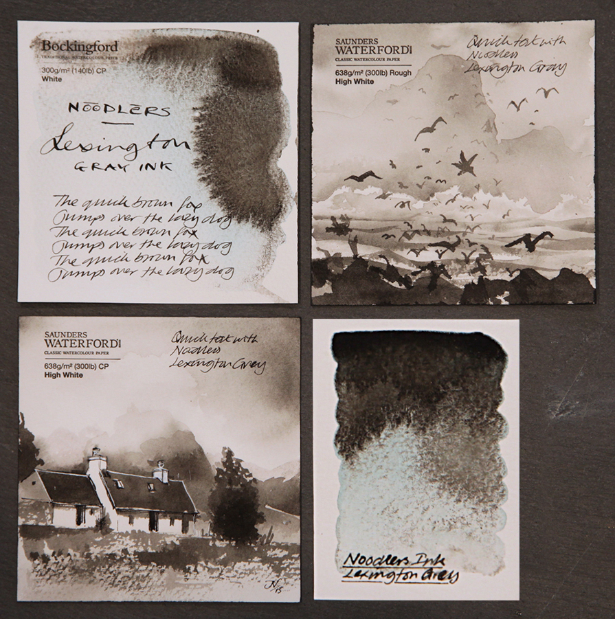
I haven’t had much opportunity to explore the Noodlers range of inks, but I was sent this sample of Lexington Gray by Jonas Heineman of Massdrop and attached are some very quick tests to show what it can do.
Lexington Gray is the strangest writing ink I have come across to-date. It behaves like a black watercolour paint with a beautiful subtle transparent blue that reveals itself when washed with water and used on watercolour paper. Now, the interesting thing is this, when used on a Bockingford watercolour paper you get a lovely cool grey and when used on a Saunders watercolour paper you get a warm grey!
For illustrating journals, this ink is a real joy because it is just so gentle. You can actually lay down subtle ink washes building to strong dark tones to give your image both depth and dimension. The image of the Scotish island and birds is very very subtle and the ink behaved exactly as explained. The image of the croft against the mountains wasn’t as subtle, but still required a decent depth of field. Once again, the ink delivered giving a decent depth of field and detail! The range of achievable tones is just fantastic.
As a writing ink it’s equally as attractive, but please note – it doesn’t like thin surfaces! If you’re into Moleskines for example – the ink bleeds! You’ll just about get away with using a Rhodia but ideally you’ll need a heavier paper or decent cartridge paper sketch book.
As a calligrapher and illustrator, I’m always on the look out for tools and mediums that properly satisfy both disciplines. Lexington Gray would appear to be a good fit for handwriting and illustration. This ink makes life easy for travelling light – a decent journal, a pen (Desiderata Daedalus), a brush (Da Vinci 1503 pocket brush), a container of Noodlers Lexington Gray ink and water and you’re away. You don’t have to bring the whole studio with you! It’s so portable, you can do what you want where you want and feel comfortable. Oh! And one more thing… the ink doesn’t take long to dry!
I have used many dark inks for ‘cross code’ purposes and had some great experiences, but for the range of tone, ease of use and beauty of the final result Lexington Gray is the best so far. See what you think!
Of note: As this is a document ink – it doesn’t react with bleach but mixes easily with water. You can use process white for painting highlights if you wish as the ink won’t react with the paint! You can also use this ink for line work on top of bleach friendly ink washes and once the ink is dry, bleach your highlights without affecting the line work! I’ll post something to illustrate this next week – hopefully.
Ink kindly provided by Massdrop
Paper samples from St Cuthberts Mill
