
Following up on the shimmer inks buzz, I got in contact with Phil Davies at Diamine Inks who very kindly sent me the 10 shimmer ink samples to play with. The first thing I noted is that none of these appear to be new base colours? By looking at my previous blogs I’m sure you’ll be able to identify their previous identities. So what has happened here is that Diamine have chozen 10 existing inks – presumably the most popular – and added fine gold particles to 6 of them and fine silver particles to 4 of them.
All of them needed a shake before being subjected to my standard water and bleach test. If you’ve been following my investigations into ink behaviour, you’ll have gathered that I am a very big fan of Diamine. Their inks deliver everything – and more – and these new Shimmer Inks are no exception and don’t disappoint.
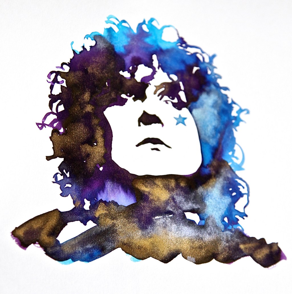
The Marc Bolan image is created from a blend of Purple Pazzazz and Blue Lightning with the silver and gold shimmers working gorgeously with the lighter water blended areas. I used a heavy cartridge paper for this and the inks respond very well to this surface. One word of caution! Once the inks have dried, the metal particles are left as a dust on the surface. If you rub against them, they will easily detach and smudge. If you are going to handle these, you will need to use a suitable fixative or varnish spray to prevent this happening.
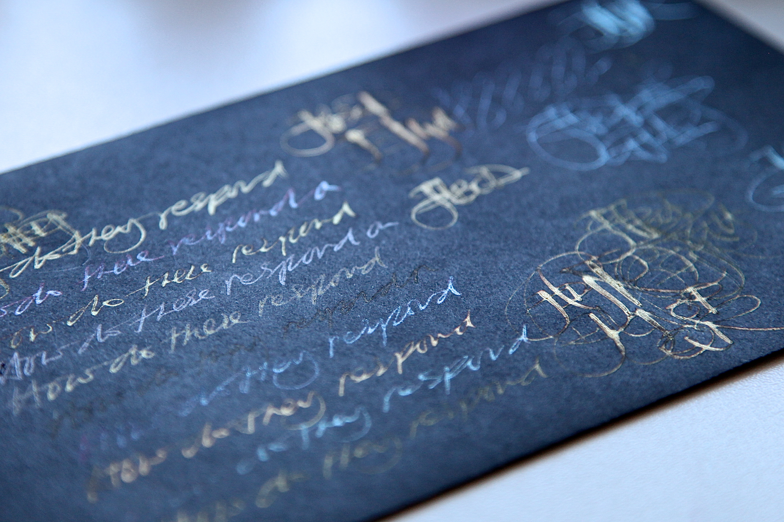
The freeform calligraphy was created on a watercolour paper. Of note – the darker toned inks don’t seem to shimmer as much as the lighter inks and this could be due to the greater absorption quality of the watercolour paper?
All of the inks flow well and blend beautifully. They are really good fun and I love ’em. My only real question for Diamine is the colour choices. These shimmers are such a scream to use – so to engage a younger and trendier audience what about creating a couple with the cherise pink and sunset orange? Glam Rock – where’s the harm?
They even work on black paper!
Ink samples kindly supplied by Phil Davies at Diamine Inks www.diamineinks.co.uk