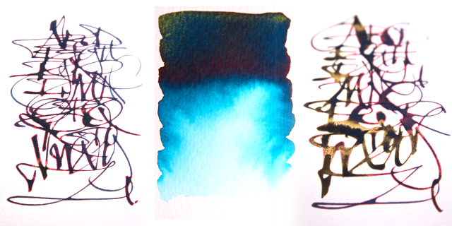
This was just to see how this new J Herbin ink would work for type and illustration and as you can see, it’s wonderful. This was created using a Noodlers Ahab flex pen on a heavy […]


This was just to see how this new J Herbin ink would work for type and illustration and as you can see, it’s wonderful. This was created using a Noodlers Ahab flex pen on a heavy […]

What a surprise! A sample of the Chivor Emerald 1670 by J.Herbin has just arrived. As you can see from the image posted, this could well be the ‘one ink to rule them all’. The freeform […]

I finally caved in got hold of some the 1670 J.Herbins. Glad I did too! As you can see from the image posted the grey and rouge work beautifully together and you can just make […]

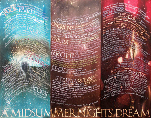
This triptych was created using Scheaffer black, brown, red and turquoise inks with the calligraphy and marks made with bleach and bleed proof using a zebra G nib in a dip pen.

Alphabet blends onto thick rough watercolour stock using a calligraphy brush Left: Diamine red dragon, ox blood, bilberry Right: Pilot Iroshizuku fuju-gaki, yama-budu, kon-peki – these inks are really lovely to work with! All with […]

Chinese character drawn with calligraphy brush blending Waterman Purple, Quink Red and Quink Black with flicks of concentrated Domestos for extra effect.

Domestos on a Quink black and Waterman Southsea blue blend. Beautiful colours and the bleach gives a great neon effect.

5 very quick alphabets for the Horsebridge Arts centre show.

This piece is based on a work by the Buddhist calligrapher Tashi Mannox – http://www.tashimannox.com. The main character ‘rgyu’ in a brushed Umeh script, is a word meaning causality or primary cause. This is then […]