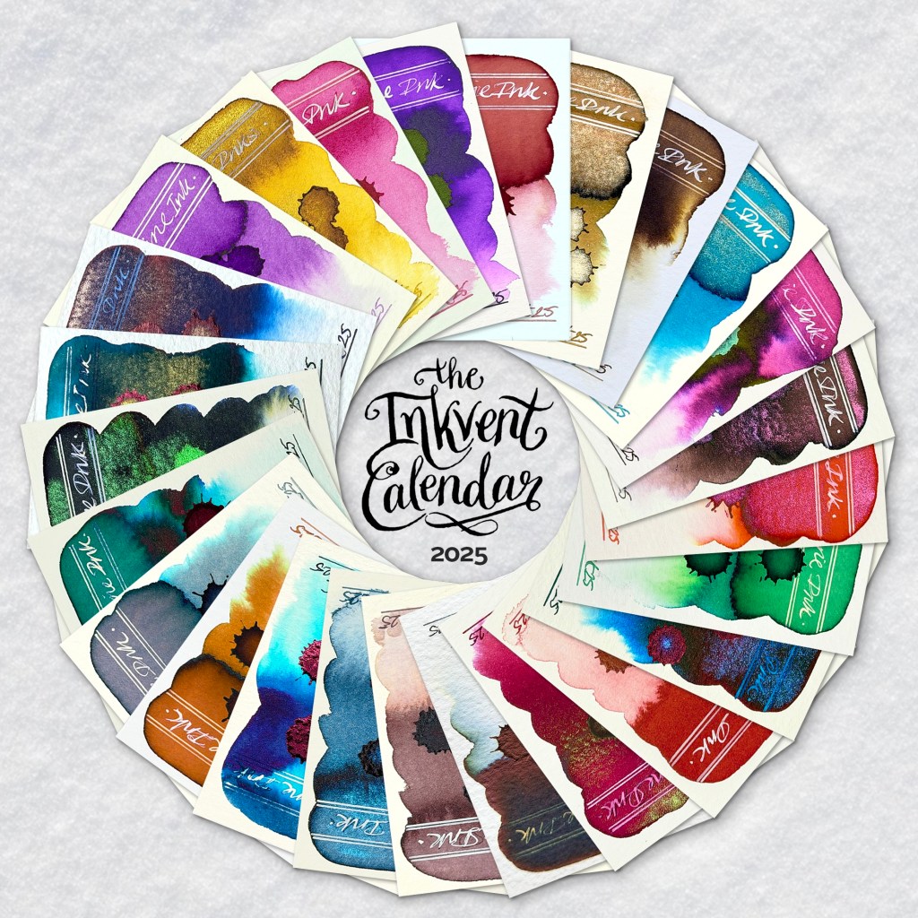
And so another years passes and yet another Diamine Inkvent Calendar is swatched. And for the Teal edition, the range of fountain pen inks is bigger and more diverse than ever.
Retailing at circa £92 (GBP) this Teal edition allegedly saw a few regular ink swatchers sit this year out due to cost, which is a shame, because with the release of the nano pigment Forever Inks earlier in the year, there are several new ink concepts featured here. Of note – Cult Pens are currently offering the Inkvent Calendar for £82 (GBP) while stocks last.
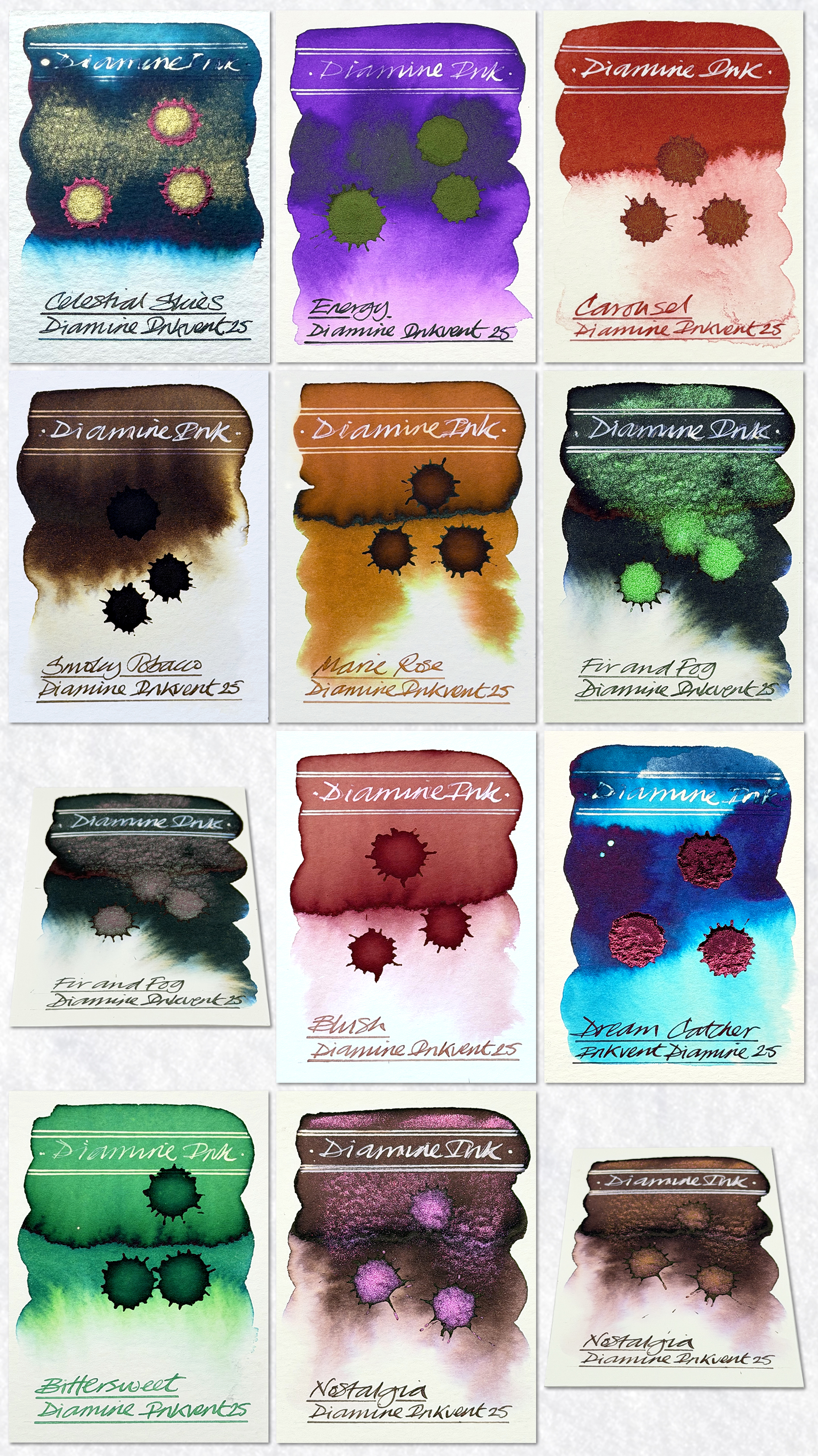
1. Celestial Skies – A shimmer sheen teal with similarities to the legendary Herbin Emeraude de Chivor. A very powerful start for the calendar and popular with followers.
2. Energy – A mid range purple with a dull green sheen. Feedback expressed disappointment with the dullness of the sheen.
3. Carousel – The first nano pigment ink to appear. This is a flat red ochre and totally water proof and agent proof when dry. I used a white calligraphy ink for the rules and lettering in the header.
4. Smoky Tobacco – A deep walnut brown standard ink with a tobacco like scent added. Some subtle chromatography and reaction to bleach.
5. Marie Rose – A wet sandy ochre standard ink with subtle chromatography, a good tonal range and reaction to bleach.
6. Fir and Fog – The first chameleon ink to make an appearance. A deep fir green ink with subtle chromatography and a stunning electric green to silver shimmer. Very popular with followers.
7. Blush – A reddish brown standard ink. No chromatography but works well with bleach.
8. Dream Catcher – A deep blue sheening ink with a stunning turquoise that reveals itself when added to wet paper. The sheen is extreme with a gorgeous metallic rose red.
9. Bittersweet – A happy grass green standard ink with subtle chromatography, a good tonal range and reaction to bleach.
10. Nostalgia – This second chameleon ink is a dark chocolate brown hue with gorgeous salmon pink and purple chromatography plus a stunning pink to copper shimmer. Good with bleach, very pretty and popular with followers!
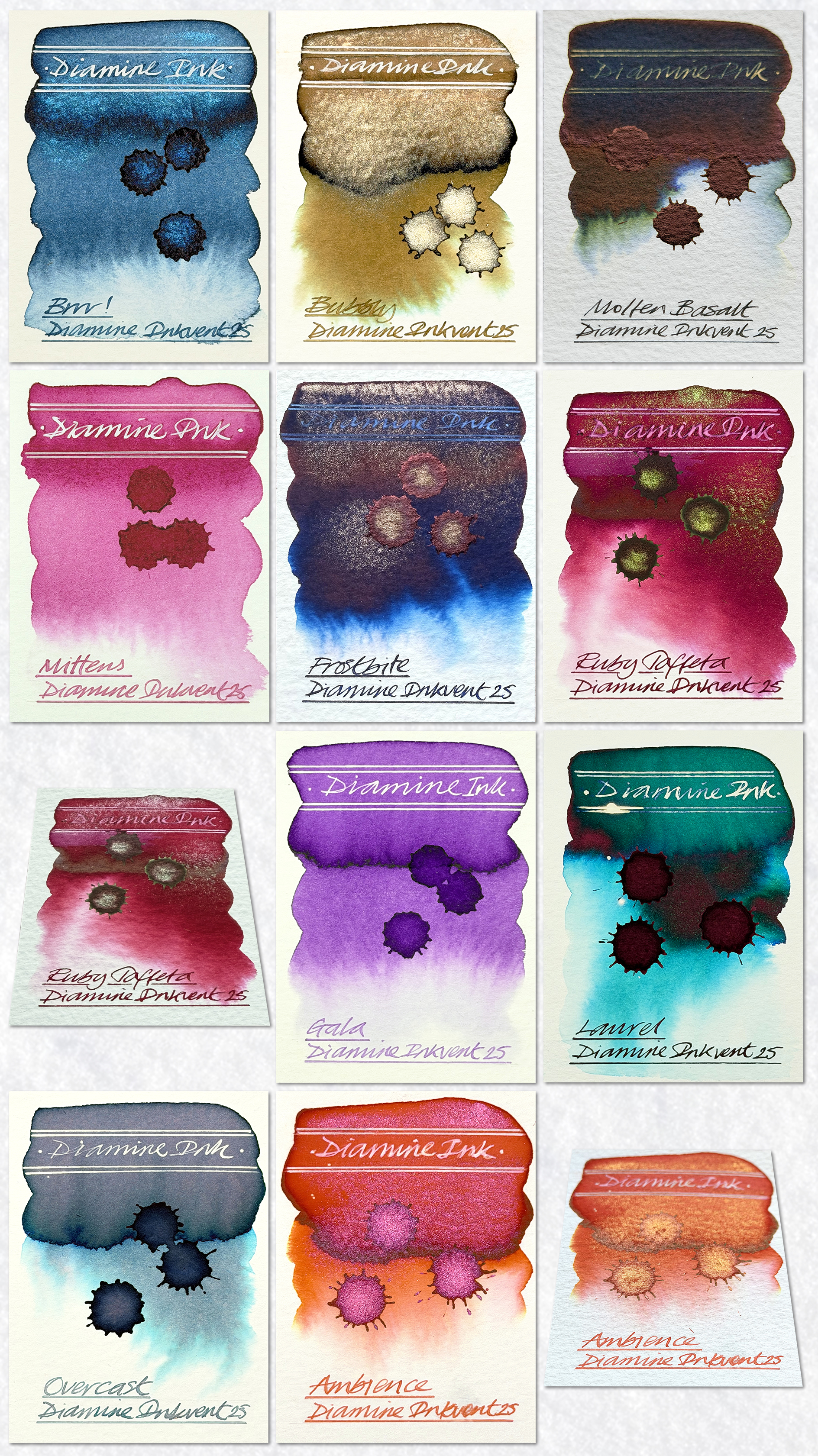
11. Brrr! – The first nano pigment shimmer! This is the first of its kind I have swatched. It’s a light Prussian blue hue with a blue shimmer. Nice.
12. Bubbly – A deep yellow ochre with green chromatography. This is a champagne gold shimmer ink and that shimmer is in abundance. Works well with bleach too.
13. Molten Basalt – By far the most popular standard ink. A deep holly green with mysterious chromatography and a weird sheen. Even reacts to bleach.
14. Mittens – A mid pink nano pigment ink.
15. Frostbite – A deep blue hue with a champagne gold shimmer and a dark red sheen. Too concentrated for bleach.
16. Ruby Taffeta – A stunning crimson chameleon ink with great chromatography and a fabulous green to pink shimmer. To concentrated for bleach.
17. Gala – A violet hue standard ink and good with bleach.
18. Laurel – Another extreme sheening ink. This is very dark green with great turquoise chromatography but a very dull red sheen. Bleach can work in the less concentrated areas.
19. Overcast – A fabulous blue grey with superb chromatography, a great tonal range and good with bleach. Followers loved this.
20. Ambience – Incredible! A rich orange chameleon ink with subtle pink and yellow chromatography plus this stunning pink to orange shimmer! Very very very popular! Bleach works too!
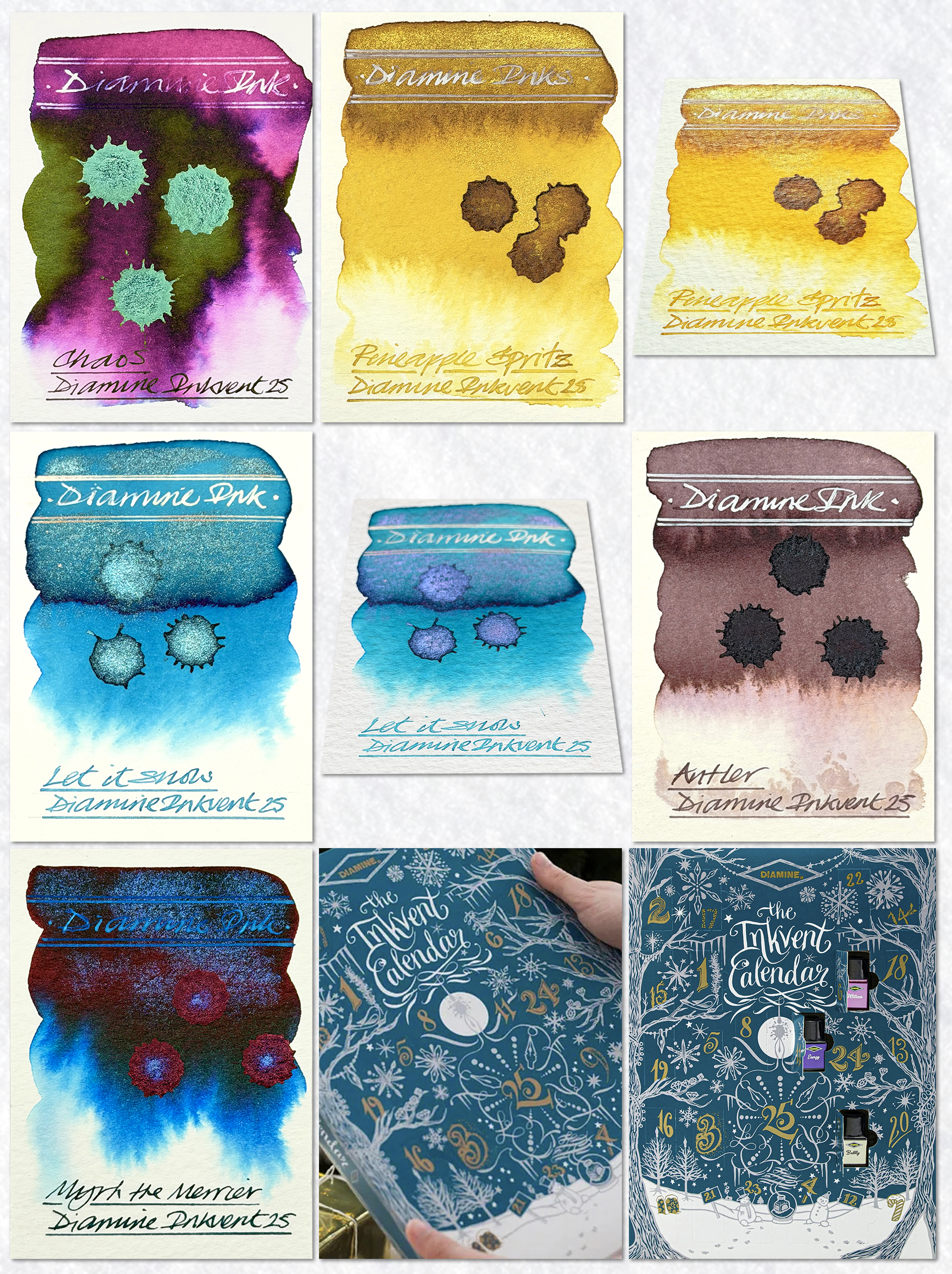
21. Chaos – A very deep purple extreme sheening ink with lovely chromatography and a stunning metallic sheen. Bleach can work in the less concentrated areas.
22. Pineapple Spritz – A pineapple yellow ochre and yellow nano pigment ink with a yellow gold to green chameleon shimmer. This didn’t work too well.
23. Let it Snow – A beautiful cyan blue chameleon ink with a blue to violet shimmer. Bleach works well.
24. Antler – A brown ochre – with purple undertones – nano pigment ink with some subtle chromatography. A first for me!
25. Myrrh the Merrier – A dark green shimmer sheen ink with blue chromatography, a blue shimmer and a red sheen. This was obviously a great effort but sadly didn’t have the visual impact it deserved. Too concentrated for bleach and white calligraphy ink to work.
In the main, I thought this edition was a treat to swatch. The inclusion of the nano pigment inks certainly made the swatching more interesting. The majority were bangers but there were also a couple of clangers in there too. So, is the calendar worth the money? For 25 days of entertainment – most definitely. Of note – I did notice some of the Colorverse advent inks out there too. Can anyone please advise on how much their calendar costs?
Thanks to all of you who invested in my online course. It was great seeing more creative swatchers out there. This is genuine art from destruction and no matter what the outcome – everything still looks great! Here’s to the next one!
And HEY! If you’re interested to know more about how to use fountain pen inks in more creative ways – whether it’s simply to observe their chromatic behaviours, or, to recreate one of my swatch cards, or, to learn how to use them in watercolour painting, illustration and calligraphy, why not check out my online course or, even better, sign up for a workshop?
