
Huge thanks to Diamine for producing yet another wonderful Inkvent Calendar (The Black Edition). Personally, I think it’s been the best yet, and a real joy to engage with. Plus it’s been great to see so many more people joining in and sharing their swatching and art on social media.
Can you believe that this is the fifth edition of the Diamine Inkvent Calendar? And what a fabulous way to showcase all the wonders of fountain pen ink: standard, shading, sheening, shimmering and chameleon inks plus a couple of scented offerings too. Of particular note for this year, is the return of sheening inks!
As always, the first 24 colours come in 12ml bottles while the Christmas Day ink comes in a 30ml bottle. So, without further ado, in day order from left to right and top to bottom, here we go:

Baltic Breeze. A dusty lilac blue with a rose gold shimmer with beautiful subtle chromatography – blue, grey, pink purple and turquoise. The bleaching also works well giving a crisp sharp neon finish.
Wilted Rose. A deep salmon brown standard ink with a bright reaction to bleach.
Noble Fir. A rich fir green with a stunning silver sheen with some subtle turquoise chromo and away from that intense shimmer bleach works wonders.
Forest Gateau. A deep dark chocolate burgundy standard ink with a hint of subtle chromo and a crisp reaction to bleach. Aptly named.
Icy Lilac. A lilac ink with lovely chromo of plum, pink, grey and turquoise with a fabulous electric blue shimmer and a neon reaction to bleach. What’s not to like?
Cranberry. A super sheening cranberry coloured ink with a green sheen. No chromo evidenced but a decent reaction to bleach away from the more concentrated areas.
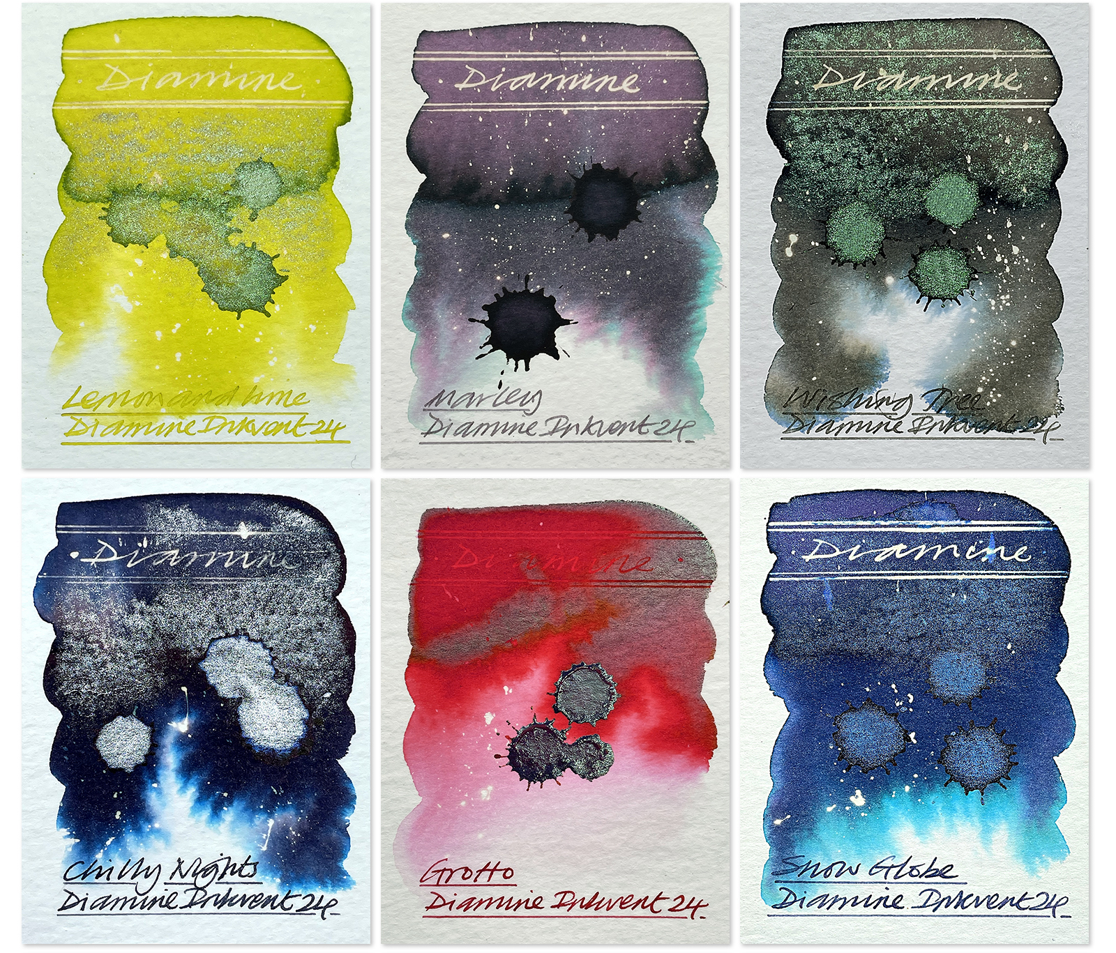
Lemon & Lime. Suitably named this is a hi viz yellow with a lime sheen and a green shimmer. There’s a crisp reaction to bleach as well. Sharp!
Marley. Presumably named after Jacob Marley one of the ghosts in A Christmas Carol by Charles Dickens, this mysterious grey purple standard ink has hidden qualities. Just look at that chromo of pinks greys and greens. Plus a neon reaction to bleach! Magical!
Wishing Tree. A dark dusty greeny grey with some subtle blue and yellow ochre chromo. The green/purple chameleon shimmer is fabulous as is the crisp reaction to bleach. Definitely one to revisit for future art.
Chilly Nights. A very attractive blue black ink with some sky blue and plum chromo and that monster silver shimmer! Good bleach reaction too. Nice!
Grotto. This is a super sheener. It’s a supersaturated vermilion with an electric metallic green sheen but is difficult to photograph as it changes its appearance depending on paper surface and lighting conditions so I’ve included another image at the end of this post. Middle image.
Snow Globe. A gorgeous French blue ink with amazing turquoise, green and plum chromo and a very pleasing blue/pink chameleon shimmer!
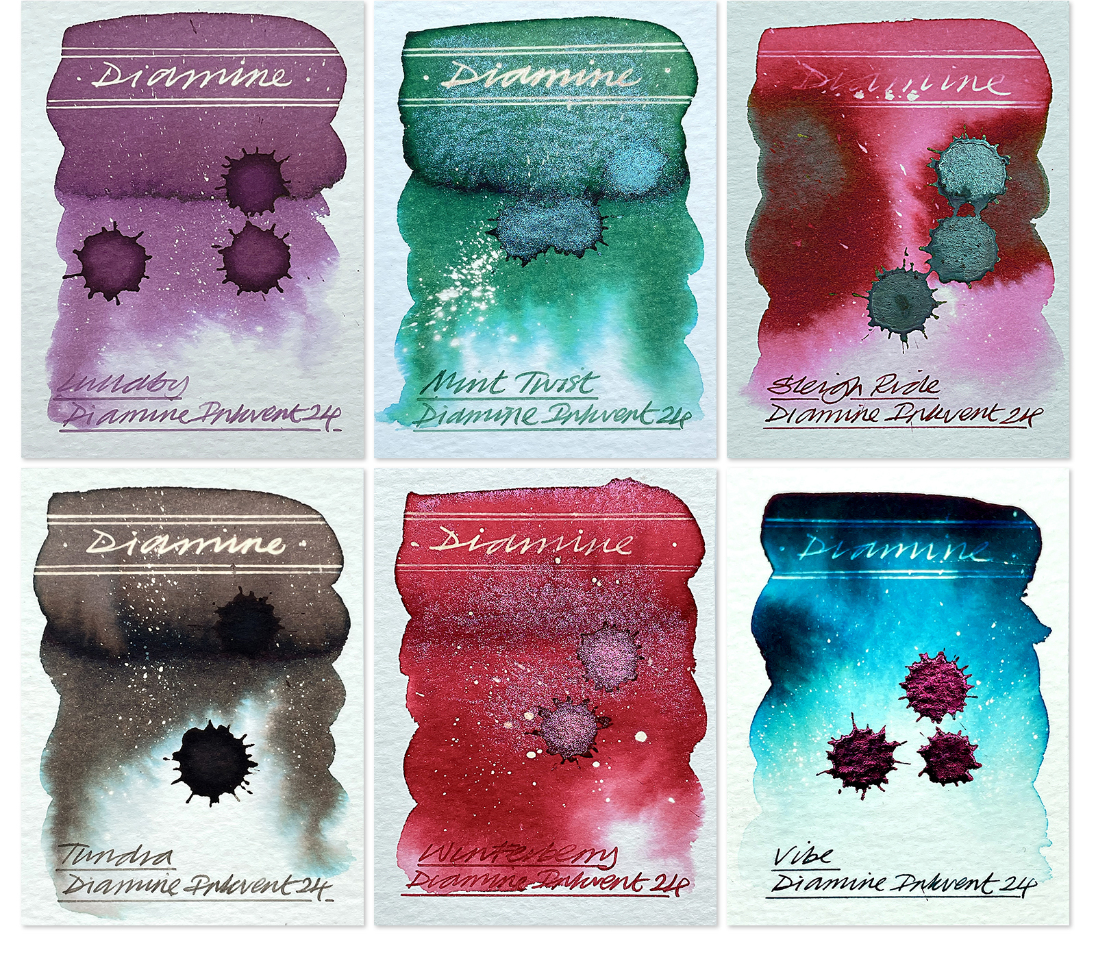 Lullaby. A dusty purple standard ink with a hint of chromo and a stunning reaction to bleach. A much needed contrast to some of the more fancy shimmers. A lovely hue.
Mint Twist. A mint green hue with turquoise chromo and a chameleon shimmer of what looks to me like metallic teal and pink/purple. A neon reaction to bleach. Tasty!
Sleigh Ride. Another super sheener. And like Grotto, not easy to photograph accurately. This is has a red hue with some pink chromo and a heavy dark green sheen. Due to the heavy ink saturation bleach struggles to make much of an impact.
Tundra. A heavy warm grey standard ink with subtle turquoise chromo and a fabulous reaction to bleach. For the artists out there – this has an excellent tonal range.
Winterberry. A lovely berry red hue with a pink and rose gold chameleon shimmer with a sharp clean reaction to bleach. Looks great!
Vibe. A dark super saturated teal with lovely chromo and a stunning metallic red sheen! Bleach works too in the less saturated areas. I’ve included another image at the end of this post. Left image.

Fruit Cocktail. A dusty orange standard ink with a hint of chromo and a stunning reaction to bleach. Not dissimilar to Diamine Coral which is another lovely Diamine ink. Not easy to photograph but got the colour adjustments as close as I could. Worth having a sniff of this!
Potpourri. A dusty red wine standard ink with subtle green turquoise chromo and a fabulous reaction to bleach.
Cosmic Glow. Another super sheener. This is a saturated French ultramarine with turquoise chromo and a lovely fortified red sheen. Due to the heavy ink saturation bleach struggles to make much of an impact. I’ve included another image at the end of this post. Right image.
Nutmeg. This is a nutmeg brown with subtle chromo, a huge gold shimmer and a fabulous reaction to bleach. What’s not to like?
Pine Needle. This is a deep Christmas tree green with subtle chromo and a big tonal range. With water added the green does become quite bright. The gold shimmer has a duotone effect. The bleach didn’t react too well with this.
Salted Caramel. As its name suggests this is a caramel coloured ink with subtle green wisps of chromo and a beautiful gold shimmer. And there is a fabulous sharp bright reaction with bleach too.
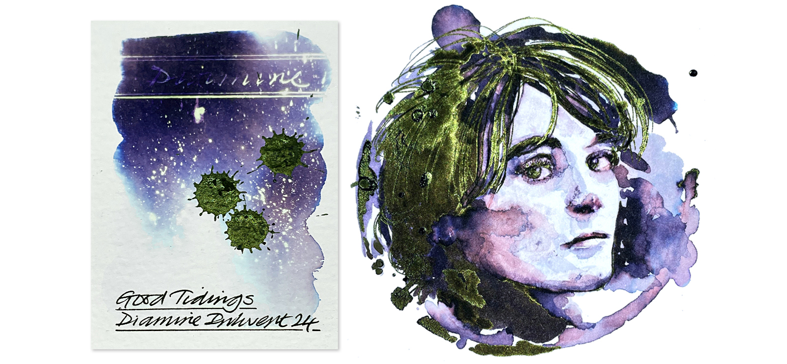
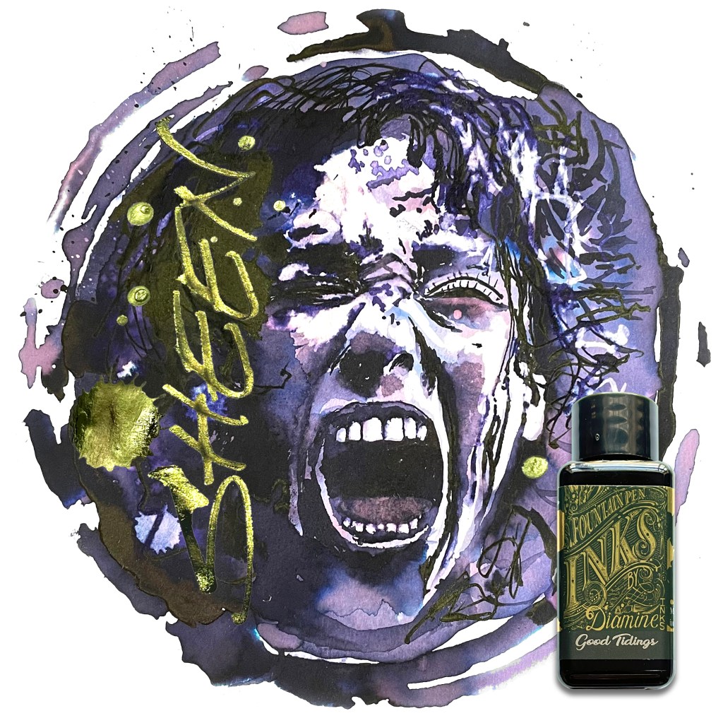
Good Tidings. A deep dark purple with amazing chromo and a huge metallic green monster sheen. This ink will vary in appearance depending on the type of paper used. But what a fabulous ink to finish with. The main hero image at the beginning of this post is also created with this ink.
 Some of the super sheeners: Vibe, Grotto and Cosmic Glow
This year’s edition really has been great fun – and as you’d expect from Diamine – full of magic. I have really enjoyed it. And evidence from this advent reveals that ink enthusiasts, both existing and new, would appear to be using fountain pen inks both more regularly and, encouragingly, in more creative ways too. I have noted a couple of poor reviews but when you see the accompanying swatch work, I’m not sure that these individuals are getting into the spirit of fountain pen ink art? Because most people who have been swatching with water and on different papers are really getting into the characters of these inks and creating some really exciting swatches and imagery showing all the hues, chromatography, sheens and shimmers to magnificent effect.
I have heard that there are still advent calendars available so, if you didn’t get one, you might be able to find one at a reduced price. There’s no harm in asking and making an offer either!! And if you want to find out more – about fountain pen ink art – including creative swatching – online course is but a click away.
If you’ve enjoyed this post, here are links to my summaries on the previous four editions: Inkvent 2020, Inkvent 2021, Inkvent 2022 and Inkvent 2023. And don’t forget to look out for my annual project review with my favourite top twelve inks I’ve swatched in 2024 which I will post next.
Swatches conducted on Bockingford 200lb rough, using a Noodler’s Creeper pen, bleach and KUM brushes.
HEY! If you’re interested to know more about how to use fountain pen inks in more creative ways – whether it’s simply to observe their chromatic behaviours, or, to recreate one of my swatch cards, or, to learn how to use them in watercolour painting, illustration and calligraphy, why not check out my online course or, even better, sign up for a workshop?
