
Ferris Wheel Press (FWP) is a design and stationery company based in Markham, Ontario, Canada, and have been creating high-end stationery and fountain pen inks for more than ten years.
Just over two years ago I signed up to become a FWP Creative Ambassador with the deal being: I get my blog featured on their Creative Ambassador webpage; get sent a couple of bottles of ink each month which I then post and blog about; and, enjoy the added benefit of receiving a small commission should anyone buy product from my link(s). They do a great job promoting fountain pen inks as a creative medium and I’m proud to be an ambassador for them.
I first stumbled across FWP two years earlier when Anja at Papier und Stift sent me an FWP gift box of ink vials. In those earlier days, the FWP inks I swatched tended to be somewhat thin and very translucent – not really my bag at all. But since then, it’s been a real pleasure to see FWP flourish and develop with some of their recent inks being nothing short of drop dead gorgeous. Of note: Atlas Iron Ore and Land of Shanghai-la are always to hand and now feature regularly in my ink art.
Due to their success, FWP has had to update their international fulfilment and so half way through the year, my swatching suffered a little due to teething problems with me not fully understanding some of their new systems. I sincerely apologise for my lack of FWP blog posts this year, so what follows is a bumper blog featuring some stunning inks and other product.
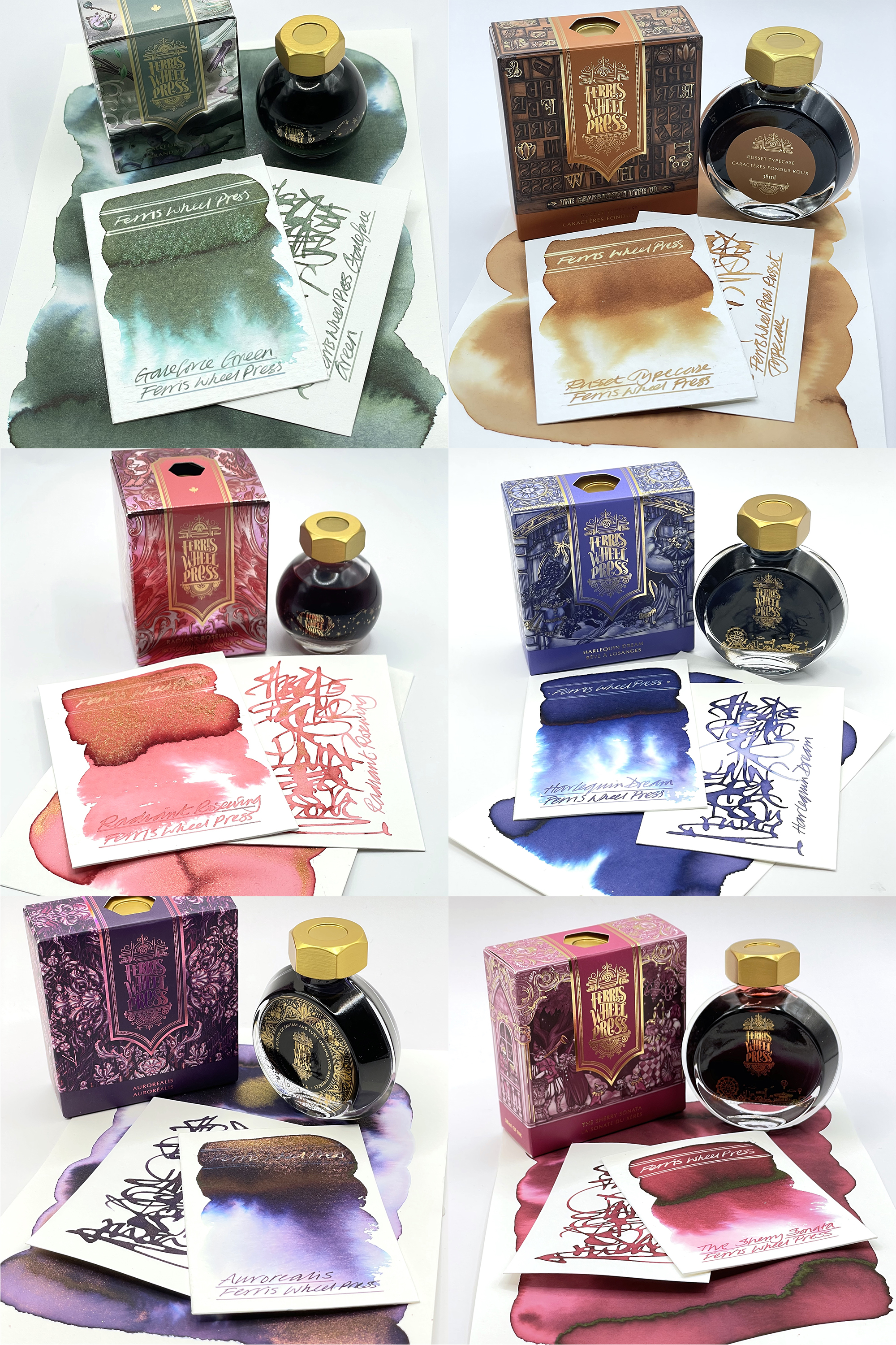
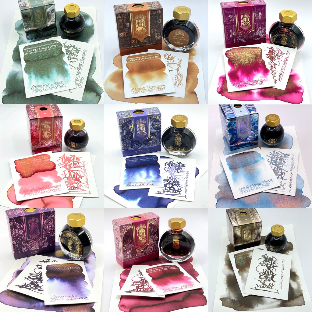
Gale Force Green is part of the ferritales collection. This is a forest green duotone green/pink shimmer ink (check out the next image) with fabulous chromatography. I have used this in my Inktober 2024 challenge.
Russet Typecase is part of the Bearington collection. This is a vivid ginger coloured ink with a degree of shading to it but no chromatography. Great reaction to bleach though.
Radiant Rosewing is part of the Wild Swans Collection. This is a rose pink ink with a rose/gold duo tone shimmer and a lively reaction to bleach beneath all that shimmer.
Harlequin Dream. A deep periwinkle blue standard ink with beautiful subtle chromo and a lively reaction to bleach.
Aurorealis. A fabulous dark purple with huge chromo, a feint yellow sheen and a duo tone gold/copper shimmer. You can see the copper shimmer in the foreground with the gold shimmer at the back near the base of the bottle.
The Sherry Sonata. For those of you into wine coloured inks – here you go. A fulled bodied red standard ink with a fabulous reaction to bleach.

Little Miss Jubilee is part of a collection of stationery items that is celebrating the Jubilee Creative Ambassador programme. This is a deep rich sultry magenta with a huge gold shimmer, some decent shading and even some subtle chromo. Bleach works well too but better on the ink rather than the shimmer. It’s lovely.
Terracotta Canyon. This is a standard ink with shading qualities that is described as a burnt orange hue. I found it to be quite a translucent ink but it does react well to bleach.
Leadcast Letters is a warm mid grey fountain pen ink with fabulous shading qualities and chromatography. It’s actually quite similar to Curious Woods but without the shimmer. There is also a decent reaction to bleach.
Unfettered Flight. A super delicate translucent blue with a gold/rose gold duo tone shimmer
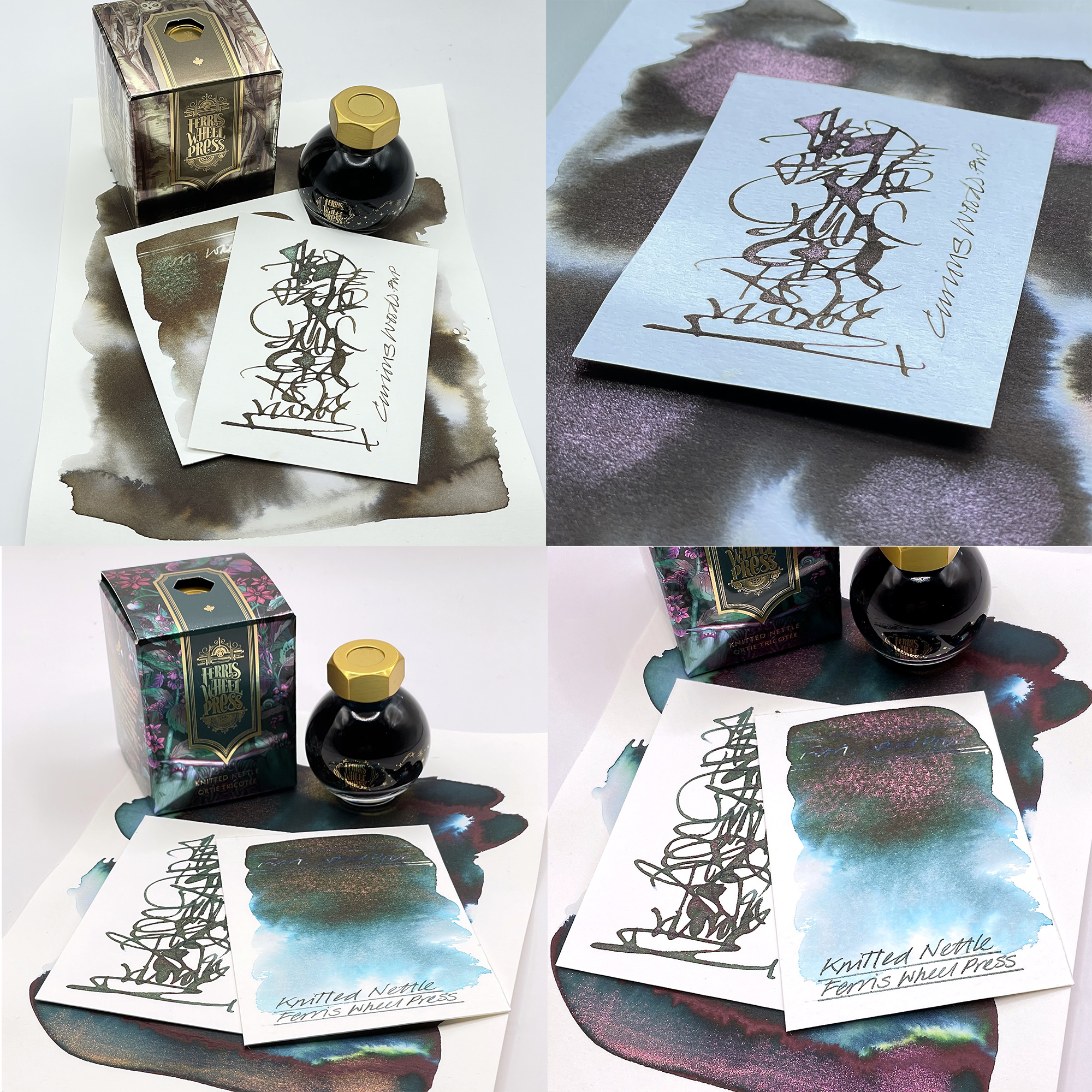
Curious Woods is part of the Three Little Pigs collection. This is an ash brown hue with a duotone green/pink shimmer ink with fabulous chromatography and a reaction with bleach.
Knitted Nettle. A rather lovely dark teal with lots of chromo, a red sheen and a duo tone gold/pink shimmer. Away from all the heavy action you do get a good reaction with bleach.
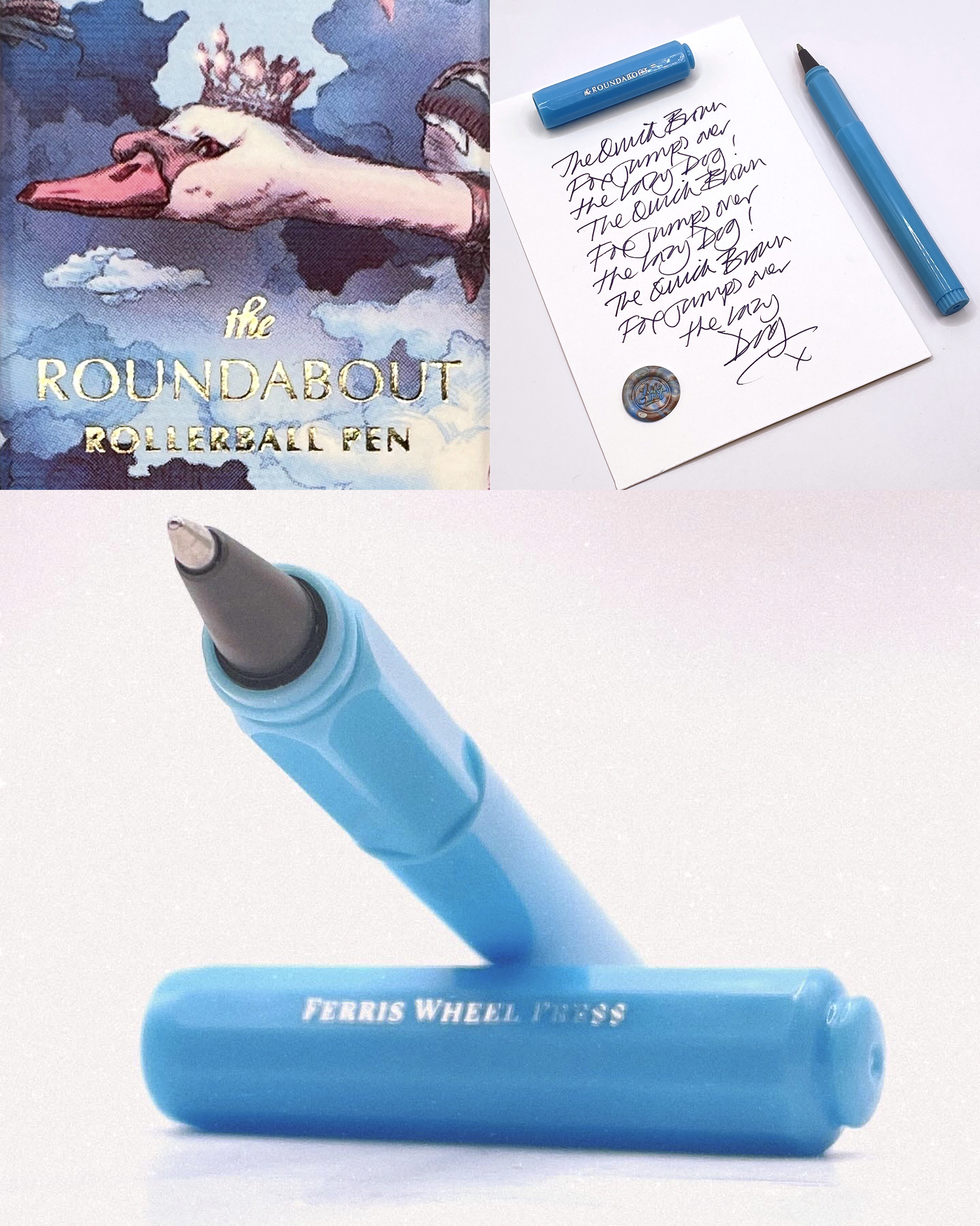
The Roundabout Rollerball Pen. This runs on standard fountain pen inks! I’m being serious! I was sceptical but these rollerballs actually work! And work rather well.
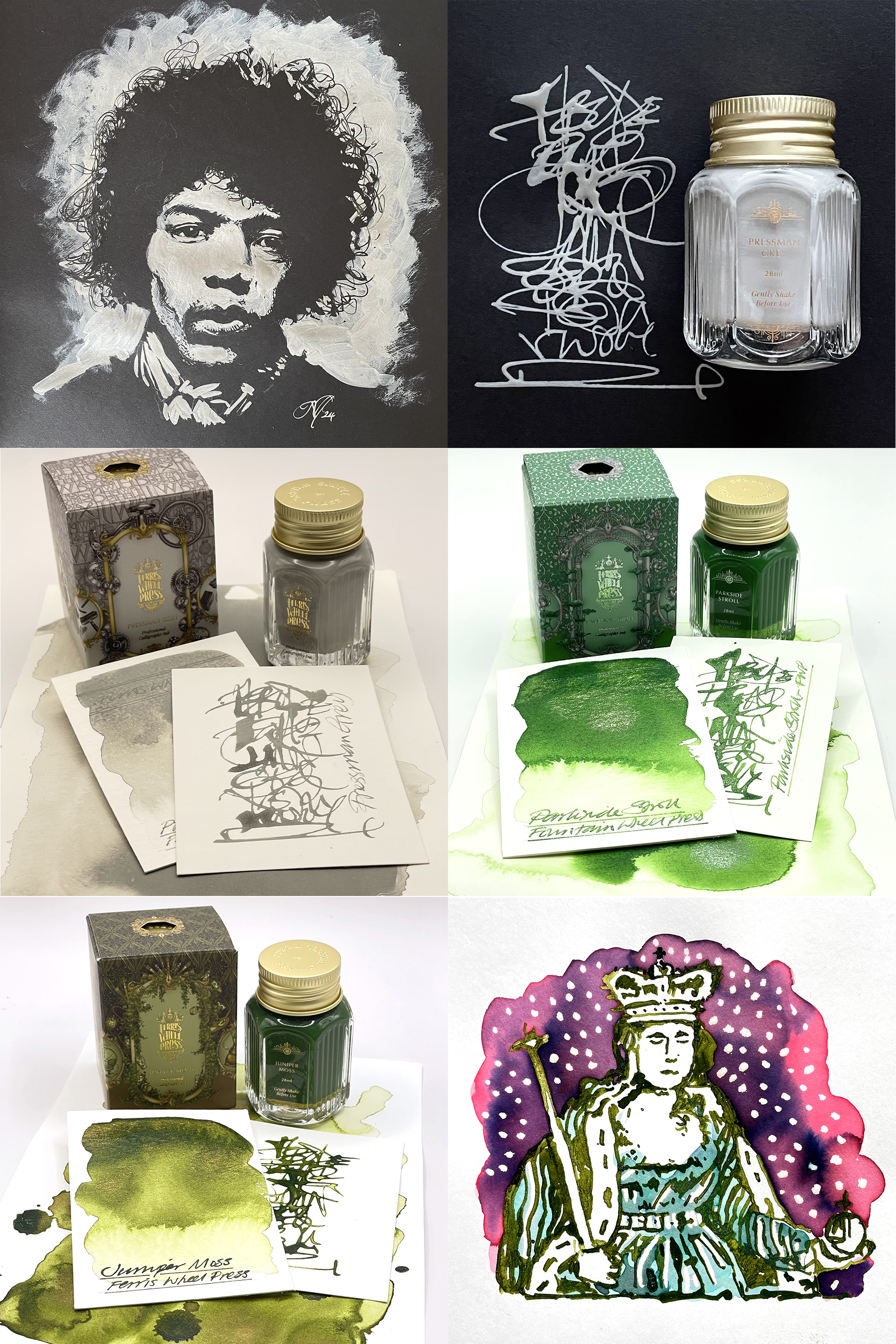
Pressman Grey is a permanent pale grey calligraphy ink so don’t put this or any of the other featured calligraphy inks in your fountain pen(s)! These are great for lettering and drawing and then overpainting with dye based fountain pen inks as they act like a resist. But this grey also works a treat on black and dark coloured papers. If you like keeping photo albums and journals with black pages, this is an ideal ink for making your captions and marks stand out as there’s no show through!
Parkside Stroll is a stunning grass green ink with a very shiny gold shimmer and apologies that my pic doesn’t show this properly.
Juniper Moss. A fabulous dark moss green calligraphy ink with a gold shimmer which when you dilute a little with water – well just look at all those greens! Stunning! Works well as a resist too! See illustration with dye based ink overpainting and bleach highlights.
Blimey! A lot to show and tell but a fabulous range of product from FWP. If you like what you see and are tempted to try something out, Ferris Wheel Press have given me a discount code that will get you 10-15% discount off their products. All you have to do is click here and use JA NICK as the code. Enjoy their website and have fun!
And HEY! If you’re interested to know more about how to use fountain pen inks in more creative ways – whether it’s simply to observe their chromatic behaviours, or, to recreate one of my swatch cards, or, to learn how to use them in watercolour painting, illustration and calligraphy, why not check out my online course or, even better, sign up for a workshop?
