
As a keen fan of the Kakimori dip pen I was eager to try out the new One Dip pen from Tom’s Studio to see how they might compare.
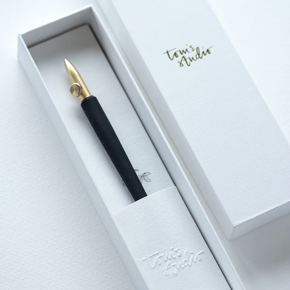
I opted for the brass version which comes tatstefully packaged with the Tom’s Studio branding plus the complimentary Dorset Tea bag. Now, the first thing to notice is that the nib is very different to the Kakimori. It looks kind of familiar in that it reminds me of the old ruling pens that we used to use for technical drawing and artwork for print before the mass production of Rotring pens and then CAD. The ruling pen was a dip pen that you controlled the line width with the thumbscrew. So what has Tom done? Well, he seems to have taken that concept but built out the tines either side so that you can achieve an even thicker line width by reducing your nib angle. See images below to grasp this concept:
 To get the Tom’s Studio One Dip to work, keep the tines vertical, just as you would a fountain pen. Always keep the thumbscrew side-on. See above.
Before starting you will need to watch the set up video very carefully (click here to view) as you will need to insert a small wick into the middle of the nib that wicks up the fountain pen ink and retains it in the reservoir. Now, it took me quite a while to get the hang of using the nib because what wasn’t mentioned, although it’s blinding obvious I suppose, is that unlike the Kakimori (click for my review) which you can use at any angle you want, this is a nib with tines and so you have to keep the tines in a vertical position, just as you would with any tined nib to allow the ink to flow. But with the rounded out tines it is easy to deviate. So remember to keep the thumbscrew side-on and perpendicular to the paper. Any divergence from that vertical position and the ink flow will be interrupted and you will get frustrated!
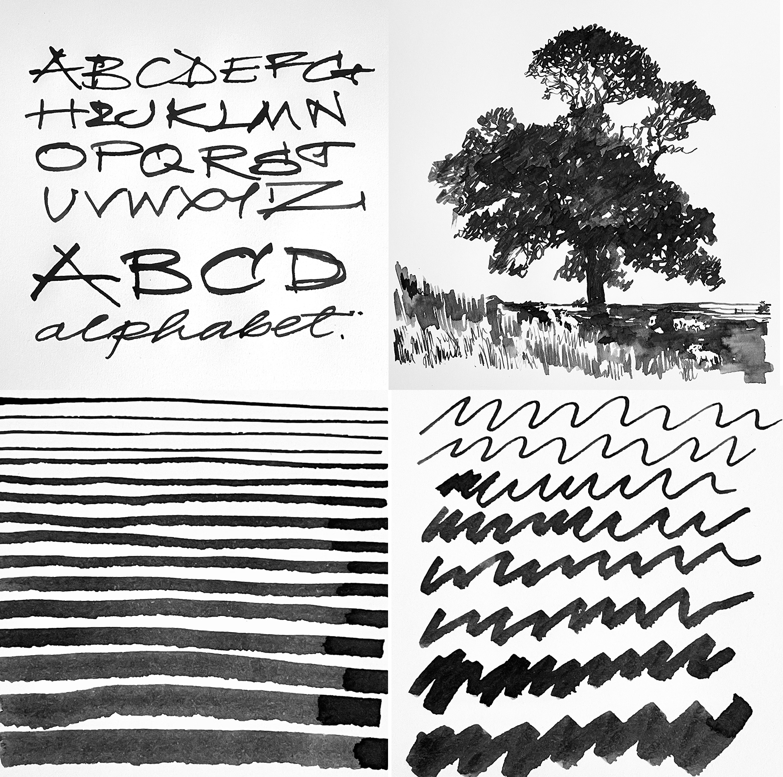
But once you get the hang of it, you can achieve a decent range of line width variation and textures – with ease.
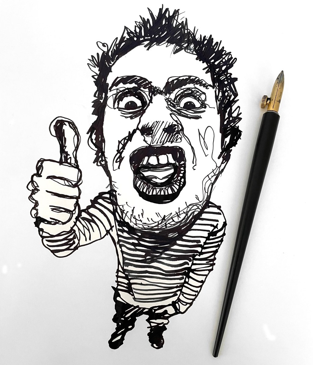
So, can this nib really fill one side of A4 with only one dip? I’m not so sure about that. My hero illustration which is on a sheet of Tomoe River A4 took 3 dips in a bottle of Quink Black. So, if I were writing on 7-8mm deep line rules?
Whatever, these nibs do make an illustrator’s life considerably easier. The ‘blocking in’ potential alone speeds up the illustration process. The image of the tree took me a matter of minutes. Using a flex nib and brush would not only have taken longer but would not have had that fabulous variation in texture.
So, the big question… which one? They both do the same job but I would honestly say that for me, the Kakimori is easier to use and clean BUT – and this is a big BUT – it costs circa £50 for the Kakimori nib while the Tom’s Studio One Dip nib will cost you £30. And then you need a holder too. But if you’re into illustrative art, these really are a great bit of kit to have. Over to you.
Click here for further information: https://tomsstudio.com/products/one-dip-nib
And HEY! If you’re interested to know more about how to use fountain pen inks in more creative ways – whether it’s simply to observe their chromatic behaviours, or, to recreate one of my swatch cards, or, to learn how to use them in watercolour painting, illustration and calligraphy, why not check out my online course or, even better, sign up for a workshop?
