
I do get asked, quite frequently, which papers are best to use for fountain pen ink art, so I’m hoping that this post may help. As mentioned in a previous post, Hahnemuhle UK were one of many stands I visited at the London Stationery Show 2023. They very kindly gave me some paper sample packs and a Nostalgie Sketch book to try.
Like many paper manufacturers, the Hahnemuhle range is extensive with papers produced for a wide range of usage from drawing and painting to high end ink jet and digital printing. Of the papers that I tested, the water colour and sketch paper surfaces are the ones that worked best with fountain pen ink and bleach. I did try others, but have not shown these as they were not appropriate.
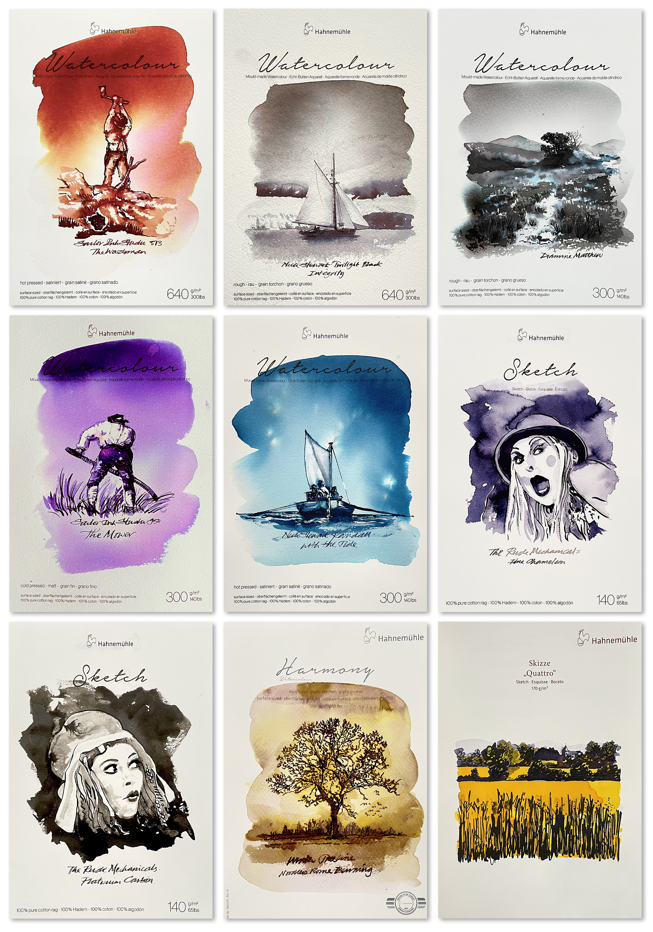
Going for left to right top to bottom, the 300lb papers that I tried worked very well. Both the rough and the smooth hot press surfaces pulled out the chromo action of the Sailor Ink Studio 873 and the subtleties of the Nick Stewart Twilight Black to great effect and when using bleach, the effects were as expected. But do bear in mind that these papers are almost like a board and are arguably just a little too thick? 200lb is the heaviest I use.
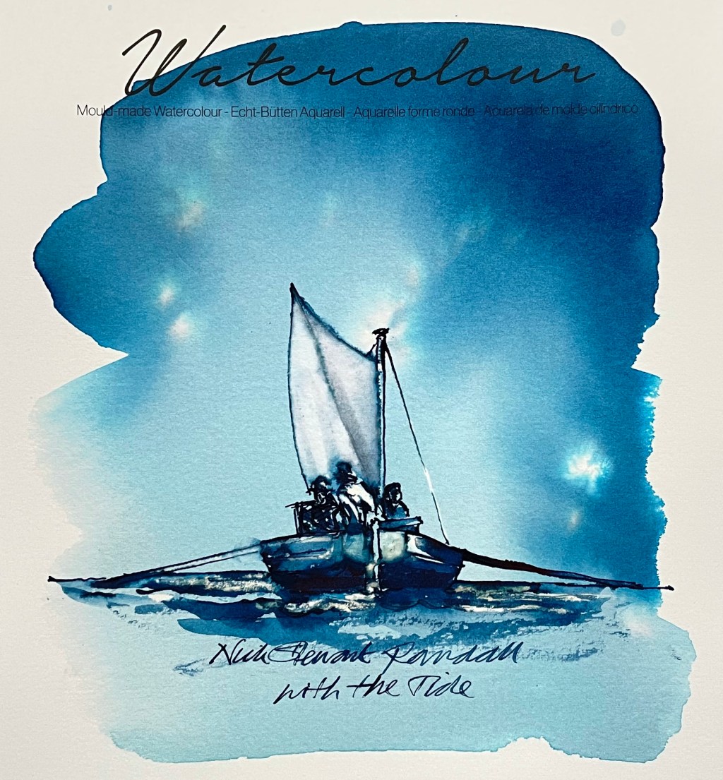
The next three surfaces were 140lb papers in rough, cold press and hot press and were all fabulous! A nice weight to work on and all three surfaces encouraged great chromo from: Cult Pens Matthew, Sailor Ink Studio 950, and Nick Stewart Randall and all with easy bleach action. If using a flex nib, the hot press is the smoothest surface so the nib can move better without getting snagged and spattering. There were no issues with the Kakimori nib on any of the papers.
Next up was the 65lb Sketch paper on which I used pigmented inks Write & Draw Blue Chameleon and Platinum Carbon using a Kakimori nib with water washes and liberally too. As this paper is flimsy, I was expecting some bleed through but there was none! I liked this paper, it was easy to use with great effects and I will investigate further.
The next test was another water colour paper called Harmony. I used Noodler’s Rome Burning which is a temperamental standard ink with huge chromo qualities. The paper did very well but I did notice bleed when illustrating with the flexnib. This needs further investigation.
And lastly was another sketch paper, Skizze Quattro. I used Write & Draw Blue Chameleon applied with a Kakimori nib with a Robert Oster Sunrise Yellow overfill. A really clean finish with no smudging! I really rate this paper surface! A lovely unexpected result.
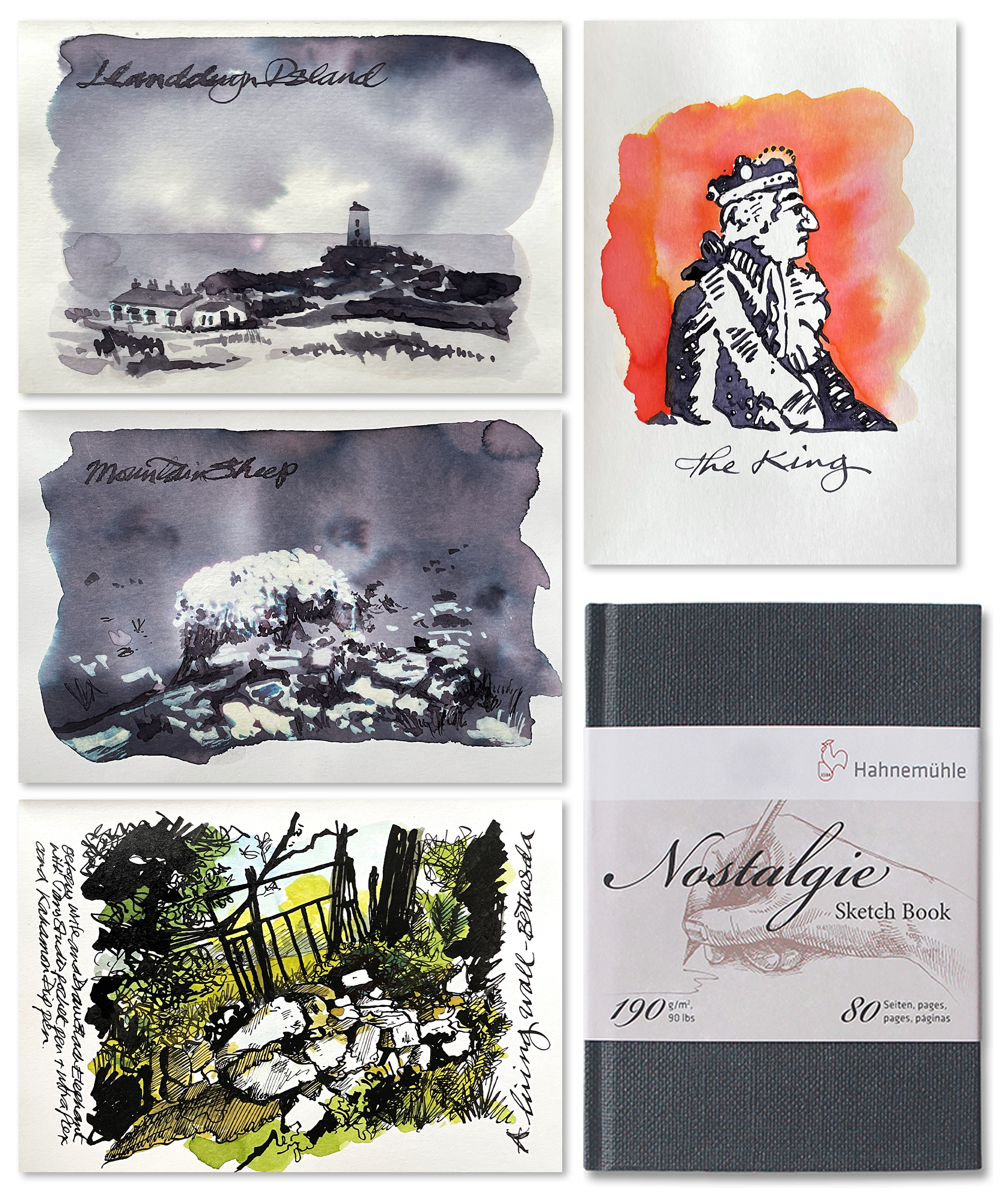
The Nostalgie Sketch book comprises a 90lb smooth finished paper which works very well with both nibs, both types of ink – pigment and dye – and bleach. The 2 swatch paintings using Nick Stewart Twilight Black and bleach each gave great chromo although I did note a little bleed when using the flexnib to write on top of the swatch backgrounds – this could be the flexnib? The two pigmented inks used for The King and the Wall Gate scene were easy to apply and dried fairly quickly. The standard dye based ink overlays and fills are vibrant with no smudging. The Nostalgie is most definitely recommended for fountain pen ink art.
Water colour and sketch papers work well for fountain pen ink art. And it’s NOT brand specific. I tend to use, where I can, UK manufactured water colour papers which may not be available in all territories. If you are in one of these territories, I would suggest you make contact with your nearest paper supplier and request some water colour and sketch paper sample packs. Test them, as I have, and discover the papers that are best for you and your inks.
And don’t forget that fountain pen inks are all different – one ink will look amazing on one paper and a different ink will look amazing on another. Fountain Pen Ink Art is not a ‘one size fits all’ medium, it’s packed full of nuance and that’s why we love it. I hope this helps.
Many thanks to Hahnemuhle for the opportunity to try out their papers.
And HEY! If you’re interested to know more about how to use fountain pen inks in more creative ways – whether it’s simply to observe their chromatic behaviours, or, to recreate one of my swatch cards, or, to learn how to use them in watercolour painting, illustration and calligraphy, why not check out my online course?
