

A new brochure created for the internationally renowned Great Dixter House and Gardens at Northiam near Rye, East Sussex, has just been launched and features illustrations and a map created entirely with fountain pen inks.
Cherry Stewart (aka Prune and Fork) used Octopus Fluids Write and Draw Inks for the line work, together with a combination of Robert Oster, Diamine and Nick Stewart fountain pen inks for the colour fills and backgrounds. Of note, Cherry used a Desiderata Daedalus pen with a zebra G flex nib and a customised feed from Beaufort Inks for the line work.
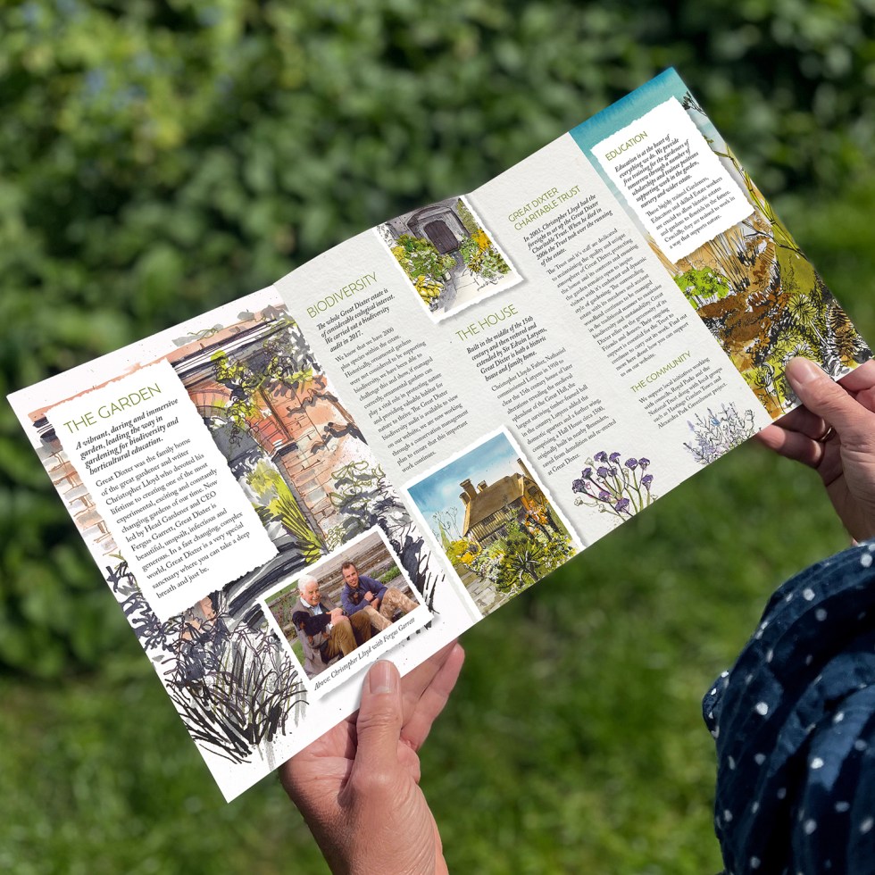

The client absolutely loved the energy and vivid colours that the illustrations evoked and said that the art really does do justice to the horticultural splendour of one of England’s finest and most revered country gardens. The client was also quite taken aback when told that the medium used was Fountain Pen Ink!
What is so pleasing, is that the creative possibilities of fountain pen ink art are slowly starting to capture the imaginations of a much wider audience. The vivid colours combined with the magic of the chromatography sets this medium apart from all others. And the reaction has been so positive that there have already been promises of more projects using fountain pen inks to come. Please spread the word!
And HEY! If you’re interested to know more about how to use fountain pen inks in more creative ways – whether it’s simply to observe their chromatic behaviours, or, to recreate one of my swatch cards, or, to learn how to use them in watercolour painting, illustration and calligraphy, why not check out my online course?
